

Mistakes happen. When people use a product, they’re bound to get stuck somewhere in response to their actions.
Those situations can be frustrating for users if they aren’t handled properly within the product. It depends on the experience that the product is providing to its users. That’s where error messages come in.
Error Message Tips to Know
- Be clear.
- Be short and meaningful.
- Don’t use technical jargon.
- Don’t blame the user.
- Avoid negative words.
- Give directions to the user.
- Be specific and relevant.
- Avoid uppercase text.
- Provide appropriate actions.
- Use the progressive disclosure approach.
- Use proper placement.
An effective error message needs to communicate to the user the nature of the problem in simple words along with a solution to rectify it. Include too much information or too little, and you’ll end up frustrating the user and potentially losing them.
Below are a few tips to strike the right balance and create an effective error message.
11 Error Message Tips to Know
1. Be Clear
Write error messages in clear and simple language. The user should be able to understand the problem while reading an error message.
If the error message is ambiguous, and the user is not able to find the reason for the message, then it’s pointless. Users can’t do anything to fix the problem, and it badly impacts the experience of the product.

Examples


2. Be Short And Meaningful
An error message should only contain necessary information. Most of the time, the user isn’t willing to read a long story.
Be concise and write a short description that is meaningful for the user and gives him a clear idea of the problem and how to resolve it.
Avoid using redundant words and don’t over-communicate the problem.

Examples


3. Don’t Use Technical Jargon
Most users aren’t interested in the technical details behind the problem. If a message contains technical terms or jargon, it will only confuse the user.
Try to use simple and plain language without referring to implementation details.
If it’s important to mention technical and complex details, then place them in a troubleshooting section and direct the user so that he can resolve the issue quickly.

Examples


4. Don’t Blame the User
A good error message is humble. It conveys the issues gracefully to its user without blaming him for his actions.
Users can perform an incorrect action again and again. But it’s the responsibility of design to inform them about mistakes in a good way.
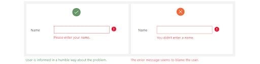
Examples
5. Avoid Negative Words
There are certain negative words that should be avoided. Since error messages are based on some unusual user actions, there’s a chance that the message could feel disrespectful to the user.
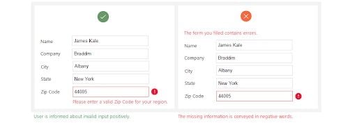
Examples

6. Give Direction to User
A good error message has three parts: problem identification, details about the cause for the error (if helpful) and a solution (if possible).
Whenever an error occurs, the user wants to fix it as soon as possible. The error message should have enough information to guide users on how to fix the situation.
The message can also direct the user to some other place or person from where he can get detailed help about the problem.
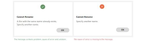
Examples
7. Be Specific And Relevant
The message should contain relevant information so that users can relate to specified locations and options easily.
Point out the exact location of the problem, where users should go and what steps they need to follow to resolve it.
If an error message contains vague information, the user will get confused, and it becomes difficult for him to remove the error.

Examples

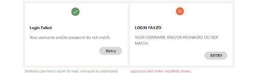
8. Avoid Uppercase Text
Text in all caps is difficult to read, and it can feel like you’re shouting at the user.
The error message is a place where the user is informed about a critical scenario, so using upper-case text can feel discouraging.
Example
9. Provide Appropriate Actions
Actions are an important part of the error message. Appropriate actions provide guidance to users about the next step.
Actions are possible routes to solve the problem. A message can contain one or more actions for the user. If the user has to perform specific actions to remove the error, then use the same action name as the button title.
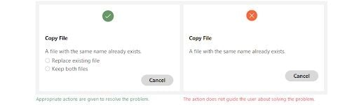
Examples

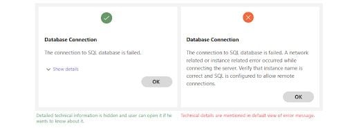
10. Use the Progressive Disclosure Approach
If there is detailed information related to a message that the user may not want to see, then place it in a show/hide section. It can be useful for an advanced user that may want to know about technical details.
Just make sure to place the least important information in these sections, as most of the time, users won’t go to the show/hide section.
Examples
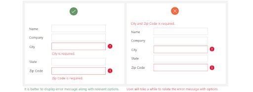
11. Use Proper Placement
It’s very important to place an error message closer to the area where the error occurred. Users shouldn’t have to hunt for the mistake after reading the message.
For example, when the user is filling in information in a form, it’s best to provide validation error along with the controls it relates to.
Otherwise, the user will first find the erroneous control and then resolve it.
An error message should be visible and noticeable. A message appearing on a screen should be responsive, following the user even as they scroll.
It’s best to avoid errors completely, but since we live in a world of humans, that’s not possible.
However, by following standard rules and guidelines, any errors can be handled in a helping way instead of scolding the user for his mistakes.


