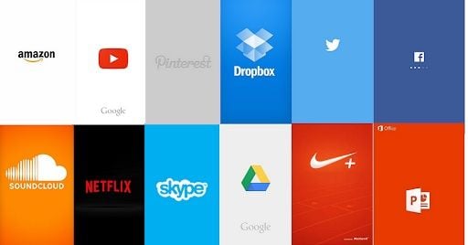
A splash screen is the first screen a user sees when they open a mobile app. It’s the first chance a company has to create a lasting, positive impact on the users. It appears while the app is loading. The splash screen, which is also called a launch screen, typically contains just a logo, name or slogan related to the product. It’s minimalistic in nature.
Splash Screen Explained
A splash screen is the first screen a user sees when they open a mobile app. It’s a minimalistic loading page that typically includes core brand elements, such as the company’s colors, logo and name.
“First impressions last.” While this sounds old school, the saying still applies to modern mobile apps. It’s your mobile app’s welcome screen that your users experience when opening the application. Your splash screen will play a crucial role in generating a user’s first impression of your application.
How to Design an Effective Splash Screen
Splash screens are straightforward. They’re used to enhance a brand and provide something fun for users to look at while waiting for the app to open. Here are some of the things to keep in mind while designing the splash screen for an app:
- Keep it free from unnecessary distraction.
- Carefully use animations.
- Don’t use multiple icons, logos or colors.

3 Splash Screen Examples
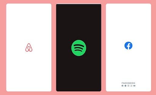
Below are three effective examples of splash screens. Starting from the left, the first two are from Airbnb and Spotify. These are minimalistic and just incorporate their logos. The third is from Facebook, which includes its logo, name and icons for Meta’s other social media sites at the bottom.

Why Are Splash Screens Important?
Splash screens can be a way to offer your users a little excitement and are an opportunity to strengthen your brand identity. An effective splash screen can create a valuable first impression on users. Whatever the reason you’re designing your splash screen for, keep it light and make sure it doesn’t make the loading time longer than it should.


