You may have seen the billboards: Towering depictions of Twitch creators — the larger-than-life personalities who make Twitch one of the world’s most popular websites.
If you weren’t already an insider, maybe you puzzled over the 20-foot-tall face of painter Bob Ross or internet celebrity LilyPichu, wondering to yourself, “What the hell is this about?”
This, of course, is the question Twitch wants you to ask. Brian Collins, speaking at the online Adobe MAX Creativity conference last week, said that, when Twitch hired his company to develop a global rebranding campaign, the core question was how to pique the curiosity of new users and invite more forms of creative expression onto the platform.
At the same time, the company didn’t want to alienate the established audience of gamers who made Twitch what it is today. So it framed its advertising strategy around a simple proposition: There’s a community, you’re part of it, and you can claim your place — on Twitch.
“We had to move into a new kind of conversation and create a home where all kinds of creators, including gamers, could belong, and then create a platform for new talent and new types of content for anyone to broadcast,” Collins said.
He’s the first to admit this was not an easy problem to solve. The same qualities that attracted gamers to Twitch — its beautiful messiness, its lack of design rules, its confounding user interface — weren’t exactly helping the platform appeal to the masses. Would the musicians, activists and sports fans who had catapulted Twitch from a cultish corner of the internet to widespread fandom need a stronger design language to stick around? And how would this language be represented in cornerstone brand elements: color, voice, emoticons, the wordmark and the logo?
Perhaps an even steeper mountain to climb was integrating these elements into the product redesign, a massive project overseen by Byron Phillipson, global executive creative director at Twitch who joined Collins in the Adobe presentation.
The interface was something else: It was a cacophonous, noisy, complex, complicated.”
Preserving the quirks that had become synonymous with the brand — emotes, inside jokes, a comic book aesthetic, and cultural icons like Mr. Rogers and Bob Ross — was a challenge in its own right. Add to that the goal of making Twitch, if not intuitive, then at least possible to navigate for newcomers, and you had just the sort of challenge career creatives love to talk about.
“Our mantra, first, was to do no harm,” Collins told the livestream audience. “You had the largest live streaming entertainment brand in the world, and the interface was something else: It was a cacophonous, noisy, complex, complicated. You had like 16,000 streaming things going on, with the emoji, the player screens, chat.”
In short, it was a lot.

Messiness Is Part of What Made Twitch Special
Twitch thrived on its weirdness and extravagance. The typical rebranding strategy adopted by mature firms or those undergoing rapid growth — essentially sanitizing the look and making it clean, uniform and tidy (hello, Apple) — wasn’t going to work.
To take Twitch into the future, they had to throw out the modernist mantra “less is more” and replace it with a new paradigm: “mess is more.” They also had to give new users some sense of firm footing so they wouldn’t “run off screaming,” as Phillipson put it in the livestream.
Somewhere between those poles was the solution, Collins said, a dynamic framework that could hold competing tensions in balance: that could amplify creativity, in some places, but be structured and disciplined in others. That could be static or in flux, responsible or expressive, elegant or glitchy, depending on where users were in their journey.
We didn’t want to lose the pride that comes from learning how to speak the Twitch vernacular, right? And earning your place in the squad.”
A diagram Collins shared representing current and new users on the vertical axis, and existing Twitch creators and viewers on the horizontal axis, revealed that the brand presence was not strong enough — particularly among new users, who didn’t understand Twitch’s point of view and found the interface overwhelming. Then again, if the brand presence became too dominant and drowned out the voices of creators, it could turn them away.
“We didn’t want to lose the pride that comes from learning how to speak the Twitch vernacular, right? And earning your place in the squad,” Collins said.
They reframed the problem; Twitch’s brand had to become a launching pad not so much for itself, but for creators to build their own brands, using the color palette, language and iconography of the design system to serve as an aid in their expression — not a hindrance.
The campaign’s tagline, “You’re already one of us,” and a frequently used companion, “Not everyone's going to get it,” captured the duality of a program comfortable embracing contradiction.
Building a Brand to Maximize Expression
Phillipson told the audience he was inspired by the maximalist approach Collins proposed, but also a bit scared by what it demanded: “It was like, ‘Holy shit, how do we bring this to the world and bring our audiences along for this journey in a way that they get it?’”
For the brand vision to succeed, he had to bring partners across marketing, PR, digital, product and advertising agencies around to a single vision. The team laid out four qualitative touchstones: to “organize the beautiful mess, max out expression, bring it to life and flex to the future.”
The best way to do this, Phillipson believed, was to begin by recalibrating a brand element sacred to Twitch: purple.
Turning up the dial on a color suddenly being embraced by companies like HBO and Slack required extensive color matching, but the result was appealing: a vibrant eight-color gradient reflective of the brand’s creative spirit. Symbolizing creativity, wisdom, mischievousness and mystery, purple is a rare color that, unlike violet, it is not represented in the optic spectrum, leaving it ripe for digital experimentation.
We wanted to make sure that, by no means, were we going to ever reduce our expression. We were going to just continue to crank it up over time.”
Twitch’s core color kit is rounded out by ice (light gray) and black. Collins and Phillipson initially butted heads on this. Having a core color bank runs counter to the notion of hyper-expressiveness, but the three-color set ultimately won out as a way to build brand equity and recognition. A palette of complementary colors selected after months of sampling gave creators a raft of options for experimentation.
“What was super interesting to me was the role that color played as a relational cue between our brand and our creators,” Phillipson said. “Really, at the end of the day, that was what it was all about for us. We were here to help them build their brands up by standing on top of our brand.”
Twitch’s wordmark also got a facelift. With letters comprising blocky, shaded forms inspired by classic video games, the new design can exist in three modes: a flat wordmark, an extruded form and a dynamic wordmark that seemingly leaps from the page, trailed by a rainbow-like afterglow.
The team chose Roobert to ground a persistent approach to typography. Inspired by the lettering of the Moog synthesizer, the sans serif typeface has a “retro-futuristic feel,” a sleek, linear quality similar to Helvetica. Glitch — Twitch’s brandmark resembling a set of quotation marks — already had sticking power. Some Twitch users sport tattoos of the logo. But diversifying its color options made it more versatile. Using Glitch as shorthand for the wordmark, in places where the two might appear redundant, also enhanced its power.
“We wanted to make sure that, by no means were we going to ever reduce our expression. We were going to just continue to crank it up over time. And make sure that every time somebody engaged with a piece of brand creative, or they came back to the platform when a new feature was launched, it would just be this constant build-up of expression.”

‘The Weirdness Gave It Energy’
While the rebranded visual assets helped amplify the brand’s presence, Twitch’s voice is what Phillipson said ultimately distinguishes it from other streaming sites. “I think we understand just the right balance of how to be quirky, with a little bit of light trolling, when necessary.”
Case in point, the tagline of this digital billboard message: “Right now, 34,108 people are riding shotgun with a shotgun surgeon.”
Or this subway advertisement for twitch.tv: “If you’re into battle royale internet superstars, or expressing your feelings through reaction faces ... you’re already one of us.”
Leaning into a playful, side-eye voice gave the messages cultural resonance without falling into the cloying “fellow kids” territory that had caused other brands to stumble, Phillipson explained.
I think we understand just the right balance of how to be quirky, with a little bit of light trolling, when necessary.”
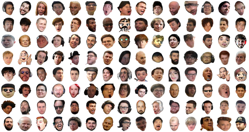
Emotes, another key element of Twitch-speak, also had to be weighed. A blend of animated characters, shapes and photo-realistic human emoticons, emotes are the visual lexicon of Twitch’s language. They’re a way to celebrate achievements, show affinity with other users or poke fun at oddball hijinks.
A tactical change in how they are introduced in brand messaging and user features has helped open the door for new audiences, according to Phillipson.
“When we’re speaking to people who are part of the community and who understand the shorthand and the lexicon, we use emotes in our communication as word replacement,” he said. “But to bring people into a place of understanding who weren’t familiar with emotes, we would simply use them as punctuation. And that little change really started sending cues and signals to the audience as to what the meaning of these emotes were.”
Because emotes were created by the community, the design team wanted to keep them raw-looking and idiosyncratic.
“This runs counter to so many designers’ desire for perfection,” Collins said. “Make it tight. Make it neat. No, the mess was the idea. The imperfection made it meaningful. The weirdness gave it energy.”

A Home for All Creatives
Elements of the brand campaign also expressed themselves in the product redesign. Apart from a host of product updates, the design approach informed changes to the About page, social assets and global offices. Large murals featuring Twitch creators speak from the brand’s point of view but elevate creators to celebrity status. One of LilyPichu’s billboards, for example, reads: “First on the mic, quick on the draw, and usually the last one standing.”
The message, like those of other creators, sit beside Twitch’s tagline: “You’re already one of us.”
For us, when we started, that was our ambition. Twitch should be a home for all kinds of creatives.”
The brand system has flexed to accommodate new audiences and verticals as well. Events like TwitchCon, described on Twitch’s website as an “IRL party starring the Twitch community and everything were into,” and Stream Aid 2020, a 12-hour music streaming event where musicians and celebrities gathered to raise money for the World Health Organization’s COVID-19 Solidarity Response Fund, have helped the platform stake new territory.
“We had some incredible musicians streaming in their bedrooms and in their living rooms,” Phillipson said. “Seeing how the brand system really lifted them up and authentically connected them with new audiences was really cool.”
“The fact that the platform has become a way for musicians to achieve success is exciting to see,” Collins said. “For us, when we started, that was our ambition. Twitch should be a home for all kinds of creatives.”