


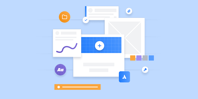
A design system is a collection of reusable components, patterns, guides and codes for building websites and apps within an organization. Not only does having a design system save time, but good and consistent design can make users happy.
What Is a Design System?
A design system is a set of standards — consisting of guidelines, tools and other elements — for designers and developers to follow. While organizations often establish design systems for their own design and development teams to reference, they may release them to the general public for anyone to use.
The main purpose of a design system is to ensure design and development teams maintain a consistent look, feel and quality across different websites and apps. Design systems also increase teams’ efficiency and make it easier to scale designs by simplifying workflows with reusable design elements.
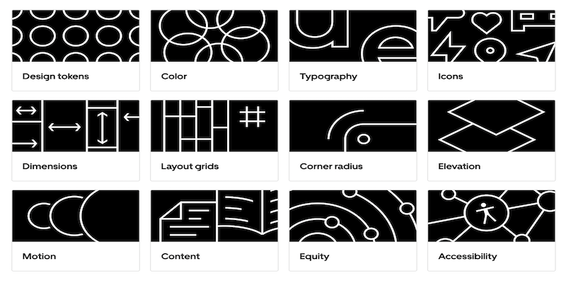
A typical design system includes the following:
- Design principles
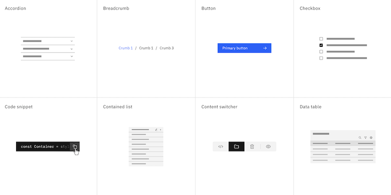
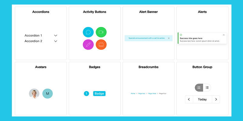
- Component libraries
- Pattern libraries
- Accessibility guidelines
- Content guidelines
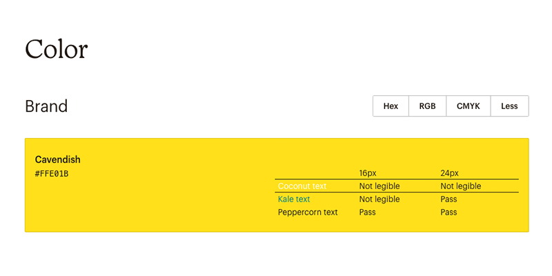
- Brand style guidelines
- Design tokens
- Icon libraries
Design System Examples
Many companies share their design systems publicly, making it easier to build websites and mobile apps with a variety of tools and resources. Here are some of the top design systems available to designers.
Atlassian Design System
Atlassian is aiming to offer a one-stop-shop for design teams with its capabilities to “design, develop, deliver.” Atlassian’s IT service management tool allows companies to centralize customer requests as they come in, and manage and track them with its customizable help centers and embeddable widgets, Atlassian states on its website. The Australian-based company’s Atlassian Design System offers component and pattern libraries, as well as content and advice on stylistic foundations.
Google Material Design System
Material Design enables designers to incorporate Google products into their designs. Google’s design system shows when to use various components and how to customize them. In addition to the usual offerings, Material Design also provides users icons and tutorials for developers and unifies UI and UX on different platforms, devices and input methods, according to the company website.
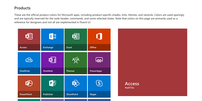
Microsoft Fluent Design System
Open-source, cross-platform Microsoft Fluent Design System offers up frameworks for designers and developers to create experiences that aim to be engaging and provide accessibility, internationalization and performance, Microsoft states on its website. Design teams can pick platforms ranging from iOS to Android.
Apple Human Interface
Apple Human Interface Guidelines (HIG)’s tools aim to help design delightful user experiences for any Apple platform, according to Apple’s website. Its expansive foundations include inclusion guidelines, which can help designers understand how others may respond to the content and experiences they create. Onboarding is one of HIG’s patterns and can be used to create brief, enjoyable experiences without the need to create a truckload of information for users to memorize.
IBM Carbon Design System
Big Blue’s open-source IBM Carbon Design System relies on its IBM Design Language as its foundation, according to IBM’s website. Fueled by an active community of contributors, the design system maintains design kits containing Carbon components. Figma and Sketch are the design kits offered and maintained by the latest version of Carbon.
Shopify Polaris
Anyone planning to offer goods on Shopify may want to look at its Polaris design system. It includes a component library, content on fundamental design elements and guidelines for ringing up a good merchant experience for end-users, according to Shopify.

Ant Design
The Ant Group created Ant Design, so designers could build content that produces natural interactions, keeps products consistent and predictable, fulfills concrete goals and takes into account product and user growth. With this in mind, designers can experiment with Ant Design’s various components, including color and layout guidelines, design patterns, design templates, global rules and other resources.

Adobe Spectrum
Adobe’s design system Spectrum aims to make its applications more cohesive by offering users access to its principles, resources and implementations, Adobe stated on its website. Resources include its Adobe XD plugins, UI kits, fonts and icons. Spectrum also includes open-source implementations with detailed usage guidelines.
Salesforce Lightning Design System
With its marketplace of cloud-based CRM apps, Salesforce said users can find a way to tie them together with a similar look and feel with its Lightning Design System. Its design system fundamentals cover component blueprints, tokens, design guidelines and tools. It also offers a way to design a system that can quickly scale as your business grows and includes Accessible Rich Internet Applications (ARIA) specifications and guidelines so you can create a site end-users with disabilities can also access.
Mailchimp Pattern Library
Mailchimp Pattern Library offers an expansive design system with a pattern library that not only includes color and typography but also data visualization and a grid system, according to Mailchimp. Buttons, lists and navigation capabilities are also among the components offered.
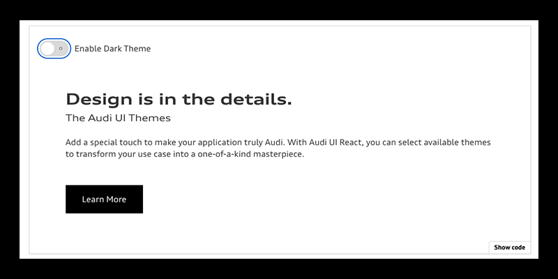
Audi Design System
Audi Design System also offers a soup-to-nuts design system, which ranges from “Getting Started” guides to core components intended for adoption within each product, the carmaker said. Audi’s design system aims to create a single source of truth for product teams and improve the user experience with its consistent components, design interactions and patterns.
Uber Base Design System
Uber’s design system Base allows teams to quickly and easily create web applications with its open-source toolkit of components and utilities that align with its Base Design System, Uber said. Base is designed to be reliable, accessible and highly customizable.
Wanda Design System
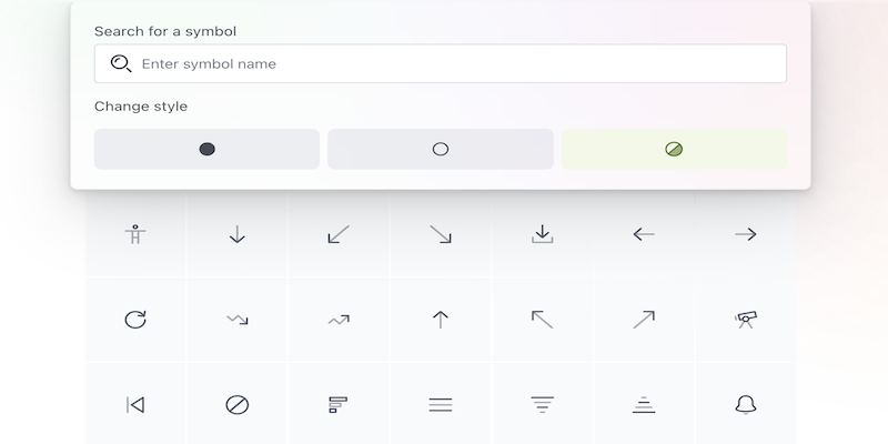
Provided by Wonderflow, the Wanda design system offers guidelines on topics like development and accessibility. Users can also access a slate of features like symbols, data visualizations, buttons and layout elements. If users are curious about what certain components look like in action, they can experiment in Wanda’s online playground space.
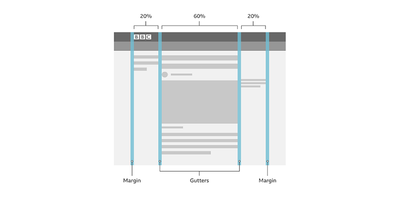
BBC Global Experience Language
Media Giant BBC shares its design system via its Global Experience Language. Its design system includes foundations — such as how to design with motion to establish a connection with a product — to design patterns, which include information about accordions that offer a vertical list of headers that users can interact with to reveal or hide the content within them. BBC’s Global Experience Language also shares how-to information like tailoring UX research to provide insights for effective website copy, the media giant said.
Cisco Momentum Design
Cisco wants to share its Momentum Design System with those upgrading their websites with Webex products. It offers ways to create a shared design language, serving as building blocks for all of Webex’s products with tokens, components, icons and personality. Under its tokens, for example, Cisco notes Webex’s typography uses type to establish a visual hierarchy through style, layout and color to support communication efforts.

GitLab Pajamas
Pajamas Design System is meant to make it as easy as possible for anyone to contribute to GitLab. The open-source design system contains brand and product design guidelines and UI components for all things Gitlab, such as its Figma UI kit which helps users create designs in Figma and then transfer them over to GitLab.
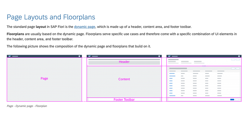
SAP Fiori Design Guidelines
Enterprise software giant SAP’s Fiori Design Guidelines aims to lend a hand to design teams looking to create business apps with a consumer-styled user experience, SAP said. Fiori’s guidelines and tools are designed to help teams easily build and customize their own apps to be consistent with SAP S/4HANA and other SAP solutions.
Zendesk Garden
The Zendesk Garden design system aims to create a cohesive user experience throughout the Zendesk product suite, according to Zendesk’s company website. Its components combine the best practices from content, design and engineering to pull together user interfaces quickly, Zendesk said.
Frequently Asked Questions
What is a design system?
A design system consists of reusable tools, coding languages, visual elements, design patterns and other resources. These components serve as guidelines that UX and UI designers can reference to maintain consistent design standards while building websites and apps.
What is the role of the design system?
In addition to facilitating consistent designs across websites and mobile apps, design systems take any guesswork out of the design process. This leads to faster workflows, allowing designers to work and scale designs more efficiently while still creating high-quality products.
Is Figma a design system?
Figma is actually a library of design tools and resources for UX and UI designers rather than a design system. This makes it just one element of a design system if teams choose to add Figma to their design arsenal.


