Let’s be honest. When we think of big decisions, we think of logic, right? Buying a new car, opening a new bank account, deciding where to go to college, these are all decisions for which we do a lot of research and try to make highly rational decisions. The key word there being try. At the root of most big decisions, however, is emotion, not logic.
Why is that important? It means that when we create the frameworks with which people make decisions, we actually need to design for how human brains and instinct actually work, not how we wished they worked. We need to make sure that when our emotions and instincts take over, the experiences through which we’re making big decisions keep us safe.
How Focusing on Feelings Improved Chime’s Bottom Line
Chime provides a service to our members called SpotMe, which is a way for them to overdraw on their accounts fee-free. When a member swipes their debit card and there isn’t enough money in their account to cover the transaction, Chime spots them the money for the transaction (up to a predetermined amount). That money is paid back to Chime the next time the member gets their paycheck. As part of the SpotMe experience, we ask members every so often to leave a tip for Chime to show their appreciation for the feature and to help us keep it free.
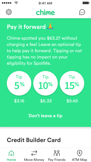
Our original tipping experience had a long message explaining why we were asking for a tip, accompanied by three large buttons with various tip amounts to choose from. There was a de-emphasized button to opt out of leaving a tip, and the whole experience felt quite obvious and straightforward, if not somewhat sterile.
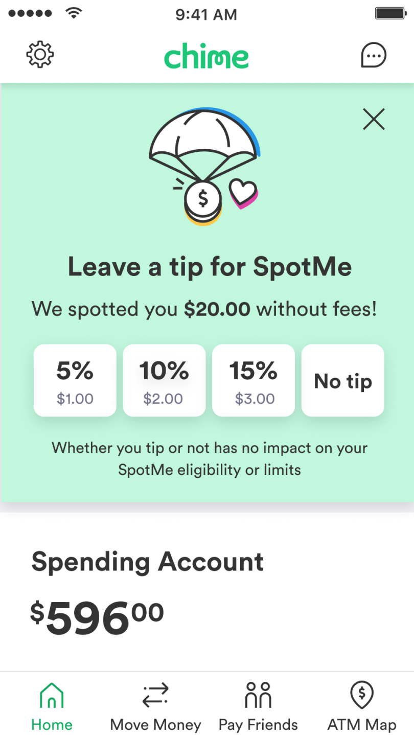
Here’s where emotion comes into play: In an experiment, we redesigned this experience in three ways. First, we made the initial request less utilitarian and more fun by removing copy and adding an illustration. Second, we made the option not to leave a tip more obvious. Third, we evolved the experience for when someone chose not to tip. Instead of the tip card just disappearing, the experience acknowledged their choice and told them “thanks anyway.” It was a small change and one that, on the surface, didn’t seem to be worth an additional investment. After all, the member had already chosen not to tip. Could this emotional design approach actually make a positive impact on our business numbers?
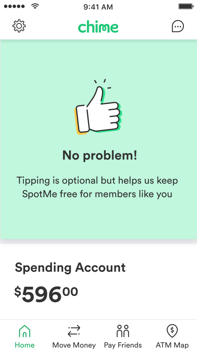
Spoiler alert: It did. We saw an increase in tipping revenue, and that was after making the “no tip” button more obvious. Not only did we see increased revenue from initial tips — we also saw increased revenue from the members who tipped the next time. The bit that we added to say “no problem,” that ounce of levity and compassion coming through — it changed how our members made decisions, and it did so in a way that provided validation to them and created a positive impact on the business.
In this experiment, our tipping revenue rose by an overall 11.3 percent, and we saw a 4.51 percent lift in the second tip rate from members who didn’t tip the first time.
With Great Design Power Comes Great Design Responsibility
Designing for emotion, done right, creates experiences that are good for the end user and good for business. Designing for emotion, done wrong, might be good for business but opens the user up to vulnerability. This is often seen in dark UX patterns.
What are dark UX patterns? These are tricks used in experiences that encourage or lead a user to do something they don’t want to. A great example? That pop-up you see every time you open a shopping site that tells you you’ll get 10% off your first purchase when you give them your email address. How often is the “cancel” or X so hidden that you feel like you have to give your email address to close the window? How often does that cancel option actually say something like “No, I prefer paying full price” (also known as confirmshaming)? Do you even realize that when you give your email address, you’re not just getting a coupon code in your email, you’re signing up for all of their marketing emails?


At its most innocent, a dark pattern might trick you into signing up for marketing emails, or doubling up your tip on a bill, but at its worst, dark patterns can trick users into taking out loans they didn’t want to take, buying insurance they didn’t want, or signing up for recurring subscriptions they can’t afford. For example, how many times have you seen a credit card advertising a 0% interest rate, only to learn the hard way (or hopefully, in the fine print), that the interest rate will shoot up after the first year?
Dark UX patterns are not always intentional and not always malicious. This is why our friends in regulatory risk are such great partners. At Chime, we team up closely with our legal and compliance teams throughout the design process. Together, we ensure that as we design experiences meant to be intuitive and helpful, we don’t unintentionally point our members towards experiences that they can’t comprehend, that put them at risk, or harm them. Especially in the world of finance, we want to ensure our experiences create positive emotions and don’t utilize shame or scare tactics to guide behavior.