Good design can change lives. Take the LifeStraw, a 10-inch plastic straw that cleans contaminated water to prevent diseases such as diphtheria, cholera, typhoid and diarrhea as you drink through it. This simple design, which cost only three dollars to produce when it went to market, won the international Index Project Award in the project’s inaugural year (2005). The LifeStraw’s designers didn’t challenge the standard of potable water or fight the privatization of water. Instead, they proposed a simple, inexpensive solution for a specific time and place. Anyone can use the LifeStraw in any place where there’s running or collected water. It’s a perfect example of well-executed user-centered design.
What Is User-Centered Design?
First you have to understand the people you’re trying to reach, and then you begin designing from their perspective. UCD is all about empathizing with the individuals you’re designing for. Then you’ve got to generate heaps of ideas and prototypes to test and share your creations with the people for whom you’re designing. You’ll inevitably fail and try again (this is where the iteration comes in) but with users at the center of your design process, you’ll eventually put your innovative solution out in the world. In other words, UCD is both how you’re thinking and what you are doing.
How to Design in User-Centric Way
Dr. Donald Norman, a cognitive science researcher, was the first to explain the importance of user-centered design. For Norman, design decisions should be based on two important components: discoverability and understanding.
First, users should be able to discover (i.e. perceive) why an object exists and what it can do for them. Then, users should be able to understand the object and how it works. To achieve these two goals, Norman lays out a concrete checklist of design steps that have evolved into what we now call user-centered design.
Don Norman’s Seven Stages of Action
- Form the goal.
- Form the intention.
- Specify an action.
- Execute the action.
- Perceive the state of the world.
- Interpret the state of the world.
- Evaluate the outcome.
User-centered design provides a common language for scientists, stakeholders and end users. For example, Jay Trimble, mission system manager with NASA’s Lunar Rover Mission, integrated user-centered design techniques and talks about the value of sharing a common language across all areas of the Rover project.
6 Phases of User-Centered Design
- Specify the use context and users’ needs.
- Specify business requirements.
- Build design solutions from rough concept to finished design.
- Evaluate designs with usability testing.
- Implementation — develop and deliver the product.
- Deployment — evaluate the final product as consumer needs change
Methods of User-Centered Design Research
User research is all about talking with people about their needs, challenges and goals. However there will be moments where you’ll need more context, history or data than a man-on-the-street style interview can offer.
To design in a user-centric way, identify those who’ll use your product, what they’ll use it for, and the conditions under which they’ll use it. Observe people’s lives, hear their needs so you can develop innovative new products rooted in those needs. This happens through various kinds of user-centric research like focus groups, questionnaires or interviews.
Responsive Principles of User-Centered Design
- Clear understanding of the users, tasks and environments
- Evaluation-driven design
- Considering the general consumer experience
- Involving the client throughout the design process
User-Centered Design in Action
Once designers determine optimal solutions for the target community, it’s time to bring in technical expertise and begin considering business goals (such as financial viability). Finding the balance between user needs and business limitations is a crucial component to designing solutions that are successful (for the user) and sustainable (for the business).
Microsoft is one of the best examples of benefitting user-centered design. For a long time, Microsoft was a technology company for technologists. The company’s user interfaces (UI) became so technical that everyday users were alienated and moved to companies with sleeker design (like Apple). So, Microsoft decided user-centered design should become part and parcel of their code. This software giant began working more closely with end users. Today, Microsoft has adopted an authentic design development process that focuses on user experiences. Users might not even be consciously aware of these changes. Try to remember how clunky your Microsoft software used to be back in the 1990s and early 2000s and compare that to what you’re using today. UCD can make a huge difference in UX!
Identify UX Problems Before They Emerge
In user-centered design, you have to be comfortable with the idea of failure and celebrating the learning it brings. You try something out but maybe you push too far; your half-baked idea didn’t quite pan out. When employing UCD methods, what you learn from those failures is just as valuable as your eventual success. That’s what iteration is for!
That said, design and product implementation is where failure gets expensive. This is where the real value of user-centered design comes into play: the multiple iterations necessitated by UCD helps you avoid expensive implementation through prototyping and testing. UCD helps identify problems before they emerge.
What Does UCD Look Like?
Here are some great examples of companies who’ve embraced UCD in their UX research and UI design.
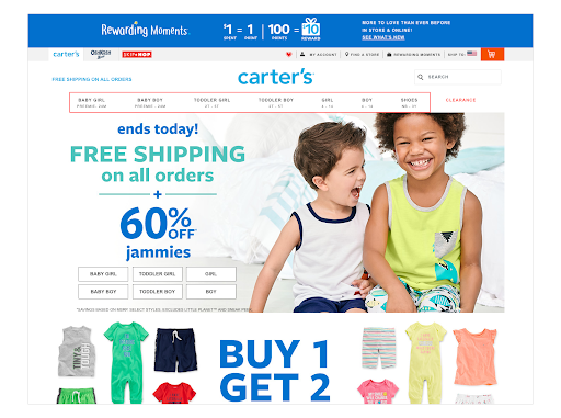
Carters.com, a children’s clothing company, is a great example of a website benefitting from UCD. The site’s navigation tools help the user promptly reach the desired section by specifying a child’s age and gender alongside the clothing style (e.g. Baby Girl → Bodysuits → Newborn) while defaulting to in-season clothes. This navigation helps parents quickly find in-stock clothing they know will fit their kids.
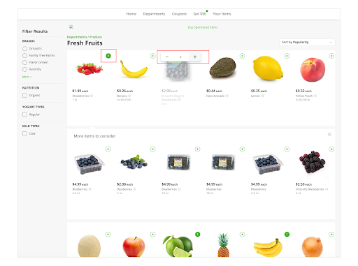
Instacart.com is a perfect showcase of adapting a website for people who are blind or have low vision because there’s a high-contrast version of the website. This site is a great example of how designers worked with users to present these minor improvements that have a big impact on UX.
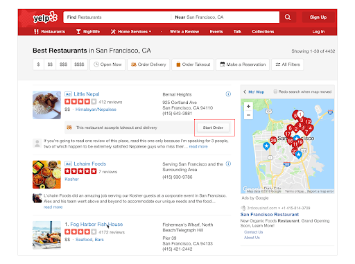
In addition to convenient navigation, Yelp online reservations visually display the number of free tables at the restaurant of your choice. If you want to order takeout, you can use the conveniently located “Start Order” button, which allows you to complete an online order in a couple of clicks and reduces the number of steps to get your food.
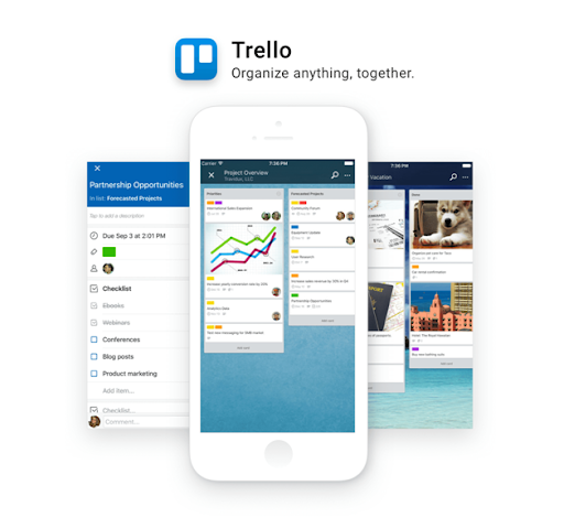
Trello is a great example of UX design. From the start screen, everything is intuitive and the interface is easy to navigate for novice users.
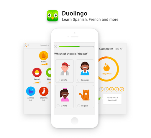
Anyone who’s used Duolingo understands the simplicity of the app. When you finish one task or game, you’re able to move on to the more advanced categories. Duolingo incorporates the fun of a mobile gaming app while teaching users new languages.
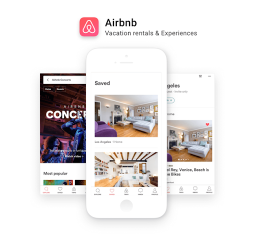
With Airbnb’s somewhat-recent addition of the “book a room instantly” feature, it became that much more important for the company to have a clean-cut mobile presence. Just like their innovative website, Airbnb’s mobile app is both visually interesting and easy to navigate.


