

Data visualization is important for many analytical tasks including data summarization, exploratory data analysis and model output analysis. One of the easiest ways to communicate your findings with other people is through a good visualization. Fortunately, Python features many libraries that provide useful tools for gaining insights from data.
Data Visualization With Python
Data visualization is a key part of communicating your research to others. Whether via histograms, scatter plots, bar charts or pie charts, a good visualization helps unlock insights from your data. Fortunately, Python makes creating visualizations easy with Matplotlib and Seaborn.
The most well-known of these data visualization libraries in Python, Matplotlib, enables users to generate visualizations like histograms, scatter plots, bar charts, pie charts and much more.
Seaborn is another useful visualization library that is built on top of Matplotlib. It provides data visualizations that are typically more aesthetic and statistically sophisticated. Having a solid understanding of how to use both of these libraries is essential for any data scientist or data analyst as they both provide easy methods for visualizing data for insight.
Matplotlib vs. Seaborn
- Matplotlib is a library in Python that enables users to generate visualizations like histograms, scatter plots, bar charts, pie charts and much more.
- Seaborn is a visualization library that is built on top of Matplotlib. It provides data visualizations that are typically more aesthetic and statistically sophisticated.
Generating Histograms in Python With Matplotlib
Matplotlib provides many out-of-the-box tools for quick and easy data visualization. For example, when analyzing a new data set, researchers are often interested in the distribution of values for a set of columns. One way to do so is through a histogram.
Histograms are approximations to distributions generated through selecting values based on a set range and putting each set of values in a bin or bucket. Visualizing the distribution as a histogram is straightforward using Matplotlib.
For our purposes, we will be working with the FIFA19 data set, which you can find here.
To start, we need to import the Pandas library, which is a Python library used for data tasks such as statistical analysis and data wrangling:
import pandas as pd Next, we need to import the pyplot module from the Matplotlib library. It is custom to import it as plt:
import matplotlib.pyplot as plt Now, let’s read our data into a Pandas dataframe. We will relax the limit on display columns and rows using the set_option() method in Pandas:
df = pd.read_csv("fifa19.csv")

pd.set_option('display.max_columns', None)

pd.set_option('display.max_rows', None)
Let’s display the first five rows of data using the head() method:
print(df.head())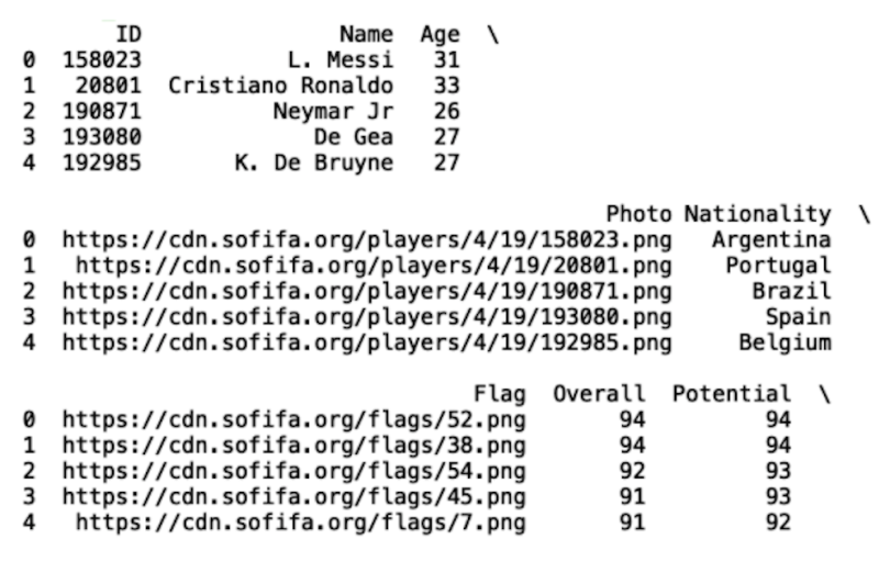
We can generate a histogram for any of the numerical columns by calling the hist() method on the plt object and passing in the selected column in the data frame. Let’s do this for the Overall column, which corresponds to overall player rating:
plt.hist(df['Overall'])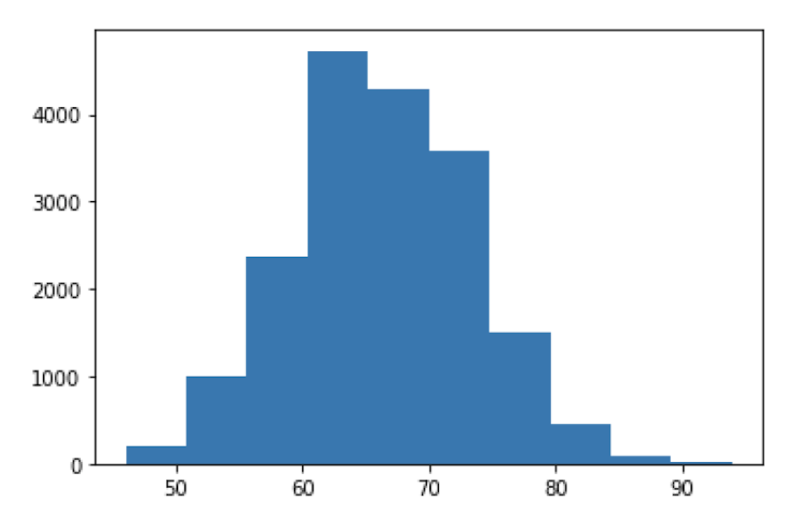
We can also label the x-axis, y-axis and title of the plot using the xlabel(), ylabel() and title() methods, respectively:
plt.xlabel('Overall')

plt.ylabel('Frequency')

plt.title('Histogram of Overall Rating')

plt.show()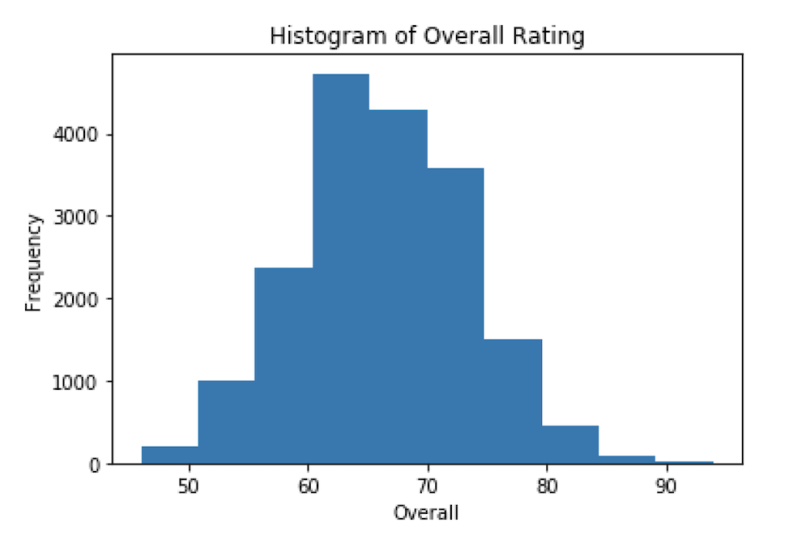
This visualization is great way of understanding how the values in your data are distributed and easily seeing which values occur most and least often.
Generating Scatter Plots in Python With Matplotlib
Scatter plots are a useful data visualization tool that helps with identifying variable dependence. For example, if we are interested in seeing if there is a positive relationship between wage and overall player rating, (i.e., if a player’s wage increases, does his rating also go up?) we can employ scatter plot visualization for insight.
Before we generate our scatter plot of wage versus overall rating, let’s convert the wage column from a string to a floating point numerical column. For this, we will create a new column called wage_euro:
df['wage_euro'] = df['Wage'].str.strip('€')

df['wage_euro'] = df['wage_euro'].str.strip('K')

df['wage_euro'] = df['wage_euro'].astype(float)*1000.0
Now, let’s display our new column wage_euro and the overall column:
print(df[['Overall', 'wage_euro']].head())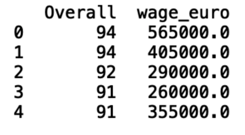
To generate a scatter plot in Matplotlib, we simply use the scatter() method on the plt object. Let’s also label the axes and give our plot a title:
plt.scatter(df['Overall'], df['wage_euro'])

plt.title('Overall vs. Wage')

plt.ylabel('Wage')

plt.xlabel('Overall')

plt.show()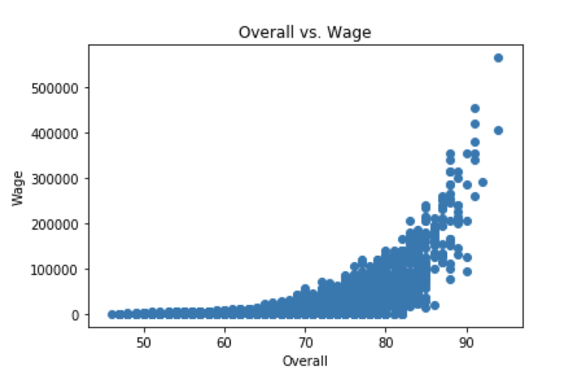
Generating Bar Charts in Python With Matplotlib
Bar charts are another useful visualization tool for analyzing categories in data. For example, if we want to see the most common nationalities found in our FIFA19 data set, we can employ bar charts. To visualize categorical columns, we first should count the values. We can use the counter method from the collections modules to generate a dictionary of count values for each category in a categorical column. Let’s do this for the nationality column:
from collections import Counter

print(Counter(df[‘Nationality’]))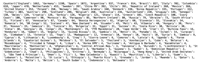
We can filter this dictionary using the most_common method. Let’s look at the 10 most common nationality values (note: you can also use the least_common method to analyze infrequent nationality values):
print(dict(Counter(df[‘Nationality’]).most_common(10)))
Finally, to generate the bar plot of the 10 most common nationality values, we simple call the bar method on the plt object and pass in the keys and values of our dictionary:
nationality_dict = dict(Counter(df['Nationality']).most_common(10))

plt.bar(nationality_dict.keys(), nationality_dict.values())

plt.xlabel('Nationality')

plt.ylabel('Frequency')

plt.title('Bar Plot of Ten Most Common Nationalities')

plt.xticks(rotation=90)

plt.show()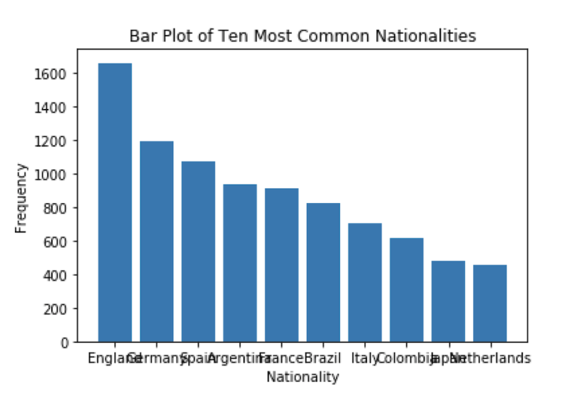
As you can see, the values on the x-axis are overlapping, which makes them hard to see. We can use the “xticks()” method to rotate the values:
plt.xticks(rotation=90)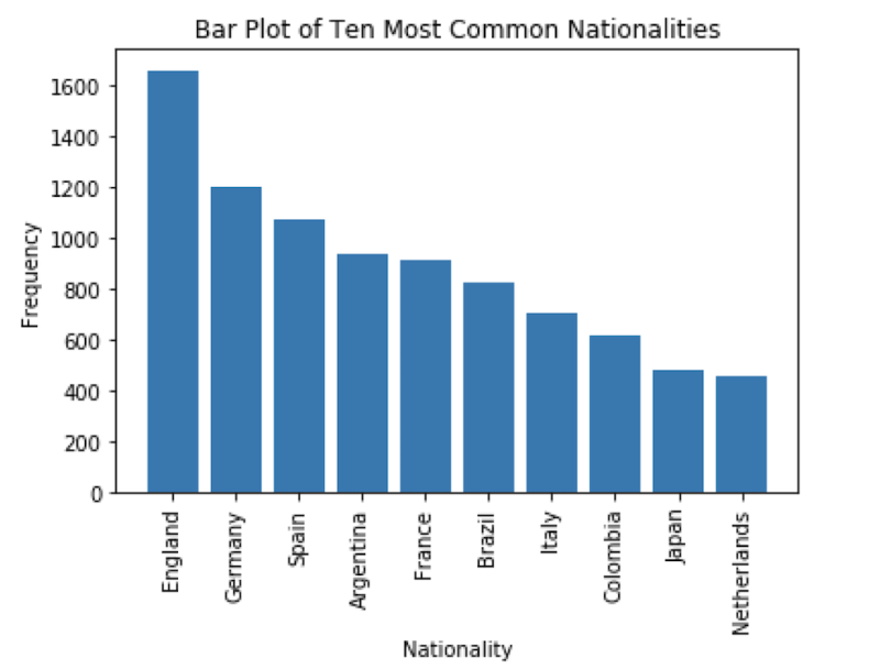
Generating Pie Charts in Python With Matplotlib
Pie charts are a useful way to visualize proportions in your data. For example, in this data set, we can use a pie chart to visualize the proportion of players from England, Germany and Spain.
To do this, let’s create new columns that contain England, Spain, Germany and one column labeled “other” for all other nationalities:
df.loc[df.Nationality =='England',  'Nationality2'] = 'England'

df.loc[df.Nationality =='Spain',  'Nationality2'] = 'Spain'

df.loc[df.Nationality =='Germany',  'Nationality2'] = 'Germany'

df.loc[~df.Nationality.isin(['England', 'German', 'Spain']),  'Nationality2'] = 'Other'

Next, let’s create a dictionary that contains the proportion values for each of these:

prop = dict(Counter(df['Nationality2']))

for key, values in prop.items():

    prop[key] = (values)/len(df)*100

print(prop)
We can create a pie chart using our dictionary and the pie method in Matplotlib:
fig1, ax1 = plt.subplots()

ax1.pie(prop.values(), labels=prop.keys(), autopct='%1.1f%%',

        shadow=True, startangle=90)

ax1.axis('equal')  # Equal aspect ratio ensures that pie is drawn as a circle.

plt.show()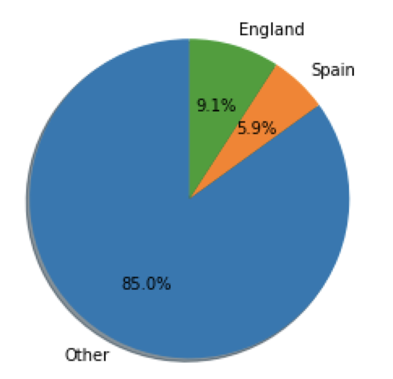
As we can see, all these methods offer us multiple, powerful ways to visualize the proportions of categories in our data.
Python Data Visualization With Seaborn
Seaborn is a library built on top of Matplotlib that enables more sophisticated visualization and aesthetic plot formatting. Once you’ve mastered Matplotlib, you may want to move up to Seaborn for more complex visualizations.
For example, simply using the Seaborn set() method can dramatically improve the appearance of your Matplotlib plots. Let’s take a look.
First, import Seaborn as sns and reformat all of the figures we generated. At the top of your script, write the following code and rerun:
import seaborn as sns

sns.set()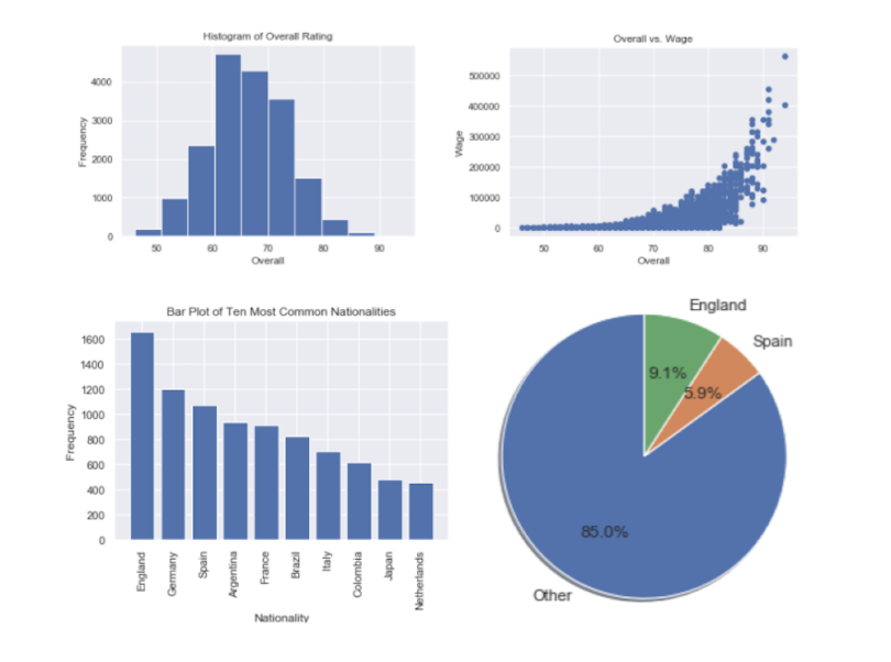
Generating Histograms in Python With Seaborn
We can also generate all of the same visualizations we did in Matplotlib using Seaborn.
To regenerate our histogram of the overall column, we use the distplot method on the Seaborn object:
sns.distplot(df['Overall'])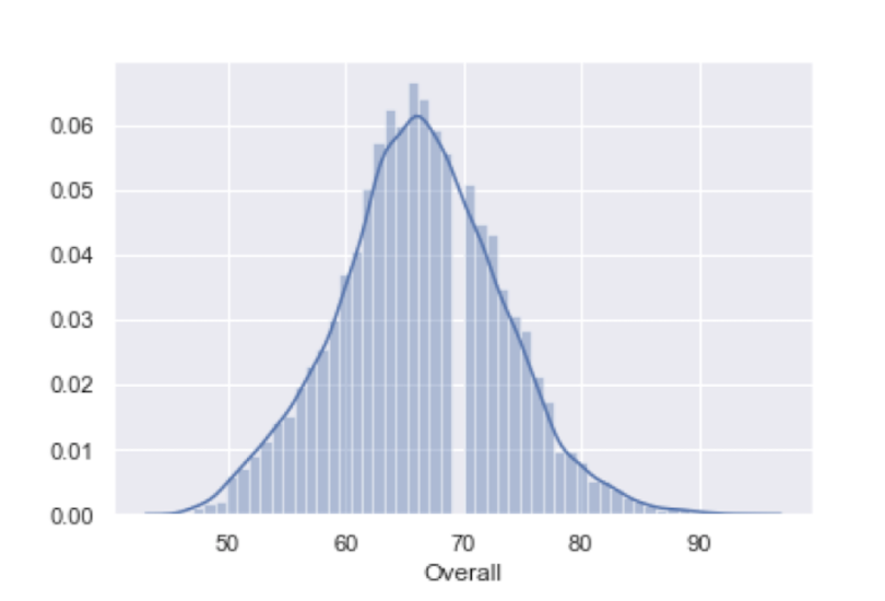
And we can reuse the plt object for additional axis formatting and title setting:
plt.xlabel('Overall')

plt.ylabel('Frequency')

plt.title('Histogram of Overall Rating')

plt.show()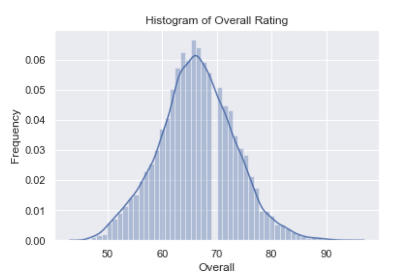
As we can see, this plot looks much more visually appealing than the Matplotlib plot.
Generating Scatter Plots in Python With Seaborn
Seaborn also makes generating scatter plots straightforward. Let’s recreate the scatter plot from earlier:
sns.scatterplot(df['Overall'], df['wage_euro'])

plt.title('Overall vs. Wage')

plt.ylabel('Wage')

plt.xlabel('Overall')

plt.show()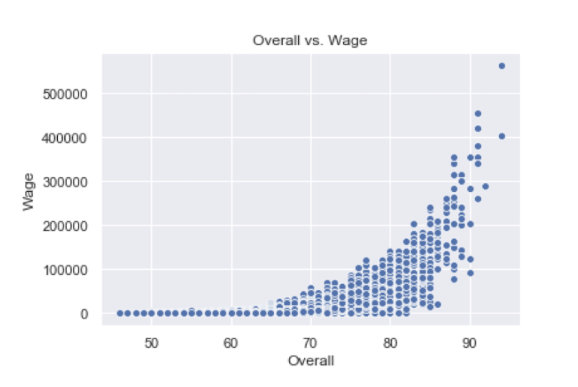
Generating Heatmaps in Python With Seaborn
Seaborn is also known for making correlation heatmaps, which can be used to identify variable dependence. To generate one, first we need to calculate the correlation between a set of numerical columns. Let’s do this for age, overall, wage_euro and skill moves:
corr = df[['Overall', 'Age', 'wage_euro', 'Skill Moves']].corr()

sns.heatmap(corr, annot=True)

plt.title('Heatmap of Overall, Age, wage_euro, and Skill Moves')

plt.show()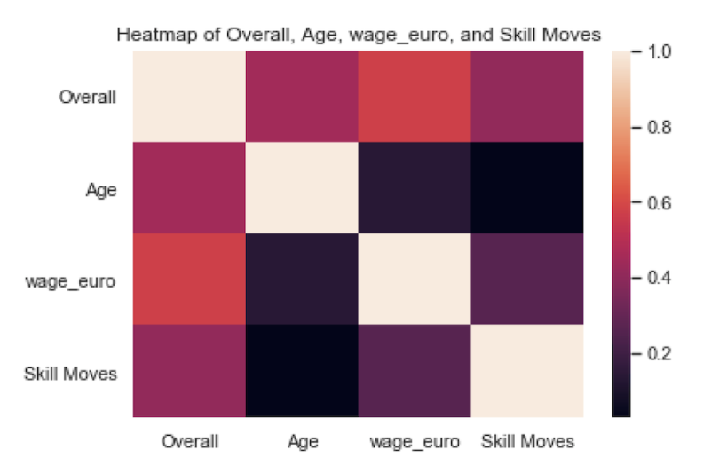
We can also set annot for annotate to true to see the correlation values:
sns.heatmap(corr, annot=True)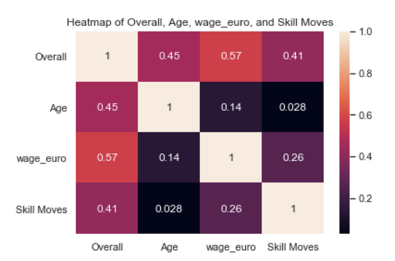
Generating Pairs Plots in Python With Seaborn
The last Seaborn tool I’ll discuss is the pairplot method. This allows you to generate a matrix of distributions and scatter plots for a set of numerical features. Let’s do this for age, overall and potential:
data = df[['Overall', 'Age', 'Potential',]]

sns.pairplot(data)

plt.show()
As you can see, this is a quick and easy way to visualize both the distribution in numerical values and relationships between variables through scatter plots.
Start Visualizing in Python Now
Overall, both Seaborn and Matplotlib are valuable tools for any data scientist. Matplotlib makes labeling, titling and formatting graphs simple, which is important for effective data communication. Further, it provides much of the basic tooling for visualizing data including histograms, scatter plots, pie charts and bar charts.
Seaborn is an important library to know because of its beautiful visuals and extensive statistical tooling. As you can see above, the plots generated in Seaborn, even if they communicate the same information, are much prettier than those generated in Matplotlib. Further, the tools provided by Seaborn allow for much more sophisticated analysis and visuals. Although I only discussed how to use Seaborn to generate heatmaps and pairwise plots, it can also be used to generate more complicated visuals like density maps for variables, line plots with confidence intervals, cluster maps and much more.
Matplotlib and Seaborn are two of the most widely used visualization libraries in Python. They both allow you to quickly perform data visualization for gaining statistical insights and telling a story with data. While there is significant overlap in the use cases for each of these libraries, having knowledge of both libraries can allow a data scientist to generate beautiful visuals that can tell an impactful story about the data being analyzed.