

GitHub’s contribution graph shows your repository contributions over the past year. A full contribution graph is not only pleasing to the eye, but also points towards your hard work, too (unless you’ve hacked it, of course). The graph, though pretty, also displays considerable amounts of information regarding your performance. However, if you look closely, it’s just a heat map displaying time series data. Therefore, as a weekend activity, I tried to replicate the graph using my own basic time series data; here’s how you can do it, too.
What’s a GitHub Contribution Plot?
Data Set and Some Preprocessing
The data set I’m using comes from the Tabular Playground Series (TPS) competitions on Kaggle. The TPS competitions are month-long contests launched on the first of every month. I’ll be using the data set from the TPS July 2021 competition.
The data set is time series-based data where the task is to predict the values of air pollution measurements over time, based on basic weather information (temperature and humidity) and the input values of five sensors.
Let’s import the basic libraries and parse the data set in Pandas.
import pandas as pd
import numpy as np
import datetime as dt
from datetime import datetime
data = pd.read_csv(‘train.csv’, parse_dates=[‘date_time’])
data.head()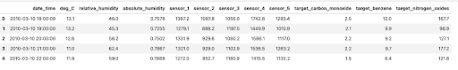
This is a decent enough data set for our purposes. Let’s get to work.
Creating a Basic Heat Map Using Seaborn
Seaborn is a statistical data visualization library in Python. It’s based on Matplotlib but has some great default themes and plotting options of its own.
What’s a Heat Map?
Let’s see how we can achieve this with code.
Before we do that, though, we’ll first need to convert our data into the desired format.
#Importing the seaborn library along with other dependencies
import seaborn as sns
import matplotlib.pyplot as plt
import datetime as dt
from datetime import datetime
# Creating new features from the data
data['year'] = data.date_time.dt.year
data['month'] = data.date_time.dt.month
data['Weekday'] = data.date_time.dt.day_name()
Subsetting data to include only the year 2010 and then discarding all columns except the month, weekday and deg_C. We'll then pivot the data set to get a matrix-like structure.
data_2010 = data[data['year'] == 2010]
data_2010 = data_2010[['month','Weekday','deg_C']]
pivoted_data = pd.pivot_table(train_2010, values='deg_C', index=['Weekday'] , columns=['month'], aggfunc=np.mean)
Since our data set is already available in the form of a matrix, plotting a heat map with Seaborn is a piece of cake now.
plt.figure(figsize = (16,6))
sns.heatmap(pivoted_data, linewidths=5, cmap='YlGn',linecolor='white', square=True)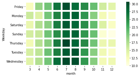
The heat map above displays the average temperature (Celcius) in 2010. We can clearly see that July was the hottest month of that year. To emulate GitHub’s contribution plot, we’ve used these parameters:
pivoted_data: The data set we usedlinewidths: The width of the lines that divide each cellline color: The color of the lines dividing the cellsquare: To ensure each cell is square-shaped
This was a good attempt, but there’s still room for improvement. We aren’t yet near GitHub’s contribution plot. Let’s give it another try with a different library.
Creating Calendar Heat Maps Using Calmap
Instead of tinkering with Seaborn, there’s a dedicated library available in Python called Calmap. It creates beautiful calendar heat maps from time series data on the lines of GitHub’s contribution plot — all in a single line of code.
#Installing and importing the calmap library
pip install calmap
#import the library
import calmap
We’ll use the same data set that we used above and use the yearplot() method for the plot.
#Setting the date_time column as the index
data = data.set_index('date_time')
#plotting the calender heatmap for the year 2010
plt.figure(figsize=(20,10))
calmap.yearplot(data['deg_C'], cmap='YlGn', fillcolor='lightgrey',daylabels='MTWTFSS',dayticks=[0, 2, 4, 6],
               linewidth=2)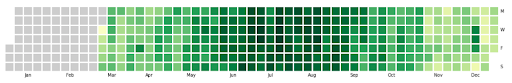
Above, we have customized the color, linewidth and fillcolor (i.e., the color we use for days without data). You can set these values as per your requirements. You can find more information in the documentation. It’s also possible to plot all years as subplots into one figure using the calendarplot() method.
fig_kws=dict(figsize=(20, 10)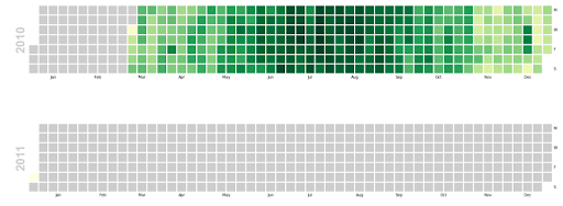
As you can see, there isn’t much data for 2011 so you can the major differences between 2010 and 2011 are pretty clear!
Heat maps are useful visualization tools that can help convey a pattern by providing some depth perspective using colors. These maps can help you visualize the concentration of values between two dimensions of a matrix that will be more obvious to the human eye than mere numbers. Use this tutorial next time you need to jazz up your heat maps (and have fun while you’re at it).


