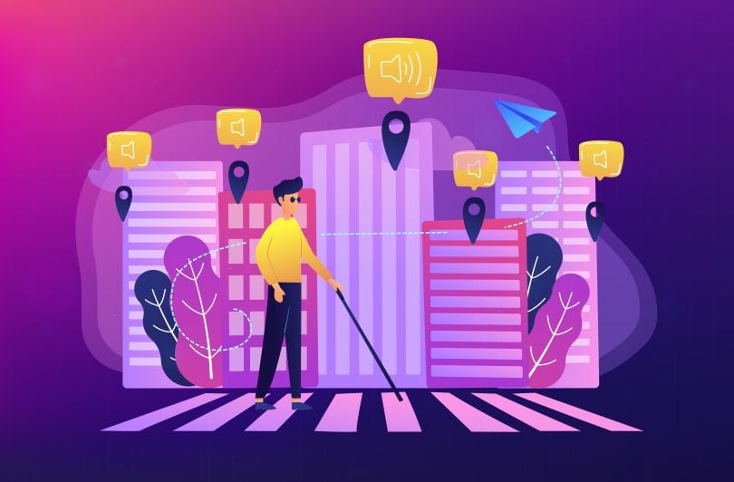
At age 68, Kevin Mar-Molinero’s uncle, whose sight is severely impaired, accessed the internet independently for the first time. Voice recognition software made it possible.
“It sounds like such a small thing, but it’s huge,” Mar-Molinero said. “Public domain internet has been around for 20-odd years. Only, recently, he didn’t have to walk up to somebody and ask them to turn their computer on and say what he wanted to listen to. He’s been afforded his own independence, his own freedom.”
Mar-Molinero is the director of experience technology at the London-based digital transformation agency Kin & Carta, which hosted an online summit, “FWD 2020: The Age of Resilience” in early June.
Speaking to me following a session titled “Designing With Empathy: Why Would You Ignore 20 Percent of Your Audience?” he told me that his uncle’s experience, along with that of his mother — who relies on the zoom feature on her iPad and inverted color contrast displays to read and compose digital text — has given him a rare window into the importance of designing with inclusion in mind.
“He’s been afforded his own independence, his own freedom.”
“I used to go around the house and put bits of tape over the switches of the buttons of my uncle’s radios, so he could differentiate which was on and which was off,” Mar-Molinero said. “We also set up pump jugs, so he could pour himself a squash, or cordial, rather than turning the tap to fill a glass, which couldn’t be measured.”
This was Mar-Molinero’s first foray into user experience design. It speaks to what Whitney Hess, a former user experience designer who is now an executive coach in New York City, describes in an interview for Eye on Design magazine as the natural empathic tendencies of many user experience designers. They are drawn to the role because understanding what users want, at its core, requires sensitivity to their feelings.

Empathy Is Not Just About Doing the Right Thing. It’s a $1.2 Trillion Market.
But not everyone is an empath, and while “doing the right thing” might be reason enough for some to take inclusive design seriously, there’s also a convincing business case to be made.
Up to 20 percent of people have some form of disability, Mar-Molinero said. (In the United States that number is one in four, according to a Centers of Disease Control and Prevention report.) Together, they represent an enormous market.
“The Purple Pound [a United Kingdom-based disability advocacy organization report] puts the spending power of those with disabilities at $249 billion,” he said, adding that, in the U.S., the figure is $650 billion and globally it’s $1.2 trillion.
“If you solve a problem for someone who has one arm, you’re also solving for someone with a broken arm, as well as someone who is looking at a phone while carrying a cup of coffee or a baby or a handbag.”
Charlie Woodhead, an accessibility and inclusion manager for the London North Eastern Railway, who joined Mar-Molinero in the talk, said companies that fail to adopt inclusive practices and policies, or view them superficially as a matter of legal compliance, are making a mistake.
“If you decide not to make a change, you’re not just cutting off people with disabilities, you’re cutting off anyone who knows them and doing massive reputational damage,” he said.
Committing to inclusive design practice, on the other hand, can have knock-on benefits: “Not only will you gain customers with disabilities because they will choose you over competitors,” Woodhead said, “but being a responsible business might be enough for people to choose you over competitors regardless of product point.”
Another possibility is that users without disabilities might prefer the accessible version of a product to the technology it replaces. As Mar-Molinero points out, voice-to-speech software, autocorrect, electric toothbrushes and the orientation of shampoo bottle lids, all started as accessibility projects for select groups of users that quickly proved their value to a broader constituency.
“If you solve a problem for someone who has one arm, you’re also solving for someone with a broken arm, as well as someone who is looking at a phone while carrying a cup of coffee or a baby or a handbag,” he said.

Disabilities Are Often Situational
The field of inclusive software design is still young, but it has roots in architecture’s universal design movement and the Americans With Disabilities Act of 1990. One of the key tenets, Mar-Molinero told me, is that disabilities are situational, and that the feeling of exclusion those with impairments can experience acutely affects all users to varying degrees. If you’ve ever followed a bad link, hunted at length for a way to cancel a subscription, or puzzled over an inexplicable error message, you’ve felt a form of it.
Much of the methodology for inclusive software design is derived from early advocates, he said, like Kat Holmes, senior vice president of product design and UX at Salesforce, who laid the groundwork in her book Mismatch: How Inclusion Shapes Design. Though few product teams incorporate these principles as well as Mar-Molinero believes they could — embedding web and mobile accessibility at all stages of the product life cycle, from research and usability testing to product requirements and acceptance criteria — recent examples suggest the industry is moving in the right direction.
Uber, for example, has done well with its app design. In an episode of The Design Better Podcast called “Listening Is the Best Hiring Skill,” tech ethicist and host Nancy Doyoun discusses her work at the company revamping the ride-hailing platform’s interface before it was introduced globally. Prior to the launch, Uber developed a system to allow cash payment, as credit cards are not as widely accessible in other parts of the world as they are in the U.S.
Uber also created features for drivers with hearing impairments, like flashing trip request notifications and messages notifying riders when a driver is deaf or hard of hearing. Eli Woolery, director of design education for InVision, paraphrasing Doyoun in a company blog post, writes that these features have been subsequently adopted by immigrant drivers as a way to remove language barriers and ensure they do not get unfairly evaluated in rider scores.
“Transsion Holdings, which has overtaken Samsung as the leading mobile provider in Africa, optimized its camera’s exposure and color settings for darker skin tones.”
Inclusive design can take other forms too. The Chinese mobile device company Transsion Holdings, which has overtaken Samsung as the leading mobile provider in Africa, optimized its camera’s exposure and color settings for darker skin tones, reports Andrew Deck in Rest of World. In countries like Kenya, Ghana and Ethiopia, where “an entry-level mobile phone on average costs 69 percent of a person’s monthly income,” Transsion has reportedly kept costs affordable by forgoing “palm-sized touch screens, multiple-lens cameras, and advanced computing power,” for cheaper phones that still allow users to text, access the internet and use apps like Facebook.
These phones have operating systems in Amharic, Swahili and Hausa scripts — part of a hyper-localized business strategy described as “glocalization” that, according to Deck, has captured new customers and improved accessibility across the continent.

Addressing Discrimination on Airbnb’s Platform
But business goals and inclusivity do not always mesh so easily. Often, the desire to make products more inclusive butts heads with the uncomfortable truth that the world is full of bad actors, some of whom happen to be customers, or partners, in the gig economy.
Benjamin Earl Evans, Airbnb’s inclusive design lead, writes on Medium that, as a guest of the platform, he once had a door closed in his face by a racist host when she recognized he was Black. “Since that night, I make nearly every Airbnb reservation using my girlfriend’s account,” he writes.
The experience formed the basis for what he describes as an inclusive design exercise to “reduce bias and discrimination” by retooling the interface to give hosts “a deeper sense of who someone is, and show them that there is more to someone than the color of their skin.”
The full UX workflow is incredibly complex, but the abridged version goes something like this: Evans contacted guests of color and convinced them to connect him with hosts with whom they recently stayed. He then applied the Implicit Association Test, a research-supported evaluation of hidden biases, to identify discriminatory hosts and create user personas for them. From there, he created a reservation task flow to determine “racism hotspots” in the booking process where hosts often discriminate — typically when they see a guest’s name or photo.
“Early indicators show that the more a host knows about a guest, the more commonalities they are likely to find.”
To begin to dismantle these biases, he developed mock-ups of guest profiles designed to discourage the kinds of “snap judgments” that might be preferred on, say, an Amazon landing page where the goal is for users to buy things. The profile pages presented a more rounded view of the guest: emphasizing trip photos, verifications, user reviews and a short personalized bio, rather than a headshot and a name.
Evans also added an extra step to the rental listing flow, so that prior to publishing a listing would-be hosts would see this inclusion reminder: “By listing your property, you agree you won’t discriminate against people, due to their race, gender, sex or age. We’re creating a more inclusive space for everyone.”
At the core of the project is the assumption that empathy can reduce discrimination, a view supported by a study published in the Journal of Personality and Social Psychology that suggests that actively imagining others’ psychological experiences can reduce reflexive expressions of racial bias. The mere exposure effect, the theory that people grow to prefer what feels familiar — ranging from Chinese characters and paintings to geometric figures and people — was also foundational for the project.
So far, the results have been positive.
“Further testing is needed,” Evans writes, “but early indicators show that, the more a host knows about a guest, the more commonalities they are likely to find. Shared values and experiences could create more empathy on Airbnb, leading to decreased discrimination.”

Inclusive Design Remains a Box-Checking Exercise for Many
For too many companies, however, inclusive design remains an exercise in checking boxes, Woodhead said. As a result, it often falls on compliance or quality assurance teams to identify and fix accessibility gaps at late stages of the product lifecycle when deadlines are tight and patience is wearing thin.
“This was my experience coming through this field, as well,” Mar-Molinero said. “You kind of followed the guidelines, and you were trying, with the right reasons and the right rationale, to make things fit the guidelines, but you could pass all the checklists, you could have a perfect score in Google Lighthouse [an open source web development tool that automates accessibility audits] and your application or your site still wouldn’t necessarily be usable by people who have impairments or use assistive technology.”
“You could pass all the checklists, you could have a perfect score in Google Lighthouse and your application or your site still wouldn’t necessarily be usable by people who have impairments or use assistive technology.”
And while many companies are beginning to take the issue seriously, others are falling short. In October, the U.S. Supreme Court denied a petition from Domino’s to hear a case over whether its website is required to be accessible for the disabled under Title III of the ADA after a lower court decided against the company. The verdict was considered a victory for disability rights advocates.
Presently, according to CIO Dive, there is no U.S. federal law requiring accessible websites, and the Web Content Accessibility Guidelines developed by the World Wide Web Consortium, which are self-imposed and not legally binding, serve as the primary accountability measure. In 2018, more than 2,200 lawsuits were filed over website accessibility — up 181 percent from 2017, according to a Seyfarth Shaw report.

Don’t Mistake Empathy for Sympathy
An even deeper problem, perhaps, is that empathy, under the guise of design thinking, has been misapplied as a convenient prop for commercial gain. Jesse Weaver, director of experiential design at CMCI Studio at the University of Colorado, writing for Medium, notes that empathy has become a buzzword that furthers the notion “that any person can design for anyone else, regardless of how different their life circumstances might be.”
But whether or not this critique is justified — Woodhead argues that empathy is, in many ways, about bridging the gap between imagined and lived experience — many companies are adopting empathy as a catch-all expression of their business ethos and design strategy.
In Eye on Design magazine, Liz Stinson reports that, in 2015 and 2016, a U.K. company called The Empathy Business actually released an Empathy Index. “The top 10 companies,” wrote founder Belinda Parmar in the Harvard Business Review, “increased in value more than twice as much as the bottom 10, and generated 50 percent more earnings.”
“If you are being sympathetic, you are potentially sorry for their situation. You’re trying to put yourself in their shoes too much. How do we fix it? What do we do that’s nice that makes them happy again?”
Stinson quotes Sub Rosa founder and CEO Michael Ventura, speaking at the Fast Company Innovation Festival in November, as saying, “people think empathy is about being nice, being compassionate, being sympathetic — it’s none of those things.”
So what is it?
To Woodhead, the answer boils down to human understanding, but not in the deeply felt way of sharing the feelings of another. People in the design community and population at large, he said, often mistake “empathy ”for its etymological cousin, “sympathy.”
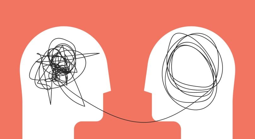
Sympathy, a much older word, implies sharing the feelings of another. Empathy is more imaginative: It is a psychological projection that has little to do with loyalty or pity, which, when unwarranted by genuine closeness, can seem condescending to those on the other side — a kind of unwanted paternalism.
“If you are being sympathetic, you are potentially sorry for their situation. You’re trying to put yourself in their shoes too much. How do we fix it? What do we do that’s nice that makes them happy again?” he said.
The widespread misunderstanding of empathy has resulted in its uneven application as a design principle, Woodhead, who is legally blind, argues.
He tells the story of two different scenarios in which he takes the train to work. In the first, he arrives at the platform and no one is there to meet him. He misses the train. He’s forced to take a later departure and, eventually, arrives at the end of the route with no one to help him get off. As a result, he’s late to work. The receptionist, who has the key to a closet that contains an accessibility ramp for the front steps, is out for the day. He stands in the rain, frustrated and miserable. Nothing goes right.
On a different day — a better day — the trip is seamless and he arrives at work without a hitch.
“Being empathetic is how you understand that’s wrong,” he said. “‘You don’t have to be in that situation yourself. You just have to understand it.”


