
At a glance, copywriting and UX writing may seem closely related — but really, they’re about entirely different things.
“One main goal of copywriting is to get attention, to be memorable,” Rachel Radway, a UX writer at the digital workspace MURAL, told me.
The best UX writing, meanwhile, is forgettable. When done well, it guides the user through an online experience step by step, whether it’s getting logged on or depositing a check. The language is clear and concise, and it strives to make the experience as frictionless as possible.
What Is UX Writing?
“The goal, in most cases, is to make the text almost invisible — in a good way,” said Radway, who has served in previous content management and editing roles at Western Union, Amazon and PayPal.
Gleb Hodorovskiy, who is co-founder of the digital optimization agency Conversion Rate Store, said the company has run A/B tests on 127 million of its clients’ users. This research has led to a striking finding about UX writing.
“Copy changes tend to outperform usability, interface design or technical experiments, and sometimes even core product features,” he said. “Just one line of copy can have a 17 percent uplift in conversion, or even more than that.”
Copy changes tend to outperform usability, interface design or technical experiments, and sometimes even core product features.”
Companies like Noom, the fifth-most visited health and nutrition site in the United States and most of the top-grossing mobile games, such as Honor of Kings, which reported $258 million in gross revenue in December, do UX writing and copywriting exceptionally well, he told me.
In short, the difference between UX writing and copywriting comes down to what each discipline is trying to accomplish: While UX writing is focused on ease of use, copywriting is aimed at optimizing sales. As a result, the two require entirely different skill sets and approaches. We spoke with UX writers, copywriters, and founders to learn more about what sets the disciplines apart.
Technical Know-How Is Key to UX Writing
As a profession, copywriting has been around for more than a century, tracing its roots back to the work of John Emory Powers, a writer for the department stores Lord & Taylor and Wanamaker’s. But, as a specialized role, UX writing is fairly new. Until recently, things like onboarding instructions, error messages, menu labels and calls to action were the handiwork of technical writers, UX designers or product managers.
But these people were rarely trained as writers, and ownership of the task was often loosely defined, leaving room for important details to fall through the cracks.
Enter the UX writer.
“At some point, people realized words were part of the experience too,” Betsy Mikel, a senior content designer at Mozilla, explained. “There needed to be a role and specialized skill set for someone not to just write words, but to think about how they are involved in the product development process.”
What is Copywriting?
Mikel, who trained as a journalist and held previous copywriting roles at Threadless and Sittercity, said UX writing — sometimes called microcopy — requires close collaboration with engineering and design teams. If you want to give guidance to a user who forgot their password, you need to understand the flow that can get them back on track. You don’t need to have a formal background in UX design — though it doesn’t hurt — but you do need to know how to ask the right questions and have an instinct for solving problems.
Humility doesn’t hurt either.
“There’s no ego in UX writing,” Mikel said. “We’re here in service of people — not to create clever, compelling headlines, but to help people accomplish tasks — and that requires empathy.”
There’s no ego in UX writing. We’re here in service of people — not to create clever, compelling headlines, but to help people accomplish tasks.”
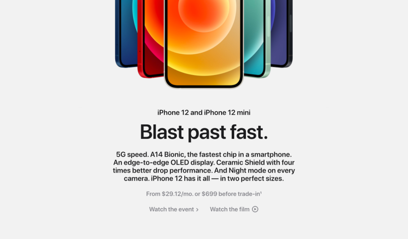
Copywriting is more of a pure writer’s game: it’s figurative, a bit flashy and reflective of a brand’s voice and personality. Miles Beckler, who runs a digital marketing consulting business under his own name, points to the zippy language promoting Apple’s iPhone 12 as a definitive example.
“They lead with the line, ‘Blast past fast,’” he said. “Not only is this punchy and forceful, but it’s clear despite its brevity. With just three single-syllable words, you immediately understand how responsive and technologically advanced the product is.”
Good Copywriting Is Short. UX Writing Is Even Shorter.
Brevity is important in copywriting, but UX writing puts even more emphasis on language economy.
“A lot of the time, there are pixel constraints or character limits, so you might only be able to put a few words into a tooltip or hover text,” Radway said.
UX copy often consists of three- to four-word strings and rarely exceeds 10 words per screen. It’s crucial to get to the point, because users frequently encounter UX copy when something isn’t going right — a page is not loading, they’re having trouble logging in, or they can’t do what they want to do as quickly as they want to do it.
“If you’re onboarding on Firefox, maybe coming from Chrome, you want to download a new browser and do something — probably search for something,” Mikel explained. “We have a million features we want to show you, but it’s not appropriate to dump them on you when you’re coming through the door.”
The most important word in the message must always come first.”
The name of the game is word prioritization.
“The most important word in the message must always come first,” Beckler said. “For example, if you enter the wrong sign-in details when trying to join a Wi-Fi network on an iPhone, you’ll encounter, ‘Incorrect password.’ This conveys the message in its most efficient form. Less effective UX writing may look more like, ‘You have entered the incorrect details.’”
“Leading with the least important words is a hallmark of weak UX writing,” he continued. “Keep it brief. People don’t have the attention spans they used to.”
If you want proof, look no further than a 2015 study from Microsoft, which found humans have shorter attention spans than goldfish. Eight seconds — down from 12 in 2000 — according to data compiled from surveys of 2,000 participants and electroencephalograms (EEGs) measuring the brain activity of 112 others.
UX Writing Aims for 1 Action Per Screen. Copywriting Tells Stories.
A good rule of thumb in UX writing is to request one action per screen in plain English, Hodorovskiy told me.
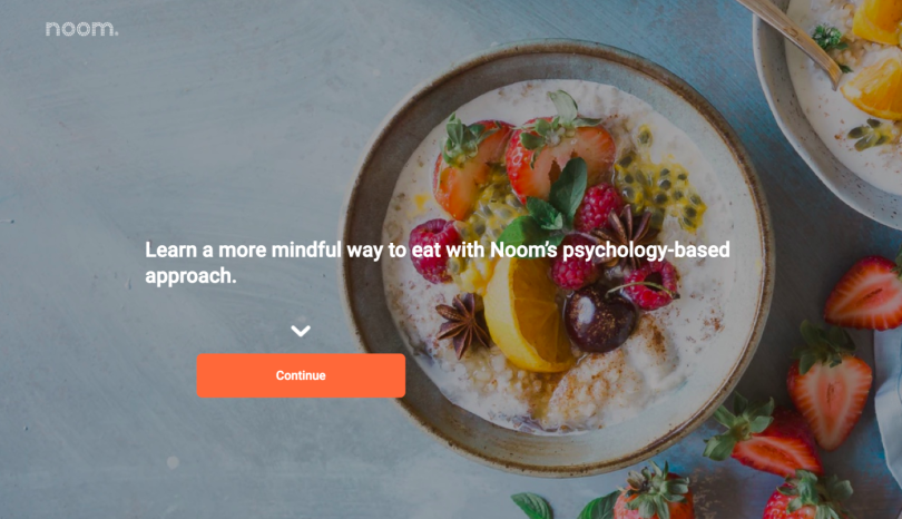
Noom’s website is a good example. A neatly framed photograph of a fruit-filled bowl of oats provides the backdrop for a single call to action. “Learn a more mindful way to eat with Noom’s psychology-based approach.”
Click “Continue” and you’re sent to a form field, with which Noom begins to build a demographic profile.
“What is your goal?” the prompt asks, followed by three options.
“Lose weight for good.”
“Get fit for good.”
“Both.”
Many survey fields follow. Each is no more than a single question, and when the response requested is open-ended — such as asking for your height and weight — an orange button at the bottom of the page reading, “Next,” or “Got It!” directs you to the subsequent screen.
A lot of the time, there are pixel constraints or character limits, so you might only be able to put a few words into a tooltip or hover text.”
Before long, you’ll arrive at a nine-month graph comparing the average weight loss of a person using Noom’s program against an individual who chooses a more restrictive diet. “Seventy-eight percent of Noom users sustained weight loss over 9 months in a 2016 study,” the website lets users know, citing research from Nature.
What makes the UX writing so effective, Hodorovskiy said, is how it is broken up into discrete steps. If a user were to see the entire survey at once, they might abandon it for another site — or give up on their nutrition kick altogether. But because it unspools like a story, with new and progressively more personalized information introduced gradually, users are more likely to be lured in.
UX Writing and Copywriting Can Both Boost Conversion — but They Do It Differently
Companies often use different metrics to assess the effectiveness of copywriting and UX writing, and there’s an important reason for this, Hodorovskiy told me: they serve different goals. Audience and purpose tend to drive the metrics.
For example, sales copywriting might be judged by subscription sign-ups or the average revenue per customer. A blog post or SEO story might be evaluated by the number of times it is shared or viewed, or how it ranks in search.
“The most critical part is to define a value proposition and explain the core product value in a few sentences,” Hodorovskiy said.
One way the Conversion Rate Store assesses the outcomes of copywriting efforts on its clients’ pages is through A/B testing. Two versions of the page are sent to a pool of test users for a set period of time, and the analytics tells the story.
When the consultancy redesigned one of Comodo’s high-traffic landing pages, the New Jersey-based cybersecurity firm saw a 17.5 percent increase in the rate of site visitors signing up for a free demo of its B2B antivirus software — up from 49 percent prior to the update.
Much of the conversion boost had to do with copywriting changes, Hodorovskiy said. The original site was copy-heavy, overly technical and did a poor job explaining the value proposition of the software: its use of forensic analysis to detect new viruses.
The most critical part is to define a value proposition and explain the core product value in a few sentences.”
After interviewing members of Comodo’s sales team and conducting an online survey, the Conversion Rate Store developed a copywriting framework to boost conversion.
The key idea was this: Users search for antivirus software to alleviate fears their devices are susceptible to malware. The copy should reflect those fears and illustrate how Comodo’s software provides a remedy that is more comprehensive and effective than its competitors.
The revised headline — “Protect all your devices from unknown malware with a free forensic analysis when you fill out the form below” — presented users with an immediate call to action.
Compare that to the original: “Prevent, analyze and protect all your devices with a free forensic analysis....”
No callout. Just a headline followed by an opaque ellipsis.
Other companies have seen similar conversion boosts, thanks to research-supported copy changes.
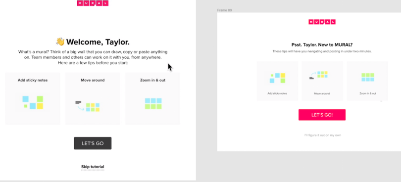
To encourage more users to participate in a short onboarding tutorial, the San Francisco-based visual collaboration company MURAL recently overhauled the UX copy on one of its landing pages.
Initially, the top-level messaging explained the function of the company’s online whiteboarding tool in a few sentences: “What’s a mural? Think of a big wall that you can draw, copy or paste anything on. Team members and others can work on it with you, from anywhere. Here are a few tips before you start.”
The message wasn’t complicated, but it was longer than it needed to be — 37 words — and not clearly rooted in the user’s point of view. The revised copy — at 12 words — packed a stronger punch: “These tips will have you navigating and posting in under two minutes.”
Subtler UX copy changes were also at play in a redesign. For instance, users were referred to in an intimate tone: “Psst. Taylor. New to Mural?” as opposed to the generic, “Welcome, Taylor.” And the skip button on the bottom of the page was reworded at the suggestion of a designer. Instead of “Skip tutorial,” the button reads, “I’ll figure it out on my own.”
“Not guilt tripping, but showing [visitors] it might be more complicated than they thought it would, and they might get something out of the help,” Radway said.
These changes, along with color swaps and text position and scaling adjustments, reduced the percentage of visitors who skipped the tutorial from 86 percent to 61 percent.
The Lines Between UX Writing and Copywriting Are Starting to Blur
For all their differences, UX writing and copywriting are starting to bear closer resemblance, particularly in contexts where players’ actions are part of the story. Take Ring Fit Adventure, a fitness game for the Nintendo Switch, where physical exercise — running, squatting, stretching, squeezing a ring-shaped controller — helps defeat monsters.
The UX copy is designed to lead users through the actions in the game, but it also has a voice. The conceit is that the ring controller is speaking to you.
“What do you say we start the day with another dynamic stretch?” the ring asks.
Or: “Oh? You’d rather skip it today? Sure thing.”
The voice feels conversational and close to the user’s experience, even as it orients them to the basic functions of the game. When something is difficult or unusual, like flexing your abs while shifting your weight to navigate a paddleboard across shifting waters, it provides reassurance.
“This’ll be weird, but press me on your abs and twist your upper body left and right.”
Perform the exercise correctly, and the voice encourages you with the kind of zippy banter you might find in a text stream: “Haha! Isn’t this incredible?”
And, yes, it is.
Radway said the best UX writing has a place for a human voice. It might not be a 404 error message, “where [users] are frustrated or annoyed or in a hurry and last thing you want to be is cute,” but even in that instance you can strike a friendly and supportive tone, she told me.
The message could direct a user to the help center, reroute them to a page to continue where they left off, or offer an option to send an email to a member of the support team. The important thing is that the user isn’t left feeling alone and abandoned.
MURAL is currently in high-level design discussions over a seemingly small point: the pronouns or adjectives used in the template headings that appear in a user’s dashboard.
Should these read, “My Murals,” “Your Murals” or “Favorite Murals?”
There are good arguments for each, Radway told me. “My Murals” suggests a kind of personal ownership and investment. “Your Murals” conveys a relationship with the brand, which could become even more important in the context of customized recommendations, “if [MURAL], as a brand, comes up with an ingenious way to figure out who you are and what you’ve used before and what you might find helpful in the future.” “Favorite Murals” is comparatively neutral in tone, but easier to replicate across pages from a consistency standpoint.
You don’t want to sound like a computer. It has to be human. You want to engage people.”
The choice has yet to be made. “One of the reasons that we haven’t yet come to a decision is because we want to look at not only the use cases that we currently have, but also the things that we’re thinking about doing in the future,” Radway told me.
Among those things? The reconfiguration of a Netflix-style dashboard, the increasing personalization of the brand’s identity, and, ultimately, what those steps will mean for user satisfaction and retention.
As Mark Twain said, “The difference between the almost right word and the right word is really a large matter. ’tis the difference between the lightning bug and the lightning.”
Time will tell how MURAL decides. What is clear is the UX copy won’t sound canned:
“You don’t want to sound like a computer. It has to be human. You want to engage people,” Radway said. “On top of that, you want to express your brand personality as much as possible. It’s what sets you apart.”