The year isn’t the only thing that’s new. Two storied brands, Burger King and General Motors, recently gave their visual identities a refresh, exchanging time-honored logos with new ones that better reflect their tech-forward aspirations.
Let’s start with Burger King.
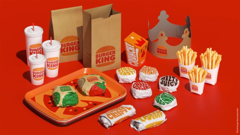
The hamburger chain ditched the logo it’s had since 1999 for one strikingly similar to the one it unveiled in 1969. Gone are the blue swoosh and shiny bun, relics of a Web-1.0-era aesthetic. Replacing them are puffy fonts, psychedelic shapes, and lots of brown, red and green. All that’s missing are bell bottoms.

Burger King’s design pivot to a ’70s vibe is no accident. It’s clearly “an appeal to nostalgia,” according to James Bowie, principal at Embelemetric, a logo design analysis blog. It’s a design trend he’s spotted in several NBA teams, as well as NASA. Using “throwback” logos helps organizations like these re-energize old generations and catch the eyes of new ones.
“It’s almost like when a newer artist covers an old musician’s songs,” Bowie told Built In. “The young crowd likes it because [it’s] this cool new song, and the older crowd is like, ‘I remember the original.’”
“It’s almost like when a newer artist covers an old musician’s songs.”
But why use a vintage design in the smartphone era? At first blush, the logo’s big disco energy seems more like a retreat back to analog than a forward push into digital. But that’s not exactly the case.
Despite evoking a bygone era, the new design is calibrated to be more friendly to digital channels. For starters, it’s flat, meaning it doesn’t use techniques or flourishes to make it appear three-dimensional.
Flat design is often preferred by mobile-first designers. Its simplicity translates easily to the context of tiny screens, where small details are harder to see.
Burger King’s previous logo had much more ornamentation and detail, which made sense in the desktop computer age. Less so now, when many people are pressing a tiny app icon to order lunch. Indeed, the new design is as much a practical move as it is a cultural one.
Speaking of culture, the other potential byproduct of Burger King’s redesign is that it’s highly photogenic. In an age when user-generated content is an increasingly utilized marketing lever for brands, it’s likely Burger King designed its new cups and bags with social media in mind.
“The typographic sandwich wrappers are great and will probably become popular Instagram content,” argued Brand New, a popular brand design blog.

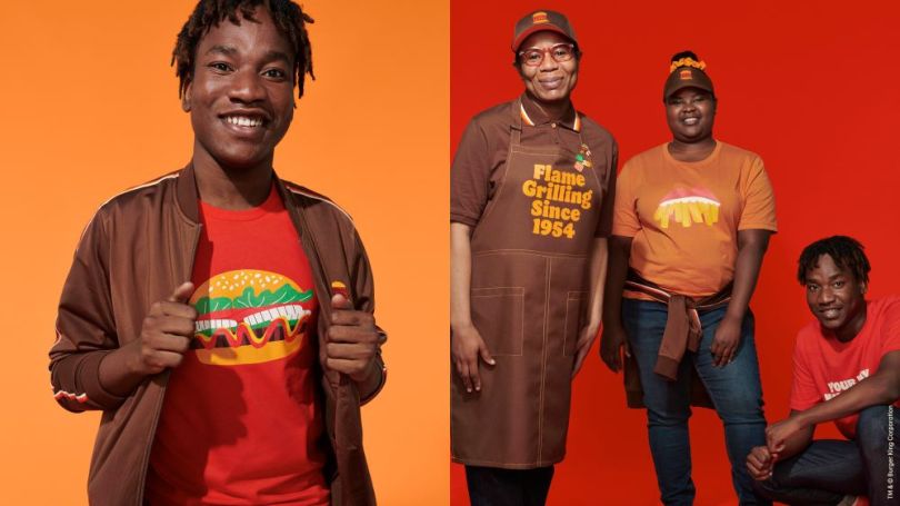
To capitalize on this, Burger King also rolled out a new apparel line to coincide with its redesign. The merch looks similar to that of Popeye’s, which took Instagram by storm when it was released early in 2020. So much so that the fried chicken restaurant’s online store quickly sold out.
BK, which is owned by the same parent company as Popeye’s, is likely angling for a similar phenomenon: vintage looks for a digital strategy.
Signaling an Electric Future
General Motors, on the other hand, appears to have gone in the opposite direction of Burger King when it comes to its new design.
The car manufacturer, which owns Buick, Cadillac, Chevrolet and GMC, swapped out the logo it’s used since 1964 for one that helps to underscore its new future.

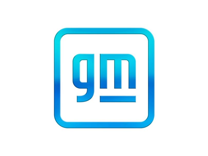
The logo’s uppercase GM was changed to a lowercase gm, and set in a friendlier font with a gradient color scheme — a far cry from the heavy navy blue the company’s used for decades, meant to signal a commitment to progress and sustainability.
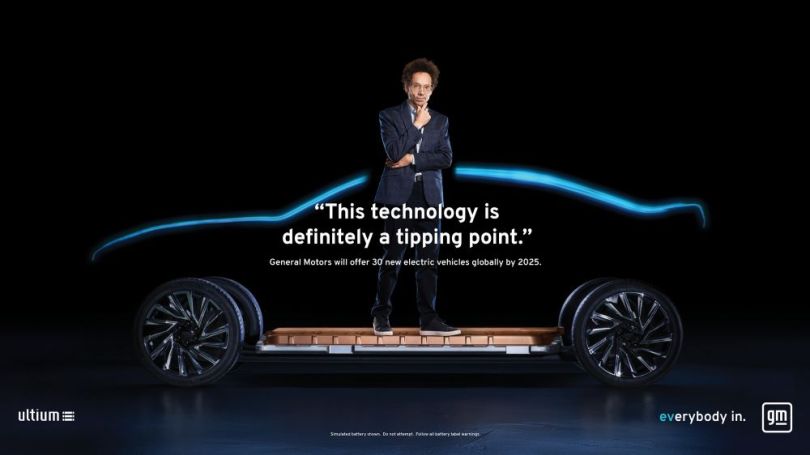
The negative space creates the shape of an electrical outlet, though it’s not easily recognizable at a quick glance (similar to the way the two words in the FedEx logo form an arrow between them), which is meant to point to GM’s bet on electric vehicles. (The manufacturer is investing $27 billion in EVs, and plans to launch 30 models in the next half decade.)
The move, though criticized by several design commentators who don’t care for its late-aughts aesthetic, is a forward-thinking one, according to Bowie. “They’re not introducing a new logo just for the heck of it,” he said. It is meant to set the tone for its sub-brands, and declare its intention to be a progressive company with an electric-first future.

Logo redesigns don’t always go hand in hand with concrete policy changes or shifts in strategy. But GM’s does.
“I think companies that are smart will introduce a new logo in association with some larger move that they’re making,” Bowie said. “If you’re just changing it for window dressing, then it’s not going to be maybe as effective.”
Though they express it differently, both Burger King and GM have used their redesigns to declare their intentions: They’re ready for the future, a brave new digital world.


