

The pandas library is a popular Python package for data analysis. When initially working with a data set in pandas, the structure will be two-dimensional, consisting of rows and columns, which are also known as a DataFrame. An important part of data analysis is the process of grouping, summarizing, aggregating and calculating statistics about this data. Pandas pivot tables provide a powerful tool to perform these analysis techniques with Python.
How to Create a Pivot Table With pandas in Python
To create a pivot table from a pandas DataFrame, type:
table = pd.pivot_table(df, values = ['values_column'],
                       index = ['row_column_1','row_column_2'],
                       columns = ['column_column'],
                       aggfunc = 'aggregate_function')
The code used above is an example, so make sure to replace variable names with those from your own DataFrame, and to replace the aggregate function with the one of your choosing.
If you are a spreadsheet user then you may already be familiar with the concept of pivot tables. Pandas pivot tables work in a very similar way to those found in spreadsheet tools such as Microsoft Excel. The pivot table function takes in a data frame and the parameters detailing the shape you want the data to take. Then it outputs summarized data in the form of a pivot table.
I will give a brief introduction with code examples to the pandas pivot table tool. I’ll then use a data set called “autos,” which contains a range of features about cars, such as the make, price, horsepower and miles per gallon.
You can download the data from OpenML, or the code can be imported directly into your code using the scikit-learn API as shown below.
import pandas as pd
import numpy as np
from sklearn.datasets import fetch_openml

X,y = fetch_openml("autos", version=1, as_frame=True, return_X_y=True)
data = X
data['target'] = y
How to Create a Pandas Pivot Table
A pandas pivot table has three main elements:
- Index: This specifies the row-level grouping.
- Column: This specifies the column level grouping.
- Values: These are the numerical values you are looking to summarize.

The code used to create the pivot table can be seen below. In the pivot_table function, we specify the DataFrame we are summarizing, and then the column names for the values, index and columns. Additionally, we specify the type of calculation we want to use. In this case, we’re computing the mean.
pivot = np.round(pd.pivot_table(data, values='price',
                                index='num-of-doors',
                                columns='fuel-type',
                                aggfunc=np.mean),2)
pivot
Pivot tables can be multi-level. We can use multiple indexes and column level groupings to create more powerful summaries of a data set.
pivot = np.round(pd.pivot_table(data, values='price',
                                index=['num-of-doors', 'body-style'],
                                columns=['fuel-type', 'fuel-system'],
                                aggfunc=np.mean,
                                fill_value=0),2)
pivot
How to Plot with Pandas Pivot Table
Pandas pivot tables can be used in conjunction with the pandas plotting functionality to create useful data visualizations.
Simply adding .plot() to the end of your pivot table code will create a plot of the data. As an example, the below code creates a bar chart showing the mean car price by make and number of doors.
np.round(pd.pivot_table(data, values='price',
                                index=['make'],
                                columns=['num-of-doors'],
                                aggfunc=np.mean,
                                fill_value=0),2).plot.barh(figsize=(10,7),
                                                          title='Mean car price by make and number of doors')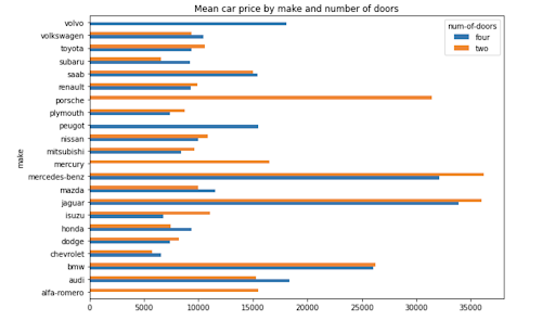
How to Calculate With Pandas Pivot Table
The aggfunc argument in the pivot table function can take in one or more standard calculations.
The following code calculates the mean and median price for car body style and the number of doors.
np.round(pd.pivot_table(data, values='price',
                                index=['body-style'],
                                columns=['num-of-doors'],
                                aggfunc=[np.mean, np.median],
                                fill_value=0),2)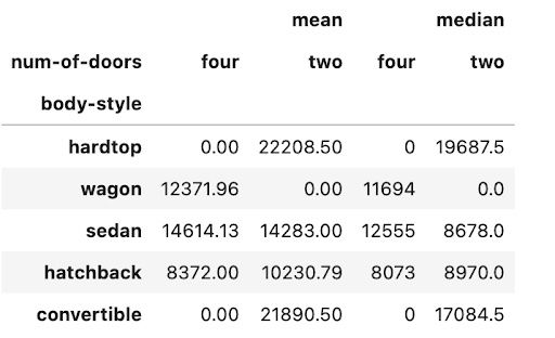
You can add the argument margins=True to add totals to columns and rows. You can also specify a name for the totals using margins_name.
np.round(pd.pivot_table(data, values='price',
                                index=['body-style'],
                                columns=['num-of-doors'],
                                aggfunc=[np.sum],
                                fill_value=0,
                                margins=True, margins_name='Total'),2)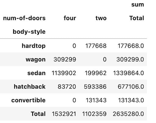
How to Style Your Pandas Pivot Table
When summarizing data, styling is important. We want to ensure that the patterns and insights that the pivot table is providing are easy to read and understand. In the pivot tables used in earlier parts of the article, very little styling has been applied. As a result, the tables are not easy to understand or visually appealing.
We can use another Pandas method, known as the style method to make the tables look prettier and easier to draw insights from. The code below adds appropriate formatting and units of measurement to each of the values used in this pivot table. It is now much easier to distinguish between the two columns and to comprehend what the data is telling you.
pivot = np.round(pd.pivot_table(data, values=['price', 'horsepower'],
                                index=['make'],
                                aggfunc=np.mean,
                                fill_value=0),2)

pivot.style.format({'price':'${0:,.0f}',
                   'horsepower':'{0:,.0f}hp'})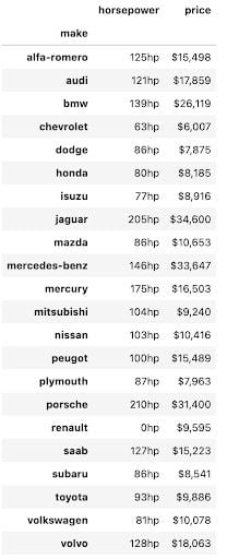
We can combine different formats using the styler and use the pandas built-in styles to summarize data in a way that instantly draws insights out. In the code and pivot table shown below, we have ordered the make of the car by price from high to low value, added appropriate formatting to the numbers and added a bar chart overlaying the values in both columns. This makes it easier to draw conclusions from the table, such as which make of car is the most expensive and how horsepower relates to the price for each car make.
pivot = np.round(pd.pivot_table(data, values=['price', 'horsepower'],
                                index=['make'],
                                aggfunc=np.mean,
                                fill_value=0),2)

pivot = pivot.reindex(pivot['price'].sort_values(ascending=False).index).nlargest(10, 'price')

pivot.style.format({'price':'${0:,.0f}',
                   'horsepower':'{0:,.0f}hp'}).bar(color='#d65f5f')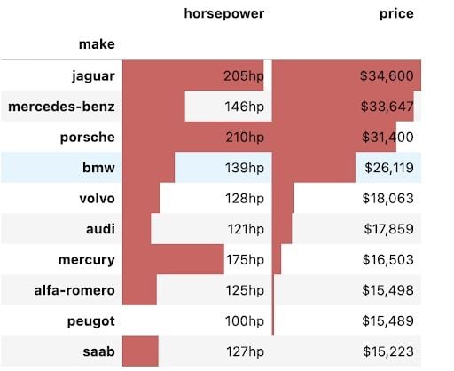
Advantages of Pandas Pivot Tables
Pivot tables have been in use since the early ’90s with Microsoft patenting the famous Excel version known as “PivotTable” in 1994. They are still widely used today because they are such a powerful tool for analyzing data. The Pandas pivot table brings this tool out of the spreadsheet and into the hands of Python users.
This guide gave a brief introduction to the usage of the pivot table tool in Pandas. It is meant to give a beginner a quick tutorial to get up and running with the tool but I suggest digging into the pandas documentation, which gives a more in-depth guide to this function.
Frequently Asked Questions
What is the difference between Pandas pivot and Excel pivot?
Pandas pivot tables are programmable, scalable and can leverage advanced functions, making it suitable for large and complex data sets. Excel pivot tables have an interactive user interface, drag-and-drop capabilities and various built-in functions, making it suitable for simple data analysis and pivot table beginners.
What is the difference between Pandas and Excel?
Pandas is a data analysis and manipulation library available for Python. Excel is a spreadsheet program included in the Microsoft 365 software suite.


