Machine learning classification is a type of supervised learning in which an algorithm maps a set of inputs to discrete output. Classification models have a wide range of applications across disparate industries and are one of the mainstays of supervised learning. The simplicity of defining a problem makes classification models quite versatile and industry agnostic.
An important part of building classification models is evaluating model performance. In short, data scientists need a reliable way to test approximately how well a model will correctly predict an outcome. Many tools are available for evaluating model performance; depending on the problem you’re trying to solve, some may be more useful than others.
For example, if you have an equal representation of all outcomes in your data accuracy, then a confusion matrix may suffice as performance metrics. Conversely, if your data exhibits an imbalance, meaning one or more outcomes are significantly underrepresented, you may want to use a metric like precision. If you want to understand how robust your model is across decision thresholds, metrics like area under the receiver operating characteristic curve (AUROC) and area under the precision recall curve (AUPRC) may be more appropriate.
Given that choosing the appropriate classification metric depends on the question you’re trying to answer, every data scientist should be familiar with the suite of classification performance metrics. The Scikit-Learn library in Python has a metrics module that makes quickly computing accuracy, precision, AUROC and AUPRC easy. Further, knowing how to visualize model performance through ROC curves, PR curves and confusion matrices is equally important.
Here, we will consider the task of building a simple classification model that predicts the probability of customer churn. Churn is defined as the event of a customer leaving a company, unsubscribing or no longer making a purchase after a period of time. We will be working with the Telco Churn data, which contains information about a fictional telecom company. Our tasks will be to predict whether or not the customer will leave the company and evaluate how well our model performs this task.
A Beginner’s Guide To Evaluating Classification Models in Python
- Building a Classification Model
- Accuracy and Confusion Matrices
- ROC Curve and AUROC
- AUPRC
Building a Classification Model
Let’s start by reading the Telco Churn data into a Pandas dataframe:
df = pd.read_csv('telco_churn.csv')Now, let’s display the first five rows of data:
df.head()
We see that the data set contains 21 columns with both categorical and numerical values. The data also contains 7,043 rows, which corresponds to 7,043 unique customers.
Let’s build a simple model that takes tenure, which is the length of time the customer has been with the company, and MonthlyCharges as inputs and predicts the probability of the customer churning. The output will be the Churn column, which has a value of either yes or no.
First, let’s modify our target column to have machine-readable binary values. We’ll give the Churn column a value of one for yes and zero for no. We can achieve this by using the where() method from numpy:
import numpy as np

df['Churn'] = np.where(df['Churn'] == 'Yes', 1, 0)
Next, let’s define our input and output:
X = df[['tenure', 'MonthlyCharges']]

y = df['Churn']
We can then split our data for training and testing. To do this, we need to import the train_test_split method from the model_selection module in Sklearn. Let’s generate a training set that makes up 67 percent of our data, and then use the remaining data for testing. The testing set is made up of 2,325 data points:
from sklearn.model_selection import train_test_split

X_train, X_test, y_train, y_test = train_test_split(X, y,

test_size=0.33, random_state=42)
For our classification model, we’ll use a simple logistic regression model. Let’s import the LogisticRegression class from the linear_models module in Sklearn:
from sklearn.linear_models import LogisticRegressionNow, let’s define an instance of our logistic regression class and store it in a variable called clf_model. We will then fit our model to our training data:
clf_model = LogisticRegression()

clf_model.fit(X_train, y_train)
Finally, we can make predictions on the test data and store the predictions in a variable called y_pred:
y_pred = cllf_model.predict(X_test)Now that we’ve trained our model and made predictions on the test data, we need to evaluate how well our model did.
Accuracy and Confusion Matrices
A simple and widely used performance metric is accuracy. This is simply the total number of correct predictions divided by the number of data points in the test set.
We can import the accuracy_score method from the metric module in Sklearn and calculate the accuracy. The first argument of the accuracy_score is the actual labels, which are stored in y_test. The second argument is the prediction, which is stored in y_pred:
from sklearn.metrics import accuracy_score

print("Accuracy: ", accuracy_score(y_test, y_pred))
We see that our model has a prediction accuracy of 79 percent. Although this is useful, we don’t really know that much about how well our model specifically predicts either churn or no churn. Confusion matrices can give us a bit more information about how well our model does for each outcome.
This metric is important to consider if your data is imbalanced. For example, if our test data has 95 no churn labels and five churn labels, by guessing “no churn” for every customer it can misleadingly give a 95 percent accuracy.
We’ll generate a confusion_matrix from our predictions now. Let’s import the confusion matrix package from the metrics module in Sklearn:
from sklearn.metrics import confusion_matrixLet’s generate our confusion matrix array and store it in a variable called conmat:
conmat = confusion_matrix(y_test, y_pred)Let’s create a dataframe from the confusion matrix array, called df_cm:
val = np.mat(conmat)

classnames = list(set(y_train))

df_cm = pd.DataFrame(

        val, index=classnames, columns=classnames,

    )

print(df_cm)
Now, let’s generate our confusion matrix using the Seaborn heatmap method:
import matplotlib.pyplot as plt

import seaborn as sns

plt.figure()

heatmap = sns.heatmap(df_cm, annot=True, cmap="Blues")

heatmap.yaxis.set_ticklabels(heatmap.yaxis.get_ticklabels(), rotation=0, ha='right')

heatmap.xaxis.set_ticklabels(heatmap.xaxis.get_ticklabels(), rotation=45, ha='right')

plt.ylabel('True label')

plt.xlabel('Predicted label')

plt.title('Churn Logistic Regression Model Results')

plt.show() 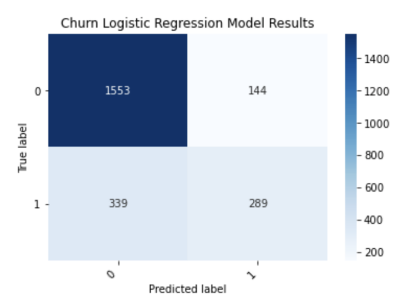
So, what exactly does this figure tell us about the performance of our model? Looking along the diagonal of the confusion matrix, let’s pay attention to the numbers 1,553 and 289. The number 1,553 corresponds to the number of customers who were correctly predicted by the model to not churn, meaning they stay with the company. The number 289 corresponds to the number of customers that the model correctly predicted to churn.
It would be better if we could display these as percentages of a total number. For example, it would be useful to know what percentage of all churns do the 289 correctly predicted customers make up. We can display percentages for each outcome by adding the following line of code before our heatmap plot:
df_cm = df_cm.astype('float') / df_cm.sum(axis=1)[:, np.newaxis] 
As we can see, our model correctly predicts 91 percent of customers who don’t churn and 46 percent of customers who do. This clearly illustrates the limitations of using accuracy since it did not give us information about the percentage of correctly predicted outcomes.
ROC Curve and AUROC
Oftentimes, companies want to work with predicted probabilities instead of discrete labels. This allows them to select the threshold for labeling an outcome as either negative or positive. When dealing with probabilities, we need a way of measuring how well the model generalizes across probability thresholds. Up until this point, our algorithm has been assigned binary labels using a default threshold of 0.5, but maybe the ideal probability threshold is higher or lower, depending on the use case.
In the case of balanced data, the ideal threshold is 0.5. When our data is imbalanced, then the ideal threshold is often lower. Further, companies sometimes prefer to work with probabilities instead of discrete labels altogether. Given the importance of prediction probabilities, it is useful to understand which metrics to use to evaluate them.
The AUROC is a way to measure how robust your model is across decision thresholds. It is the area under the plot of the true positive rate versus the false positive rate. The true positive rate (TPR) is (true positives)/(true positives + false negatives). The false positive rate is the (false positive)/(false positive + true negative).
In the context of our churn problem, this will measure how well our model captures customers who do not churn across different probability thresholds.
Let’s start by calculating the AUROC. Let’s import the roc_curve and roc_auc_score methods from the metrics module:
from sklearn.metrics import roc_curve, roc_auc_scoreNext, let’s generate predicted probabilities on our test set using our trained model:
y_pred_proba = clf_model.predict_proba(np.array(X_test))[:,1]We can then calculate the false positive rate (for) and true positive rate (tpr) for different probability thresholds:
fpr, tpr, thresholds = roc_curve(y_test, y_pred_proba)Finally, we can plot our ROC curve:
sns.set()

plt.plot(fpr, tpr)

plt.plot(fpr, fpr, linestyle = '--', color = 'k')

plt.xlabel('False positive rate')

plt.ylabel('True positive rate')

AUROC = np.round(roc_auc_score(y_test, y_pred_proba), 2)

plt.title(f'Logistic Regression Model ROC curve; AUROC: {AUROC}');

plt.show()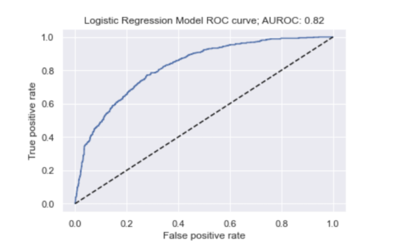
The faster the true positive rate approaches one, the better the behaviour of our ROC curve. So, our model performs pretty well in these terms.
Further, an AUROC of 0.82 is pretty good since a perfect model would have an AUROC of 1.0. We saw that 91 percent of negative cases (meaning no churn) were correctly predicted by our model when using a default threshold of 0.5, so this should not come too much as a surprise.
AUPRC (Average Precision)
The area under the precision recall curve gives us a good understanding of our precision across different decision thresholds. Precision is (true positive)/(true positives + false positives). Recall is another word for the true positive rate.
In the case of churn, AUPRC (or average precision) is a measure of how well our model correctly predicts a customer will leave a company, in contrast to predicting that the customer will stay, across decision thresholds. Generating the precision/recall curve and calculating the AUPRC is similar to what we did for AUROC:
from sklearn.metrics import precision_recall_curve

from sklearn.metrics import average_precision_score

average_precision = average_precision_score(y_test, y_test_proba)

precision, recall, thresholds = precision_recall_curve(y_test, y_test_proba)

plt.plot(recall, precision, marker='.', label='Logistic')

plt.xlabel('Recall')

plt.ylabel('Precision')

plt.legend()

plt.title(f'Precision Recall Curve. AUPRC: {average_precision}')

plt.show()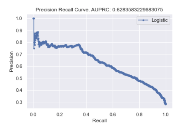
We can see that, with an AUPRC of 0.63 and the rapid decline of precision in our precision/recall curve, our model does a worse job of predicting if a customer will leave as the probability threshold changes. This outcome is to be expected since we saw that when we used a default threshold of 0.5, only 46 percent of churn labels were correctly predicted. For those interested in working with the data and code, the Python script is available here.
Evaluating Classification Models
Data scientists across domains and industries must have a strong understanding of classification performance metrics. Knowing which metrics to use for imbalanced or balanced data is important for clearly communicating the performance of your model. Naively using accuracy to communicate results from a model trained on imbalanced data can mislead clients into thinking that their model performs better than it actually does.
Further, having a strong understanding of how predictions will be used in practice is vital. It may be the case that a company seeks discrete outcome labels that it can use to make decisions. In other cases, companies are more interested in using probabilities to make their decisions, in which case we need to evaluate probabilities. Being familiar with many angles and approaches to evaluating model performance is crucial to the success of a machine learning project.
The Scikit-learn package in Python conveniently provides tools for most of the performance metrics you may need to use. This allows you to get a view of model performance from many angles in a short amount of time and relatively few lines of code. Quickly being able to generate confusion matrices, ROC curves and precision/recall curves allows data scientists to iterate faster on projects.
Whether you want to quickly build and evaluate a machine learning model for a problem, compare ML models, select model features or tune your machine learning model, having good knowledge of these classification performance metrics is an invaluable skill set.