Mark Twain famously popularized the phrase “lies, damned lies and statistics.” He also originated this lesser-known, but similarly perceptive, quote: “As [statistics] rise higher and higher to the sky, they become in the same proportion more and more inexplicable.”
Psychologists have terms for this: The “psychic numbing effect,” or “compassion fade,” describes how our capacity for empathy decreases as the number of people suffering rises.
To help close this gap, data visualization designers sometimes operate on what Jeremy Boy and colleagues dubbed the “anthropographic assumption,” the idea that using human-like data graphics, or “anthropographics,” can promote prosocial feelings in the observer. Simply put, human-like graphics humanize the data.
Or so you’d think.
In 2017, Boy interrogated the assumption across seven experiments, each based on data related to human-rights issues, to see if anthropographics would move the empathy needle among viewers. Responses were measured by how much hypothetical money participants donated after viewing the graphics.
“In contrast to our expectations, we find that anthropographics and standard charts (e.g., pie charts) have very similar effects on empathy and prosocial behavior,” he wrote. At least within the human rights context, “anthropographics are neither truly beneficial, nor detrimental.”
Now, researchers in Brazil and France have expanded the initial anthropographics design space outlined by Boy — from four design dimensions to seven — and conducted new research based on their larger vision of human-like data graphics. Once again, the expectation was that the visualizations might drive feelings of compassion; once again, the expectation did not quite bear out. In two experiments that incorporated some of the expanded dimensions, the results were either inconclusive or showed only small improvement.
The second experiment did show clearer evidence that people who saw the anthropographics felt worse, or more empathetic, but they also didn’t donate much compared to the other group. “It seems that anthropographics might slightly increase empathy but not compassion,” said lead author Luiz Morais, pointing out a subtle, yet notable, difference. “But the effect is not as large as practitioners expected.”
“The expectations were high because everyone talks about using visualizations to evoke empathy today ... but that’s how science works, and we didn’t find a large effect,” he added.
It seems that a dataviz technique that is relatively simple and static yet able to elicit empathy and humanize data would be greatly valuable. But the latest research again indicates that some of the most common approaches still don’t deliver.
The Long-Running Debate
Whether or not practitioners should even attempt to humanize data or elicit empathy in visualizations has been a debate in the dataviz community for years. Perhaps the most prominent skeptic is Alberto Cairo, who, in 2015, voiced his doubts that the medium “can convey (or even care about conveying) or increase empathy.”
Visualizations communicate information, while supplemental elements — photos, videos, narrative text — are better-suited to capture the “people behind the numbers,” he further explained in 2016.
Graphics that visualize data about humans, by definition, mediate humanity, so asking them to humanize what they make abstract — the argument goes — is like asking the map to be the territory itself, to channel a phrase Cairo invoked.
Building a Design Space for Anthropographics
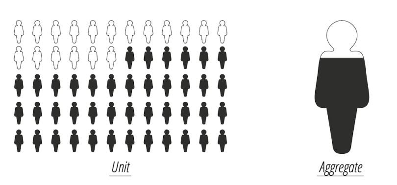
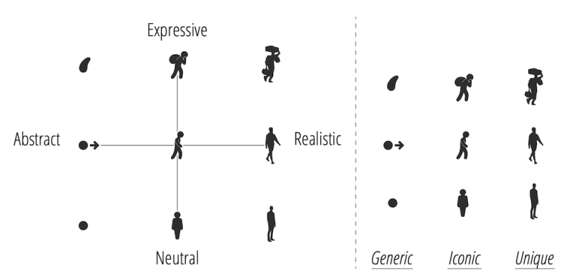
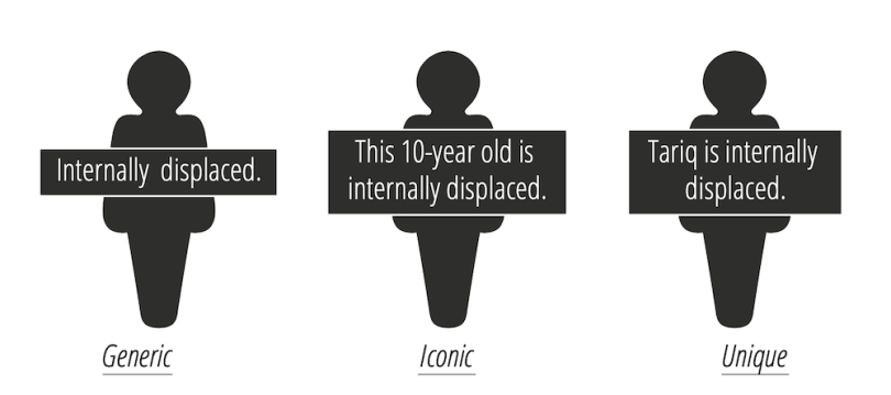
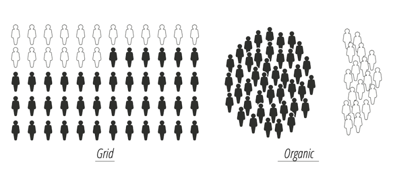
In his writing, Cairo referenced a Jacob Harris piece that suggested that using “wee people” in dataviz might help foster empathetic responses — a concept Boy drew upon to help formulate the characteristics of anthropographics. Those characteristics were class of visualization, human shape, unit labeling and unit grouping.
Class refers to whether the anthropographic mark or marks were individual-specific or an aggregation:
Human shape is the degree to which the graphics are actually human-like:
Unit labeling refers to whether a graphic label contains generic or specific information:
Unit grouping means how the “people” are grouped — as a grid, in true-to-life groupings or somewhere in between:
Now, Morais and his colleagues have blown out the design space even further, devising seven design dimensions: granularity, specificity, coverage, authenticity, realism, physicality and situatedness. Some are tweaks of Boy’s previously outlined dimensions (expanding the “realism” spectrum to include photographs, for instance). Some are brand new (like the flat-versus-dimensional spectrum of “physicality”).
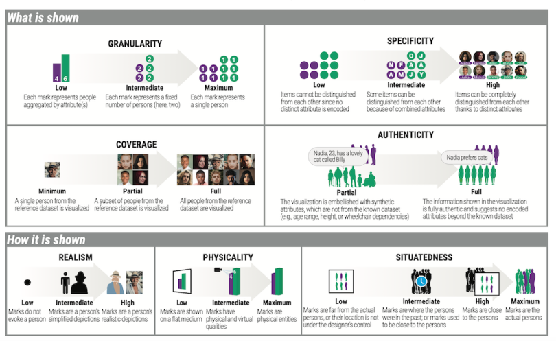
It’s interesting and useful to pour over the different dimensions above and consider the variety of ways visualization practitioners might parse anthropographics. But perhaps more important is how the new dimensions fared.
For his experiment, Morais combined multiple anthropographic elements in hopes of boosting the likelihood that an effect would surface, even if that meant the resulting visual wasn’t the most streamlined presentation of the data. He also cranked up the “granularity” — meaning each person in the data set was visualized with an individual mark — and maximized “authenticity” — no altering the shape or size of the silhouette graphic, unless that information was explicit in the data set. (Morais suspected the negative responses in Boy’s respondents may have stemmed from “low granularity” and “low authenticity.”)
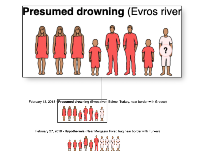
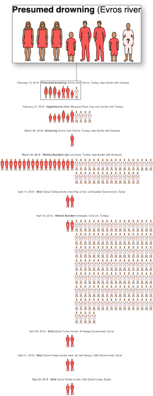
The resulting test graphic — which visualized mortality and survival rates from the 2018 migrant crisis — is far more involved (and a lot larger) than the humble bar chart against which study participants compared it. But it nevertheless failed to elicit more prosocial responses. A modified variation on the experiment expanded the sample size and tried to account for so-called naive diversification bias, or the tendency to evenly allocate one’s resources across available options. But the second run fared little better.
Here’s a close-up section of the test graphic. See below and left for the full graphic.
So What Now?
 Despite the results, Morais isn’t quite ready to dimiss anthropographics’ potential to provoke empathy. There are many combinations of design dimensions yet to be explored, and even his larger design space could be expanded even further, he noted.
“I’d like to see different approaches, beyond individualized graphics with human-shaped marks — taking what we’ve found in the design-space paper and trying to expand it,” he said. “But I don’t yet have a clear answer on which techniques we could use to create those [empathy-promoting] visualizations.”
Enrico Bertini, a prominent data visualization researcher who also co-wrote the 2017 paper that introduced the term “anthropographics,” agrees, although the results so far have not inspired confidence.
“I think more research is required, but the evidence is piling up that what has been tried so far fails pretty much consistently,” he told Built In.
Morais wonders if tweaking the measurement mechanism might impact results too. Perhaps studies that measured real donations, rather than hypothetical ones (which his study also used) or other forms of prosociality — like donating one’s time rather than money — might have some effect, he said.
But if human-like static marks don’t deliver empathy, what might? Bertini suggested that photorealism, virtual reality and animation might be better options. Indeed, per the latter, about 40 percent of the collection of visualizations Morais used to define his seven dimensions was comprised of dynamic visualizations — even though his test graphics were all static.
That’s hardly a groundbreaking suggestion. In 2015, dataviz researcher Mushon Zer-Aviv suggested Periscopic’s animated, interactive visualization of gun deaths — replete with a dramatic slow build — as counterpoint to Cairo’s skepticism of dataviz’s capacity to elicit empathy. According to him, the visualization successfully presented quantitative information while also achieving a “compassionate response.” But it’s not great news for anyone holding out hope that simpler, static techniques might deliver something comparable.
“I started very optimistic. Now I’m less optimistic, because of our results,” Morais said. “But I’m still very interested to see how it goes in the future.”


