It’s been a tough stretch for the humble dashboard. In recent years, the collections of charts, gauges and assorted graphical indicators have garnered a reputation as “data dumpsters,” too easily giving way to information overload.
The pandemic hasn’t exactly helped reverse the sentiment. While the Johns Hopkins COVID-19 dashboard became a go-to resource for tracking the spread, a glut of hastily released lesser entries contributed more noise than signal.
Dan Platt, technical product manager at data storytelling platform Narrative Science, saw an opportunity for the company’s technology to help create clear “stories,” with top-line takeaways and condensed information, from Johns Hopkins and World Health Organization data. Now, a year later, Platt is doing the same to track vaccination — worldwide, nationwide, statewide and in the city of Chicago, where Narrative Science is headquartered.
“The vast majority of people in the world or in a city are not comfortable with getting the information that they need through graphs and dashboards,” Platt said. “You can’t just throw a bunch of charts in front of someone and expect them to make the best possible decision for them and their family. That’s why I thought that this data in particular was a good display of what we do as a company.”
Each vaccination story spotlights the total number of vaccines administered in a given stretch of time, plus how that figure compares to the immediately preceding time range. Users can adjust time filters to look at the current day, week or month or the previous day, week or month.
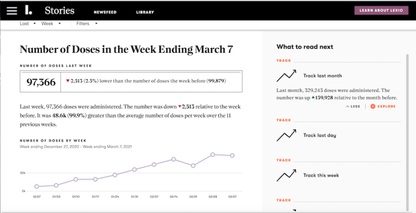
Below is a screenshot of the Chicago vaccination story, with the parameters set to show the number of doses administered in the city in the week ending March 7. The story is generated by Lexio, the company’s product that communicates data streams as a newsfeed of distinct stories, rather than a business intelligence-style dashboard, automatically pulling data from the City of Chicago Open Data Portal.
You can see how the top line immediately foregrounds the number (97,366), right alongside the raw numbers of the previous week and the difference between the two — in number and percentage — in bold.

There are a few handy graphical details — the red, downward-pointing arrow and the small line chart — to keep the important information digestible at a glance. But it’s no accident that it leads with words.
“It is not inherent in human DNA to present line charts and pie charts and Sankey charts at people,” Platt said. “We talk to people, we tell stories, we write things down. So we believe that’s ultimately the best way for people to receive information.”
That’s not to say there’s no place for visualizations. It’s just that language is so fundamental it shouldn’t be underestimated as a means of communicating data, especially for lay people.
“You see the line chart there, but the narrative, the story and the words are the first-class citizens in Lexio,” Platt said.
What’s the Beef With Dashboards?
“Dashboards are where data goes to die.”
Michael Solomon, product strategy director at Hearst Magazines, lobbed that bomb during Slack’s 2019 Frontiers conference. He was speaking specifically about a custom bot his team built that helped content creators at the magazine ask about things like trending topics, e-commerce sales and content traffic, rather than having to tease out the information from a central dashboard.
“It’s a little hyperbolic, but it’s kind of a nice way to think about surfacing the right data to the right people at the right time,” he said.
Solomon was ahead of the curve, as 2020 would prove to be the year that dashboard skepticism went mainstream.
Jared Spool, co-founder of UX design school Center Centre, struck a nerve in August with a viral Twitter thread.
“Dashboards report on current status,” he wrote. “Users don’t act on status. They act on change in status. Dashboards are passive when the user needs something active. They are a failure before it happens.”
But the real flashpoint had come four months earlier, when the data notebook Count paired its launch with a popular jeremiad post titled “Dashboards Are Dead.” The widely shared broadside prompted a spate of (often sympathetic) response pieces. In June, Nightingale, the journal of the Data Visualization Society, invited the co-founder and CEO of Count and the product manager of dashboard provider Chartio to hash out the debate further.
Some of the criticisms they voiced were:
- Dashboards aren’t as intuitive to use as they might first appear. Users might have to transform data in SQL to make it useful.
- Even if users can glean information, the important context behind the information isn’t clear. “We might learn ‘what’ happened, but rarely ‘why,’” deathofdashboards.com posited. Or as data scientist Alexander Jia put it, “While democratization of data is certainly an awesome thing, pure democracy is anarchy (poorly curated and contextualized data shared through a bunch of channels).”
- Dashboards sometimes lack transparency. It can be unclear what data source(s) the dashboard is tapping.
- Developers have to go through the time-consuming process of adding in filters to make dashboards more useful.
- And, of course, the overarching criticism: It’s all just too much information. “Poor curation leads to confusion (which dashboard do I use), distrust (dashboards are wrong) and waste (unused content, unnecessary maintenance),” Jia wrote last year.
Narrative Science and its Lexio data storytelling platform far predate the Great Dashboard Debates, but the design serves as a pretty clear rejoinder to most of those criticisms.
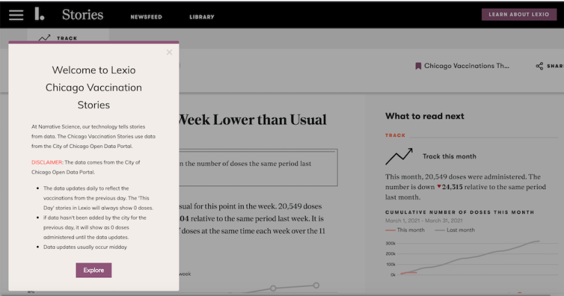
The stories themselves are designed to curate streams of information, with notable numbers and trends (literally) spelled out. As for transparency, in the vaccine stories, a disclaimer pop-up points out where the data is sourced, how often those data sources are updated and how the times at which the data is updated at the source level might affect the story.

At the same time, Platt is quick to note that he’s not anti-dashboard. They just often need a helping hand. Narrative Science’s Quill platform, for example, uses artificial intelligence to generate stories within dashboards, adding discrete charts, buttons and short narratives to provide context and point out key details.
“There are ways that we can play together, and you can weave those two things,” he said.
Indeed, Chartio’s Matt David pointed to similar functionality on that platform — where users can add text, images and links to dashboards for added context — in the interview with Nightingale.
“Many of the dashboards people end up making in Chartio look a lot more like a Google doc than what you might normally think of as a traditional dashboard,” he told the journal.
In other words, all dashboards don’t necessarily need to be put out to pasture. They need to keep evolving. Whether that’s in the realm of public-health data or business intelligence — supplemental, contextual narratives and text can help fill that void, according to Platt.
“There’s a story to be told, outside of just what you observe as a point on a chart,” he said.


