Back in 2014, before Airbnb unveiled its current logo, the branding agency that developed the image took it to marketing semiotics firm Sign Salad for review.
Semiotics is the study of how an idea or object communicates meaning — and what meaning it communicates. For example, “coffee” is a brewed beverage, but it also evokes comfort, alertness, creativity and countless other associations.
What Is Semiotics?
Semiotics is the study of how an idea or object communicates meaning, what meaning it communicates and which associations it brings forth. In semiotics, meaning is considered through the interplay between a signifier — the representation of a concept — and the signified — the concept itself.
The Airbnb logo was similarly layered. Sign Salad Founder Alex Gordon and his team noted the rich visual symmetry of the logo’s “A” shape and base that echoed two lowercase “b’s, cleverly mirroring the brand name. Also, the rocket-like shape calls to mind progress, upward movement and ingenuity. It’s also an inverted heart, dovetailing with the romance of travel and exploration.
But there was another layer.
“We also did say to them: ‘Watch out. It looks like a cock and balls. And you’d better be aware of that,’” Gordon told Built In.

Gordon wasn’t the only one to make such a connection. “Is it balls? Is it a vagina? Is it balls in front of a vagina?” asked Gizmodo in a post that chronicled social-media reaction after Airbnb made the logo official.
While Airbnb shrugged off this association and enjoyed the year’s biggest IPO in 2020, the same can’t be said of the Ford Edsel. The most infamous flop in automotive history did itself no favors with a vertical grille design that also carried anatomical connotations. In this case, the name — derived from Edsel Ford, son of Henry Ford — was also an eyebrow-raiser. A factory-set personal name for a car just doesn’t quite compute.
“Names like that do not work,” said Marcel Danesi, a professor of semiotics and linguistic anthropology at the University of Toronto. “You don’t drive a Montgomery.”
Semiotic Theory
The Edsel is a classic entry in the archive of “failures of meaning” in marketing semiotics, according to Danesi. In semiotics, meaning is built via the relationship between the representation of a concept (the signifier — the word “coffee,” to use the previous example) and the concept itself (the signified — the actual drink, plus all those other associations).
In the words of 20th-century linguist and semiotics godfather Ferdinand de Saussure, they are “the plane of expression” and “the plane of content,” respectively. Together, they create the sign, or literal meaning. (“Semiotics” comes from the Greek “semio,” meaning “of signs.”)
Put another way, there is millennia worth of historical and cultural (and, yes, sometimes biological) baggage that might be associated with a given concept. In semiotics, nothing exists in a vacuum.
“From a research point of view, semiotics is just about stepping back from the consumer and looking at the culture.”
Though the concept originated in linguistics and blossomed in cultural studies, its implications in marketing are obvious, where faithfully communicating desired associations around a brand or product is paramount. Indeed, people have been semiotically decoding marketing messages at least since the late philosopher Roland Barthes teased out the “Italianicity” of the phrases and color combinations in a 1960s Panzani pasta ad.
In the context of the old, misbegotten Edsel, “the signifiers didn’t work at all, because they attached the wrong signifieds,” Danesi said with a chuckle.
Airbnb and Edsel directly demonstrate two of the three most important things to remember about semiotics in a marketing context, according to Danesi. First, the name is most critical — “it’s the key that opens up the code,” he said. A brand can’t control the various connotations swirling around its market or within the culture at large, but it can at least aim to choose its associations wisely.
Second comes visual identity, which includes logos, but also elements like packaging, site design, typography and photography. Third is narrative, or “the connection of the brand or product to the larger environmental, ecological milieu,” Danesi said. “It has to hook up with emergent ideas in the culture — not only reflect them, but sometimes even shape them.”
Anatomy of a Semiotic Analysis in Marketing
Rob Thomas, who trained at the influential Semiotic Solutions before founding his own agency, Practical Semiotics, cuts right to the essence: “From a research point of view, semiotics is just about stepping back from the consumer and looking at the culture,” he said.
As a marketing semiotician, Thomas doesn’t create ad campaigns himself. Rather, he provides clients with thorough research on how a given concept interacts with the culture at large — and how the culture at large defines and shapes that concept.
He and Gordon both framed the challenge as a series of concentric circles. At the center is the brand. Around that is the brand category and the brand’s competitors. Around that is the broader culture. Whatever concept a brand aims to convey needs to be authentic to itself, distinctive from the competition and culturally relevant.
Thomas said that entails multiple weeks spent investigating a concept across each “circle.” Practical Semiotics considers historical artifacts ranging from books to podcasts to iconic phrases. Any pertinent visual components — statues, photographs, record covers, movie posters and beyond — are analyzed too. The firm also watches how people are discussing the concept on social media, in web forums and in news accounts.
Thomas stressed the importance of not placing too much emphasis on any one signal.
“To be credible, semiotics has to hang its conclusions on a wide variety of sources,” he said. “You have to find your theme being played out in maybe 50 different places.”
Once they’ve surveyed the full spectrum, Practical Semiotics presents a client with the most notable examples and compiles the full research for the client to reference as they like.
Gordon described a similar process for Sign Salad. Analysis combines cultural “detective work,” rooted in structural anthropology, plus AI-enabled social-media listening and a granular analysis of sneakily important factors like font size or positioning of visual elements.
“To be credible, semiotics has to hang its conclusions on a wide variety of sources.”
A wide variety of expertise is critical, Gordon said. His 15-person staff reads like the humanities-department version of a heist flick’s team of specialists — the psychologist, the art-history expert and the cultural-linguistics authority instead of the explosives guy, pickpocket and martial arts pro. It’s all about well-rounded observation and analysis.
But even with a deep bench of knowledge, Gordon is quick to emphasize that marketing semiotics is no panacea. It’s one arrow in a quiver that should also include sophisticated data-driven marketing, neuroscience awareness and qualitative consumer research.
6 Marketing Semiotics Examples
We asked a panel of experts to walk us through a few examples of marketing semiotics in action. They peeked back into their own portfolios and also provided mini-deconstructions of a few prominent recent ads. They’re not the full-team breakdowns that clients get, but the analyses illustrate the concepts — or attach the signified, as it were.
Packaging

Lipton’s Tea Bags
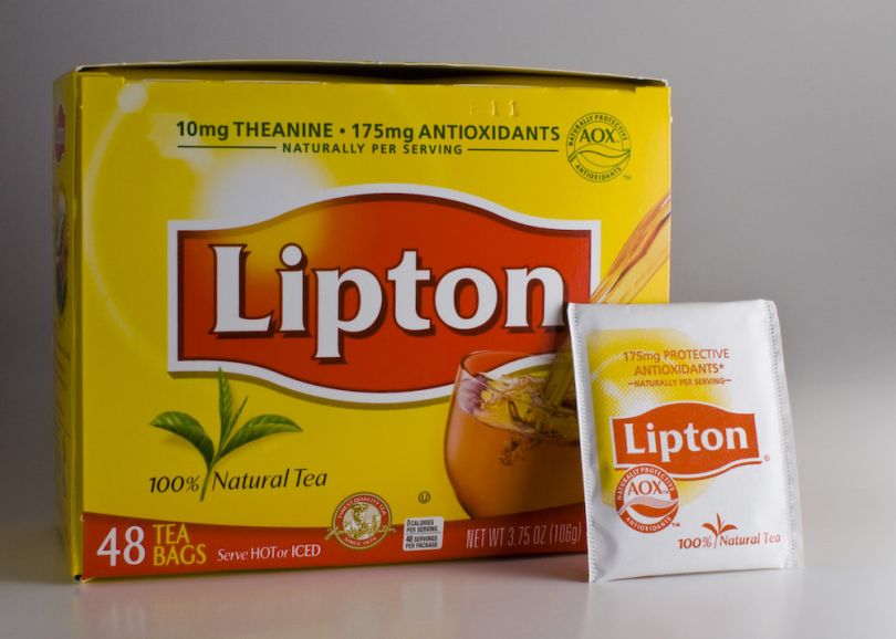
Lipton tea came to Sign Salad looking for answers as to why its tea bags, as sold in the packaging pictured above, weren’t moving. The bags brewed either cold or hot tea, but instead of communicating both options, the visual design muddled the two.
As Gordon pointed out, the cup — a teacup, not a tall tumbler — communicates hot tea, but there’s no steam. The height of the pour screams iced tea. (No one would pour hot tea so high.) But there’s no ice.
“Two of the key signifiers are not there,” and the restorative connotations that should be implied — the warm bath of hot tea, the cool swimming pool dip of iced tea — don’t register, Gordon said. “They were asking consumers to do an enormous amount of work.”
Lipton soon switched to two packages. One pictured a steamy hot teacup. The other sported an iced-tea pitcher, complete with ice cubes, a lemon slice and tea sloshing carefree. It brought clarity — while also differentiating Lipton from competitors who were similarly chasing a Frankenstein graft of contradictory elements — and helped recover lost market share, Gordon said.
Instant Coffee
Laura Oswald has written two books on semiotics marketing, and her firm has conducted analyses ranging from luxury branding in China to patronage of Chicago’s crown-jewel botanical conservatory. And, like Gordon, she’s helped a beverage brand fix its mixed signals.
An ad for an instant coffee featured an image of a woman sipping coffee, except her likeness was digitally stylized with superimposed coffee beans. The tagline — “gourmet in an instant” — and the woman’s gaze and flowing hair all suggested escape and fantasy, Oswald said.
Oswald’s semiotic survey of the coffee landscape unearthed the marketing imagery used by big brands (heavy with casual social gatherings), luxury brands (pleasure-focused, dream-like) and gourmet brands (connoisseurs drinking solo). Oswald picked up on elements of all three in the instant coffee ad — and, therefore, really none at all.
“When I see tension within an image, it’s like a nail on a blackboard,” Oswald said. Sure enough, consumers in testing felt the same.
The lesson? Bold aesthetics without clear context ring hollow. “The Clio archives are probably loaded with award-winning, beautiful ads that have failed with consumers” for that reason, Oswald said.
Video Ads
Apple: ‘Behind the Mac — Greatness’
Another celebrity-dotted clip, this ad illustrates how marketers can unite seemingly disparate signals to generate meaning. Consider it the flipside of our cognitively dissonant beverage examples.
As Gordon pointed out, the black-and-white still photography communicates both age-old sophistication and nostalgia for the pre-digital tangibility of analog — this for a company also associated with emergent tech.
There’s plenty more. Gordon noted the dependability of reliable old Tom Hanks juxtaposed with the youthful spark of Billie Eilish; images of artists playing off images of scientists; the classical, solitary craft of writing paired against a DJ hyping up the festival throngs. Saussure, fond of a chess analogy that stressed how pieces are valuable only in relation to others on the board, would surely approve.
It all adds up to a sense of progress, but rooted in a continuum.
Of course, few companies have pocketbooks and brand identification as deep as Apple, so good luck replicating such star-studded shorthand. Still, the semiotic richness speaks for itself.
Burger King: ‘The Moldy Whopper’
Thomas described something similar when we asked him for a semiotic dissection of one of 2020’s most lauded ads: a time-lapse clip of a Burger King Whopper decomposing into a moldy mess, meant to sell viewers on its lack of artificial preservatives. The ad does betray semiotic awareness; it’s riffing on fresh/rotten binaries. But the inversion doesn’t dispel our deep-seated negative associations, despite its visual panache and conceptual ambition, according to Thomas.
“All the ad does is yoke together the image of the brand and this disgusting, moldy thing,” he said.
Beats by Dre: ‘You Love Me’
Another one of last year’s most celebrated ads is rife with cultural awareness, in both allusion and big-picture focus. Released amid the racial justice protests of 2020, the clip addresses America’s contradictory love of Black culture and the systemic racism it perpetuates against Black people.
It includes celebrity athletes like Bubba Wallace and Naomi Osaka alongside figures like Black Lives Matter activist Janaya Future Khan, plus sequences of baby-hair styling and braiding, intimate acts that carry large cultural significance. The big half of the ad’s big/small dichotomy hits most dramatically with an unmistakably direct allusion: a white sheet, set ablaze, burnt to black.
Beats by Dre’s intended audience is accustomed to “forensically looking at culture” and therefore “alive to these nuances,” which makes the intimate/dramatic dynamic even more potent, Thomas said.
Physical Retail

Domino’s Pizza Theater
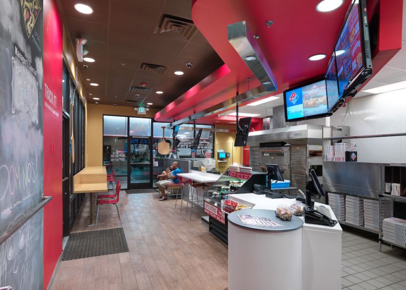
Oswald channeled an unlikely inspiration — the semiotics of theater — when she was asked to revamp the counter layout design at Domino’s. She drew on the idea of the proscenium, which delineates spectator and performer and naturally creates a sense of spectacle.
She also pulled from research on Disney World’s architectural layout. Buildings in the theme park seem to shrink smaller as guests walk through, helping maintain a sense of classical perspective while also making visitors feel immersed in the scene. That sensation “is where the whole consumer experience begins,” Oswald said.
Back at Domino’s — where the theater concept continues to expand — the oven, the pizza boxes, the ingredient spreads, everything is positioned to approximate a similar sense of immersion, Oswald said.
Arbitrariness and Archetypes
Semiotics hinges on the fact that signifiers rely on shared understandings to create meaning, but the relationships between the thing and what it communicates are also arbitrary. As a semiotician will remind you, language itself is arbitrary. There’s no semantic resonance, for instance, between words and the things they represent. The word “phone” isn’t shaped like a phone. The pronunciation doesn’t sound like a phone ringing. The relationship is random, but it works because we’ve all agreed on it.
It’s probably no surprise that the postmodernists had a field day with semiotics. There’s a scene in 24 Hour Party People in which Factory Records impresario Tony Wilson is grilled by a journalist about why Joy Division, the post-punk legends signed to his label, named themselves in reference to fascist abuses.
“Do you know nothing about the free play of signs and signifiers?” Wilson barks back, before pointing out that his label roster also includes a band whose name references a Spanish Civil War-era anarchist military division.
Marketers would be wise to pass on anything quite so provocative. But it raises a point: If meaning can be so quicksilver and so reliant on context, when is it clear that a desired meaning is actually being communicated?
“Although the expressions of ideas change pretty rapidly, I think the core concepts behind those expressions move much more slowly.”
Don’t let the postmodernists get you twisted. Semiotics also puts great stock in the resilience of archetypes, meaning our internal wiring is plugged into age-old symbols and narratives, many of which stretch back to ancient mythology.
“It’s as if our brain is a reservoir of archetypes and forms that we return to, and it’s in the combination of things that it changes, not in the things themselves,” Danesi said.
Thomas also recalled the many archives of semiotic evidence he’s presented to clients and how bedrock fundamentals tend to stay fixed.
“Although the expressions of ideas change pretty rapidly, I think the core concepts behind those expressions move much more slowly,” he said.
Semiotics Isn’t Just for Grad School Anymore
Despite the potential of semiotics in marketing, Gordon said some skepticism does indeed still exist. However, two decades of demonstrable ROI has helped assuage concerns. So has the sheer speed at which culture now moves and mutates. When meaning can shift in just 15 seconds, who wouldn’t take all the help they could get?
“We know that consumers aren’t always conscious of their motivations and the influences on those motivations.”
But it took some convincing. One big obstacle was marketers’ fixation on getting insights directly from consumers. That’s valuable, to be sure, but there’s sometimes a gulf between what consumers claim to favor and what they actually prefer, Gordon noted. Recall the old wine industry adage that says people drink sweet even though they’ve been conditioned to talk dry.
“We know that consumers aren’t always conscious of their motivations and the influences on those motivations,” Gordon said. “Their responses are often instinctively conscious responses to unconscious cultural conditioning.”
That said, part of the blame may lay on marketing-semiotics practitioners themselves. They didn’t always effectively translate the ideas from the jargony halls of the university into the business world, according to Gordon.
“Because a lot of semioticians are ex-academics, it’s taken us a long while to divest the methodology of its academic heritage and turn it into practical talk,” he said.
There’s an academic semiotics tool, for instance, called the Greimas square, which dates back to 1966 and remains prominent in marketing semiotics textbooks. But Gordon said he doesn’t expose clients to things like that, even though the square is still considered effective in its purpose — which is to chart out the relationship between oppositional terms. Think hot versus cold, or fresh versus rotten.
That ironic tension — between the reality of semiotics’ dense roots and the seemingly necessary desire to smooth it for broad consumption — is surely something a semiotician can appreciate, even if it might gnaw a bit.
Future Applications of Semiotics in Marketing
That said, semiotics is key to helping marketers enhance their research and campaigns.
Marketing revolves around the belief that consumers make choices based on complex relationships between feelings and ideas, objects, images and other factors. If marketers can decipher these connections, they can understand what drives consumers to make certain decisions and adjust their marketing strategies, campaigns and overall brands accordingly.
This process opens the door for marketers to make more accurate predictions about consumer behavior. Knowing how specific associations impact consumers’ emotions gives marketers insights into how to sway individual purchasing decisions and even anticipate how consumers could react to larger industry trends.
Semiotics can also support other developing technologies, most notably artificial intelligence. Ongoing research is exploring how semiotics can be used to study what facial signs consumers associate with intelligence and incorporate these expressions into digital AI faces. Marketers could one day apply this technology in the form of realistic AI-powered assistants and chatbots to provide a better customer experience.
As a result, marketing teams can expand their research, predictive and customer service capabilities when supplementing traditional marketing techniques with semiotics.


