

Dropdown menus are essential UI components that allow users to select one option from a list. In React Native, dropdowns can be implemented in various ways, depending on the design and user experience requirements.
3 Steps to Create a React Native Dropdown
- Create a dropdown component that toggles a modal.
- Render dropdown options inside the modal.
- Pass the selected value back to the parent.
Here, we’ll explore two approaches to creating dropdowns from scratch:
- Using a modal to display the dropdown.
- Inline display of the dropdown below a button or text field.
Before starting, ensure you have React Native set up in your project. You can install React Native using:
npx react-native init MyApp
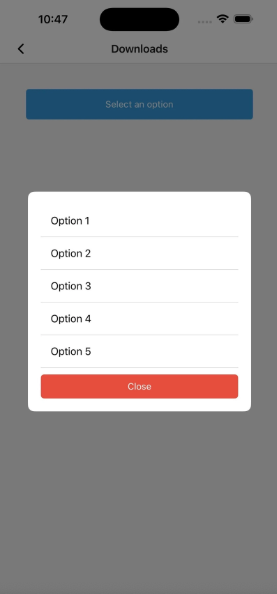
React Native Dropdown Using a Modal
The modal approach is useful in cases where you want the dropdown to take up the full screen or focus the user’s attention on the options.
Steps
- Create a dropdown component that toggles a modal.
- Render dropdown options inside the modal.
- Pass the selected value back to the parent.
Code
import React, { useState } from "react";
import {
  View,
  Text,
  Modal,
  TouchableOpacity,
  FlatList,
  StyleSheet,
} from "react-native";

const ModalDropdown = ({ data, onSelect }) => {
  const [isModalVisible, setModalVisible] = useState(false);
  const [selectedValue, setSelectedValue] = useState(null);

  const toggleModal = () => setModalVisible(!isModalVisible);

  const handleSelect = (item) => {
    setSelectedValue(item);
    onSelect(item);
    toggleModal();
  };

  return (
    <View style={styles.container}>
      <TouchableOpacity style={styles.button} onPress={toggleModal}>
        <Text style={styles.buttonText}>
          {selectedValue || "Select an option"}
        </Text>
      </TouchableOpacity>

      <Modal visible={isModalVisible} transparent animationType="slide">
        <View style={styles.modalBackground}>
          <View style={styles.modalContent}>
            <FlatList
              data={data}
              keyExtractor={(item, index) => index.toString()}
              renderItem={({ item }) => (
                <TouchableOpacity
                  style={styles.option}
                  onPress={() => handleSelect(item)}
                >
                  <Text style={styles.optionText}>{item}</Text>
                </TouchableOpacity>
              )}
            />
            <TouchableOpacity style={styles.closeButton} onPress={toggleModal}>
              <Text style={styles.closeText}>Close</Text>
            </TouchableOpacity>
          </View>
        </View>
      </Modal>
    </View>
  );
};

const styles = StyleSheet.create({
  container: {
    margin: 20,
  },
  button: {
    padding: 15,
    backgroundColor: "#3498db",
    borderRadius: 5,
  },
  buttonText: {
    color: "white",
    textAlign: "center",
  },
  modalBackground: {
    flex: 1,
    backgroundColor: "rgba(0, 0, 0, 0.5)",
    justifyContent: "center",
    alignItems: "center",
  },
  modalContent: {
    width: "80%",
    backgroundColor: "white",
    borderRadius: 10,
    padding: 20,
  },
  option: {
    padding: 15,
    borderBottomWidth: 1,
    borderBottomColor: "#ddd",
  },
  optionText: {
    fontSize: 16,
  },
  closeButton: {
    marginTop: 10,
    padding: 10,
    backgroundColor: "#e74c3c",
    borderRadius: 5,
  },
  closeText: {
    color: "white",
    textAlign: "center",
  },
});

export default ModalDropdown;
The component ModalDropdown is a reusable dropdown menu built with React Native.
- It uses
useStateto manage two states:isModalVisibleto control the visibility of the modal (dropdown).selectedValueto store the currently selected item.
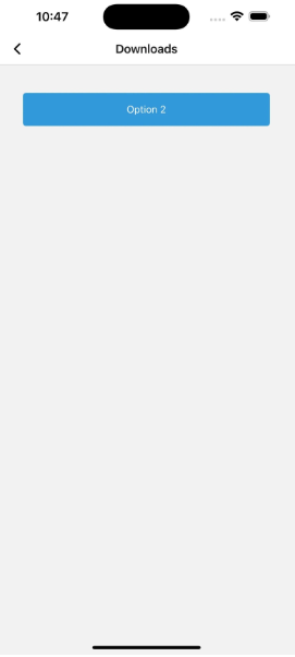
- A button displays the selected value or a placeholder (“Select an option”).
- When the button is pressed, it toggles a modal that appears as an overlay.
- The modal contains a
FlatListthat renders all options passed through the data prop. - When an option is tapped:
- It updates
selectedValue. - It calls the
onSelectfunction passed from the parent to inform of the selection. - It closes the modal.
- It updates
- A “Close” button is also provided inside the modal to dismiss it manually.
- Styling is handled through StyleSheet to define layout and appearance for buttons, modal and text.
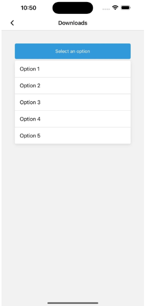
React Native Dropdown Displayed Inline
This design showcases the dropdown directly beneath a button or text field; it is incorporated into the screen layout very smoothly.
Steps
- Use a
TouchableOpacityto toggle the visibility of the dropdown. - Dynamically position the dropdown list below the button.
- Use
FlatListto render the options.
Code
import React, { useState } from "react";
import {
  View,
  Text,
  TouchableOpacity,
  FlatList,
  StyleSheet,
} from "react-native";

const InlineDropdown = ({ data, onSelect }) => {
  const [isDropdownVisible, setDropdownVisible] = useState(false);
  const [selectedValue, setSelectedValue] = useState(null);
  const toggleDropdown = () => setDropdownVisible(!isDropdownVisible);
  const handleSelect = (item) => {
    setSelectedValue(item);
    onSelect(item);
    setDropdownVisible(false);
  };
  return (
    <View style={styles.container}>
      <TouchableOpacity style={styles.button} onPress={toggleDropdown}>
        <Text style={styles.buttonText}>
          {selectedValue || "Select an option"}{" "}
        </Text>
      </TouchableOpacity>
      {isDropdownVisible && (
        <View style={styles.dropdown}>
          <FlatList
            data={data}
            keyExtractor={(item, index) => index.toString()}
            renderItem={({ item }) => (
              <TouchableOpacity
                style={styles.option}
                onPress={() => handleSelect(item)}
              >
                <Text style={styles.optionText}>{item}</Text>{" "}
              </TouchableOpacity>
            )}
          />
        </View>
      )}
    </View>
  );
};
const styles = StyleSheet.create({
  container: {
    margin: 20,
  },
  button: {
    padding: 15,
    backgroundColor: "#3498db",
    borderRadius: 5,
  },
  buttonText: {
    color: "white",
    textAlign: "center",
  },
  dropdown: {
    marginTop: 5,
    backgroundColor: "white",
    borderRadius: 5,
    elevation: 3,
    shadowColor: "#000",
    shadowOpacity: 0.1,
    shadowRadius: 5,
    shadowOffset: { width: 0, height: 2 },
  },
  option: {
    padding: 15,
    borderBottomWidth: 1,
    borderBottomColor: "#ddd",
  },
  optionText: {
    fontSize: 16,
  },
});

export default InlineDropdown;
- The component
InlineDropdownis a dropdown menu rendered inline, not in a modal. - It uses
useStateto track:isDropdownVisible: controls whether the dropdown list is shown or hidden.selectedValue: stores the currently selected item from the dropdown.
- A button displays the selected value or a placeholder text (“Select an option”).
- When the button is pressed:
- The dropdown list toggles between visible and hidden.
- If the dropdown is visible:
- A
FlatListshows all items passed through the data prop. - Each item is rendered as a touchable option.
- A
- When an item is selected:
- The selected value is stored in selectedValue.
- The
onSelectcallback is called to inform the parent component. - The dropdown is hidden.
- The component is styled using StyleSheet to:
- Define the layout and look of the button, dropdown box and options.
- Add visual depth with shadows and spacing to make the dropdown list appear layered.
What’s the Best Approach to Create a React Native Dropdown?
Different use cases are suited for modal and inline dropdowns in React Native. While the modal approach is effective for scenarios requiring a focused user interaction, the inline dropdown is ideal for scenarios where a seamless, lightweight experience is desirable.
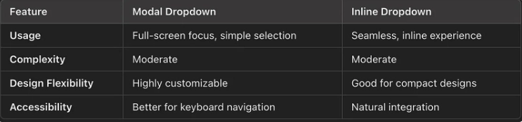
You can thus implement either of these approaches using the code above or customize them to suit your application needs.
Frequently Asked Questions
How do you create a dropdown in React Native?
There are two options to create a dropdown in React Native: Using a modal display or an inline display.
The modal can be completed with the following steps:
- Create a dropdown component that toggles a modal.
- Render dropdown options inside the modal.
- Pass the selected value back to the parent.
The inline display can be completed with the following steps:
- Use a
TouchableOpacityto toggle the visibility of the dropdown. - Dynamically position the dropdown list below the button.
- Use
FlatListto render the options.
Which method is better to create a dropdown in React Native?
Both the modal and inline dropdown options are effective depending on the use-case. The modal approach is effective for scenarios requiring a focused user interaction, while the inline is effective for creating a seamless user experience.


