Everyone has thoughts and feelings, habits and rituals, frustrations and aspirations.
Since UX professionals design for the user, they have to find ways to see the world through their eyes. And one handy exercise that guides them through that process is empathy mapping.
Empathy mapping helps UX professionals articulate what’s in the user’s head — based on information gathered in the initial research phase — before advancing to the next stage of design.
What Is Empathy Mapping?
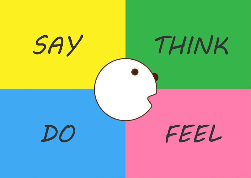
The most common way to create an empathy map is to make a four-quadrant visualization, and in each quadrant list out what the user says, thinks, does and feels. This process clarifies the attitudes and behaviors of the user, which informs design decisions.

How to Create an Empathy Map
Empathy mapping takes place near the beginning of the design process, after initial user research is done. Here’s how to do it:
1. Gather user research. If there are multiple personas, each one needs its own empathy map.
2. Get a whiteboard (or a large paper pad), sticky notes and a marker. Divide the canvas into four quadrants: say, think, do and feel.
3. Fill out each section with the following information:
The Empathy Map Quadrants
- Say — Things a specific user says. This can be in the form of direct quotes from a user research interview, or things that a user could be imagined saying.
- Think — Thoughts the user might have, especially throughout the experience. What might the user be thinking that they didn’t verbalize?
- Do — Behaviors the user demonstrates, and actions the user takes during the experience. This could be what the user has been observed doing, or things that a user can be imagined doing.
- Feel — Emotions the user experiences. What is the user encountering that’s causing them to feel that way?
Some versions of empathy maps include an additional section, called Pains and Gains, allowing for a more focused list of the user’s frustrations and aspirations.
Dave Gray, the empathy map’s originator, created an updated version of his empathy map so teams can begin the exercise with more clearly defined goals. In this new version, empathy mapping starts out with answering questions like:
- “Who is the person we want to understand?”
- “What situation are they in?”
- “What do they need to get done?”
- “How do we know they’ve been successful?”
Why Create an Empathy Map?
Empathy mapping is a quick, inexpensive and effective way for designers to walk a mile in the user’s shoes. The visual snapshot of the user’s point of view provides a focal point from which to design.
Empathy mapping also creates shared understanding of the user among stakeholders. This might include the designer’s colleagues, such as product developers, salespeople and marketers — and clients, if the designer works for an agency.
“Sometimes, [empathy mapping] ends up being a lot more beneficial for the business owners themselves than it is even for us,” said Kelly Cunningham, user experience designer at Fuzzy Math, a UX design consultancy.
The Difference Between Empathy Maps, User Personas and User Journey Maps
- Empathy maps are used to visually articulate a user’s attitude and behaviors.
- User personas are archetypal profiles that summarize a user’s description, interests and goals. They are more detailed than empathy maps and are often depicted as a specific person.
- User journey maps, or customer journey maps, show how a user interacts with the product or service at every step of the experience. Unlike empathy maps, they are linear, chronological.
Fuzzy Math’s user experience designers typically facilitate an empathy mapping session as part of their client kickoff calls, which take place after they have familiarized themselves with the product, company and stakeholders. The designers listen to what the clients think their users want and need.
It is sometimes revealed during the empathy mapping session that various stakeholders had different ideas about what the user’s needs and wants were.
“It’s not often you force people to stop and try to empathize with their users,” said Jon Tinman, who is also a user experience designer at Fuzzy Math. He added that empathy mapping is an effective way for people who typically operate in their own silos — and have their own ideas about what users are like — to get in the same room and get on the same page, so they can start thinking similarly (and correctly) about the user. It simply slows everyone down — in a good way.
“There’s a chance that different stakeholders might jump immediately into what they want out of the product, or they might immediately start talking about constraints, or you might start talking about timelines,” Tinman said. “Doing this empathy map as early as possible in the process is the best way to have everybody stop, take a moment and really think about the person you’re designing for.”
The process of empathy mapping is in itself beneficial. It grounds the designer and stakeholders in the mindset of the user. “The most important part of an empathy map is not the end result of what you’ve created,” Tinman said. “It’s the discussion that you have around creating that empathy map.”
Plus, empathy maps are useful documents to refer back to throughout the design process.


