
")
Outlier detection is the process of identifying extreme data values in a data set. It has applications across a wide variety of industries, including finance, insurance, cybersecurity and healthcare.
How to Find Outliers in Data
To find outliers in a data set, use statistical methods such as z-score, interquartile range (IQR), DBSCAN or visual techniques like box plots and scatter plots.
A z-score identifies outliers as values more than three standard deviations from the mean, while the IQR method flags values outside 1.5 times the interquartile range. Visual tools help spot unusual data points that deviate from expected patterns.
Given that outlier detection has many important applications across industries, data scientists interested in working in these fields need to have a solid understanding of the state of the art methods and tools for conducting such analysis.
Approaches and Methods for Finding Outliers
There are many approaches to outlier detection, and each has its own benefits. Two widely used approaches are descriptive statistics and clustering.
1. Descriptive Statistics
Descriptive statistics are a way to quantitatively describe a feature in a data set using summary statistics. This includes calculations such as such a mean, variance, maximum and minimum and includes graphical representations such as boxplots, histograms and scatter plots.
Z-Score
Z-score, or standard score, is a statistical measurement that describes a data point’s relationship to the mean of a data set. In particular, it represents how many standard deviations a given value is from the mean, making it useful for identifying outliers.
The formula for calculating z-score is z = (x - μ) / σ, where:
- x = the data point
- μ = mean of the data set
- σ = standard deviation
A positive z-score means the data point is above the mean, while a negative z-score indicates it is below the mean. A z-score of 0 indicates the data point is exactly at the mean.
In a normal distribution, approximately:
- 68 percent of data falls within 1 standard deviations of the mean (z-scores between -1 and 1)
- 95 percent of data falls within 2 standard deviations of the mean (z-scores between -2 and 2)
- 99.7 percent of data falls within 3 standard deviations of the mean (z-scores between -3 and 3)
In the context of outlier detection, a data point with a z-score greater than 3 or less than -3 is often considered an outlier because it falls in the extreme tails of the distribution.
Interquartile Range (IQR)
A common approach for detecting outliers using descriptive statistics is the use of interquartile ranges (IQRs). This method works by analyzing the points that fall within a range specified by quartiles, where quartiles are four equally divided parts of the data. In general, it is a good way to analyze and measure the spread of data.
Although IQR works well for data containing a single shape or pattern, it is not able to distinguish different types of shapes or groups of data points within a data set.
IQRs are defined in terms of quartiles, meaning four equally divided groups of data.
- First quartile (Q1) corresponds to the value where 25 percent of the data is below this point.
- Second quartile (Q2) is the median value of the data column. 50 percent of the data in this column falls below this value.
- Third quartile (Q3) is the point where 75 percent of the data in the column falls below this value.
- IQR is the difference between the third quartile (Q3) and the first quartile (Q1).
After calculating the first and third quartiles, calculating the IQR is simple. We simply take the difference between the third and first quartiles (Q3 minus Q1). Once we have the IQR, we can use it to detect outliers in our data columns.
Using IQR to detect outliers is called the 1.5 x IQR rule. Using this rule, we calculate the upper and lower bounds, which we can use to detect outliers. The upper bound is defined as the third quartile plus 1.5 times the IQR. The lower bound is defined as the first quartile minus 1.5 times the IQR.
It works in the following manner:
- Calculate upper bound: Q3 + 1.5 x IQR
- Calculate lower bound: Q1 - 1.5 x IQR
- Calculate outliers by removing any value less than the lower bound or greater than the upper bound.
2. Clustering
Clustering techniques are a set of unsupervised machine learning algorithms that group objects in a data set together such that similar objects are in the same group.
Fortunately, clustering techniques address the limitations of IQR by effectively separating samples into different shapes.
DBSCAN (Density-Based Spatial Clustering of Applications With Noise)
A commonly used clustering method for outlier detection is DBSCAN (density-based spatial clustering of applications with noise), which is an unsupervised clustering method that addresses many of the limitations of IQR.
DBSCAN works by identifying groups of data points that are densely packed together (the more nearby neighbors, the higher the cluster density), and then identifies outliers as data points that fall outside of any densely packed cluster. Unlike IQR, DBSCAN is able to capture clusters that vary by shape and size.
Using Pandas in Python to Find Outliers
The quantile() method in Pandas allows for easy calculation of IQR.
For clustering methods, the Scikit-learn library in Python has an easy-to-use implementation of the DBSCAN algorithm that can be easily imported from the clusters module. This ease of use is especially ideal for beginners since the Scikit-learn packages allow users to work with a default algorithm that requires minimal specifications from the data scientist. Further, the interface for each of these algorithms allows users to easily modify parameters for quick prototyping and testing.
We will work with the credit card fraud detection data set. We will apply IQR and DBSCAN to detect outliers in this data and compare the results. This data has an Open Database License and is free to share, modify and use.
Reading Data in Python
Let’s start by importing the Pandas library and reading our data into a Pandas DataFrame:
import pandas as pd

df = pd.read_csv("creditcard.csv")
Next, let’s relax the display limits for columns and rows using the Pandas method set_option():
pd.set_option('display.max_columns', None)
pd.set_option('display.max_rows', None)
For demonstration purposes, we’ll work with a downsampled version of the data:
df = df.sample(30000, random_state=42)
df.to_csv("creditcard_downsampled5000.csv")
Now, let’s display the first five rows of data using the head() method:
print(df.head())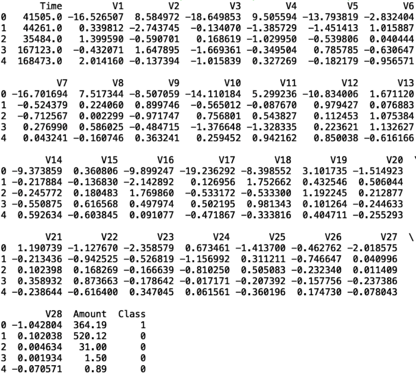
As we can see, the data set has columns V1 through V28, which reflects 28 principal components generated using features corresponding to transaction information. Information about the original features is not public due to customer confidentiality.
The data also contain the transaction amount, the class (which corresponds to the fraud outcome: one for fraud, zero otherwise), and time, which is the number of seconds between each transaction and the first transaction made in the data set.
How to Find Outliers in Pandas Using Interquartile Range (IQR)
Let’s perform an IQR operation on the V13 column in our data.
1. Create a Boxplot to Visualize IQR
To start, let’s create a boxplot of our V13 column. I chose V13 because the IQR for this data column in our boxplot is easy to see. Boxplots are a useful way to visualize the IQR in a data column.
We can use three simple lines of code to generate a boxplot of V13:
import seaborn as sns
sns.set()
sns.boxplot(y = df['V13'])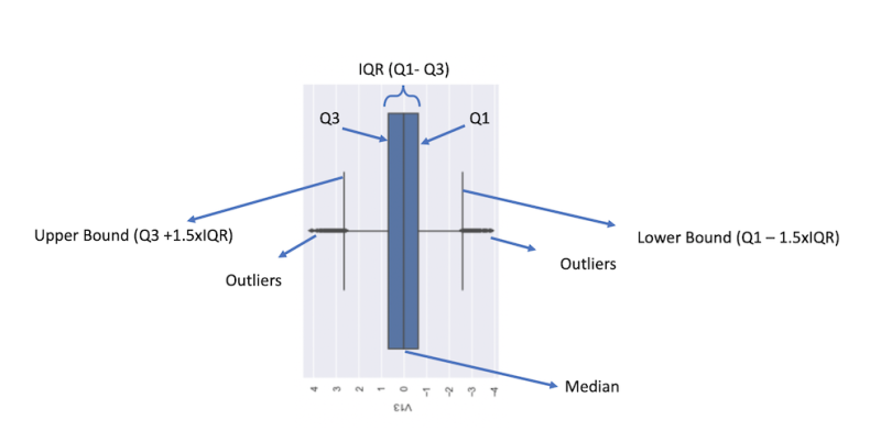
We can see here that we get a great deal of information condensed into one plot. Likely, the first thing we’ll notice is the blue box, which corresponds to the IQR. Within the blue box, a vertical black line corresponds to the median. The left and right edges of the blue box correspond to Q3 and Q1, respectively. The furthest left and furthest right vertical black lines correspond to the upper and lower bounds, respectively. Finally, the black dots on the far left and right correspond to outliers. We can use the values of the upper and lower bounds to remove the outliers and then confirm they have been removed by generating another box plot.
2. Calculate Q1 and Q3 Using Quantile()
First, let’s calculate the IQR for this column, which means we first need to calculate Q1 and Q3. Luckily, Pandas has a simple method, called quantile(), that allows us to do so.
To calculate Q1, we call the quantile() method with the parameter input 0.25 (for 25th percentile):
Q1=df['V13'].quantile(0.25)
print("Q1:", Q1)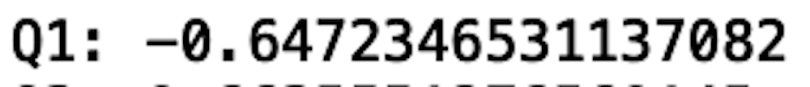
We see that the first quartile (Q1) is -0.64. This means that only 25 percent of the data in the V13 column is below -0.64.
To calculate Q3, we call the quantile() method with the parameter input 0.75 (for 75th percentile):
Q3=df['V13'].quantile(0.75)
print("Q3:", Q3)
We see that the third quartile (Q3) is 0.66. This means that 75 percent of the data in the V13 column is below 0.66. And the IQR is simply the difference between Q3 and Q1: IQR=Q3-Q1
3. Calculate IQR
From here, we can define a new Pandas series that contains the V13 values without the outliers:
IQR=Q3-Q1
print("IQR: ", IQR)
We see that the IQR is 1.3. This is the distance between Q3 and Q1.
4. Calculate Upper and Lower Data Bounds
From here, we can calculate the upper and lower bounds. The lower bound is Q1 - 1.5 x IQR:
lower_bound = Q1 - 1.5*IQR
print("Lower Bound:", lower_bound)
We see that the lower bound is -2.61. Therefore, any value below -2.61 is an outlier.
The upper bound is Q3 + 1.5 x IQR:
upper_bound = Q3 + 1.5*IQR
print("Upper Bound:", upper_bound)
We see that the upper bound is 2.62. As a result, any value above 2.62 is an outlier.
5. Use Upper and Lower Bound Values to Find and Remove Outliers
So, our method of removing outliers for this column is to remove any value above 2.62 and below -2.61:
df_clean = df[(df['V13']>lower_bound)&(df['V13']<upper_bound)]6. Display Cleaned Data
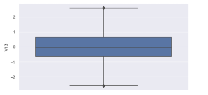
We can now plot the cleaned data, which has no outliers:
df_clean = df[(df['V13']>lower_bound)&(df['V13']<upper_bound)]
sns.boxplot(y = df_clean['V13'])
We see that the points outside of the upper and lower bounds have been removed:
Although this method is useful for removing outliers in single columns, it has some significant limitations. The biggest limitation is an inability to capture different shapes within our data. For example, a point in a column may not be an outlier in a one-dimensional boxplot, but it may become an outlier in a two-dimensional scatter plot.
To understand this, consider the median income in the U.S.: At the time of writing, it’s $44,225. Although this value falls within the IQR of all incomes in the U.S., it may qualify as an outlier if we consider other factors. For example, $44,225 would probably be an outlier income for doctors in the U.S. who have been practicing for 10 years. In order to capture different shapes in our data that can describe situations like this, clustering is a better approach.
How to Find Outliers in Pandas Using DBSCAN
Let’s use DBSCAN to identify outliers in the data we have been working with.
1. Create a Scatter Plot of Data Columns
To start, let’s visualize some clusters to get an idea of how the algorithm works. Let’s generate a scatter plot of columns V13 versus V14:
sns.scatterplot(df['V13'], df['V14'])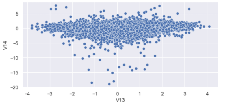
We see that we have a pretty densely packed cluster with many outlier points far from it. Interestingly, some outlier points in this two-dimensional space would have fallen into the IQR of V13 and erroneously stayed in the data. Look at the points in the plot close to zero for V13 and -20 for V14. The values of V13 are fine, whereas V14 values are outliers. This makes those points outliers.
Although we could have removed outliers from both V13 and V14 to remedy this, doing so for each column becomes laborious, especially if you’re working with dozens of features.
Let’s see how we can use clustering to do better than the IQR method.
2. Import DBSCAN From Scikit-Learn
Let’s import the DBSCAN algorithm from Scikit-learn:
from sklearn.cluster import DBSCAN3. Define Training Data
Next, let’s define our training data. Let’s consider columns V13 and V14:
X_train = df[['V13', 'V14']]4. Fit Clustering Method to Training Data
Now, let’s fit our clustering method to the training data. To keep it simple, let’s keep the default values by leaving the input parameters empty:
model = DBSCAN()
model.fit(X_train)
5. Create a Scatter Plot to Label Outliers
Let’s generate a scatter plot where we will label the outliers:
cluster_labels = model.labels_
plt.scatter(df["V13"], df["V14"], c = cluster_labels)
plt.show()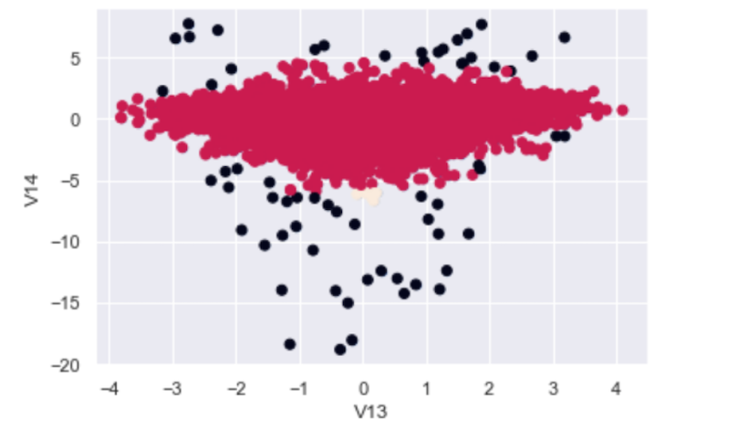
We see that the algorithm does a great job at labeling the outliers, and even the ones the IQR method would have missed. The black dots in the scatter plot correspond to V13/V14 2D outliers while the red dots are good data points.
6. Store Cluster Labels in New Pandas DataFrame
Now, we can easily remove these outliers based on these cluster labels. Let’s store the cluster labels in a new column in our data frame:
df['labels'] = cluster_labels7. Remove Outliers by Removing Data Labeled With -1 Value
Next, let’s remove the outliers. Scikit-learn’s DBSCAN implementation assigns a cluster label value of -1 to noisy samples (outliers). We can easily remove this values and store the cleaned data in a new variable:
df_cluster_clean = df[df['labels'] != -1]8. Display Cleaned Data
Now, let’s plot our cleaned data:
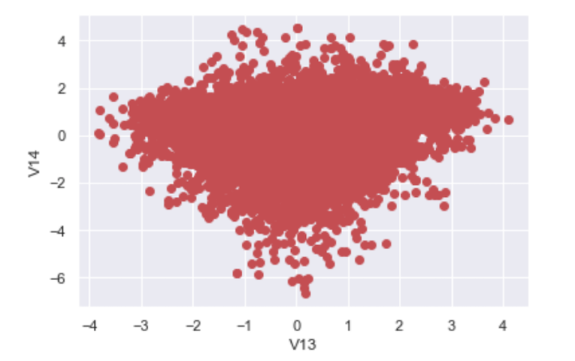
We see that we no longer have the outlier points in our original data. Most importantly, outliers that the IQR method missed when we were only looking at V13 are also removed.
It’s worth noting that we’ve only considered outliers in two dimensions. Visualization with more than three dimensions becomes increasingly difficult. Despite this, methods like DBSCAN are able to detect outliers in data containing many more dimensions than we can visualize or interpret, which is great news. When it comes to outlier detection in high-dimensional spaces, clustering is truly the superior method.
The code in this post is available on GitHub.
When to Use IQR vs. DBSCAN for Outlier Detection
When considering which methods to choose, the data scientist should have a good understanding of the data at hand.
If the data is simple and contains very few columns, IQR should work well.
If the data contains many columns, there is a high likelihood there are shapes and patterns in the data that can’t be captured with IQR. For this reason, when considering the task of outlier removal in high-dimensional spaces, clustering methods like DBSCAN are a good choice.
Why Is Outlier Detection Important?
Outlier detection and removal is an important part of data science and machine learning. Outliers in data can negatively impact how statistics in the data are interpreted, which can cost companies millions of dollars if they make decisions based on these faulty calculations. Further, outliers can negatively impact machine learning model performance, which can lead to poor out of sample performance. Poor machine learning model performance is a big concern for many companies since these predictions are used to drive company decisions.
Finding outliers is important across almost every data-driven industry. In finance, for example, it can detect malicious events like credit card fraud. In insurance, it can identify forged or fabricated documents. In cybersecurity, it is used for identifying malicious behaviors like password theft and phishing. Finally, outlier detection has been used for rare disease detection in a healthcare context.
For these reasons, any data science team should be familiar with the available methods for outlier detection and removal.
Frequently Asked Questions
What is an outlier in a data set?
An outlier is a data point that significantly differs from other observations in a data set. It may result from measurement or entry errors, or it could be a valid value that is simply rare or extreme.
Why is it important to detect outliers in data science?
Detecting outliers is important because they can skew statistical analyses and lead to misleading results. Identifying them helps analysts decide whether to investigate, remove or retain them based on the context.
What are common methods to identify outliers?
Common methods to identify outliers include visual inspection, the z-score method, the interquartile range (IQR) method, box plots and scatter plots. These methods help detect unusual values that fall outside expected patterns.
How do you use a z-score to detect outliers?
A z-score measures how far a data point is from the mean in terms of standard deviations. Typically, a data point with a z-score greater than 3 or less than -3 is considered an outlier.


