There are hopeful signs that social distancing is slowing the spread of influenza, and quite possibly COVID-19 as well. In the United States, observed county-level influenza-like illnesses as measured by smart thermometer technology from the San Francisco-based start-up Kinsa Health are lower than in previous years and declining in areas where strict social distancing policies, from restaurant and bar closures to physical separation guidelines, are being enforced.
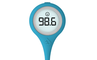
Kinsa Smart Thermometer
“All the stuff we’re doing is slowing the spread. People might not be sick, they may not know someone who is sick, and say ‘why are we doing this.’ The short answer is our collective efforts are working. We’re seeing a decrease in levels of [febrile] illness across the country and together we’re going to be able to stop the spread of the coronavirus,” said Nita Nehru, a Kinsa spokesperson.
That’s one of the many heartening stories from the Pandemic Response Hackathon hosted by the San-Francisco based middleware company Datavant, along with Kinsa, tech giants AWS and Snowflake, as well as public-health organizations including the Health and Human Services Office of the National Coordinator Health IT and the American Public Health Association.
“We’re seeing a decrease in levels of [febrile] illness across the country and together we’re going to be able to stop the spread of the coronavirus.”
The weekend-long event, which opened Friday, March 27, at 4 p.m. with remarks from former Senator Tom Daschle of South Dakota and concluded Sunday at 9 p.m., brought together some 2,000 technologists and public-healthcare experts to collaborate on 230 technology-based responses to the coronavirus pandemic. These ideas, shared in a Slack channel and on a live message board, ranged from crowdsourced geomaps, to public-health information reporting tools, to logistics protocols for medical equipment production and delivery.
“For me, clearly, crowdsourcing to help track disease is an amazing opportunity,” said Georges Benjamin, executive director of the American Public Health Association. “Data tracking using temperatures themselves, and then self-reported symptoms are two tools that have gone way beyond proof of concept and will help us do disease surveillance for infectious diseases in the future, for sure, and possibly for chronic diseases as well.”

Throughout the event, Kinsa provided API access to its new online “Health Weather” map of the United States. The website aggregates fever data from one million internet-connected thermometers, along with flu-like symptoms such as coughs and sore throats that users self-report on a mobile app. As of Monday morning, Nehru said, Kinsa data showed that, across the country, fever incidence is lower than expected for this time of year, about 1.5 to 2 percent of the population compared to 3 percent in a typical year, a signal that social distancing is working.
“Almost everywhere, what we’re observing are numbers much lower than forecast. Because people are not interacting, we’re seeing a lot less illness,” Nehru said. “To be clear, we are not suggesting, in the near term, coronavirus cases are going down. Before measures were enacted, people were already infected and asymptomatic, so they will be presenting symptoms in one to two weeks. But overall febrile illness — colds and flus — is going down.”

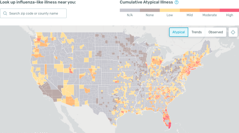
The “atypical” mode of the map visualization charts where observed flu-like symptoms since March 1 diverge from cumulative seasonal expectations. Atypical illness has nothing to do with a singular illness episode or anything that an individual would enter on the app, Nehru explained in an email. Rather, it is calculated by subtracting the expected level of illness in a geography at this time of year from the observed level of illness in that same geography.
“For example, if we expect Utah to have an illness level of 2.5 percent in the first week of April, but what we observe is actually 4 percent, that means 1.5 percent is what we would deem atypical (4 percent observed minus 2.5 percent expected). We suspect that areas with illness levels that are higher than expected may be early indicators of community spread of COVID-19,” Nehru wrote.
While there are many publicly available COVID-19 trackers and dashboards, including notable ones like those developed by the New York Times and the Center for Systems Science and Engineering at Johns Hopkins University, most focus on confirmed cases, which can emerge weeks after onset or even later where diagnostic tests are in short supply.
“Our map is actually entirely different — we are not tracking confirmed coronavirus cases,” Nehru said. “The goal is to create a system that helps identify where the illness may be starting to fan and spread in real time.”
“Our map is actually entirely different — we are not tracking confirmed coronavirus cases.”
It should be noted there is a risk of selection bias in data collected from a consumer product. John Ioannidis, a professor of medicine and professor of epidemiology and population health at the Stanford University School of Medicine points this out in a widely circulated article in Stat News: “The data collected so far on how many people are infected and how the epidemic is evolving are utterly unreliable.... The most valuable piece of information for answering those questions would be to know the current prevalence of the infection in a random sample of a population and to repeat this exercise at regular time intervals to estimate the incidence of new infections. Sadly, that’s information we don’t have.”
Still, medical experts, including Jennifer Radin, an epidemiologist with the Digital Medicine Division at Scripps Research Translational Institute, say the speed at which Kinsa’s smart thermometers can track influenza, about one to three weeks ahead of Centers for Disease Control and Prevention data, make it useful as a tool to alert public-health officials of areas where high fever levels may indicate community spread of COVID-19.
“[Viral outbreaks] could be the results of many infections [not necessarily COVID-19],” Radin said. “But influenza-like illness is a good indicator of where something might be happening. Public-health responders can look at areas of increased fever activity and use this as an incentive to spur those on the ground to look at what is going on.”
In recent weeks, Kinsa’s fever incidence map, Nehru said, has served as an indicator of emerging COVID-19 hotspots, such as the Florida coast, where spring breakers consciously or unwittingly flouting social distancing recommendations reveled on beaches in mid-March. “To take Florida as an example, it was almost double what you would expect, which is very unusual. It shouldn’t be that far off, even if our forecasts are off,” Nehru said.
For public-health and government officials monitoring fast-moving diseases, real-time awareness of such atypical fever patterns can be extremely valuable. “If you know where and when illness is starting and spreading, you can take the appropriate measures. You can send virologists in to investigate what the illness might be, you can alert hospitals and clinics to help with staffing, deploy medical supplies and additional resources, and take any public-health measures deemed necessary to slow the spread,” Nehru wrote.

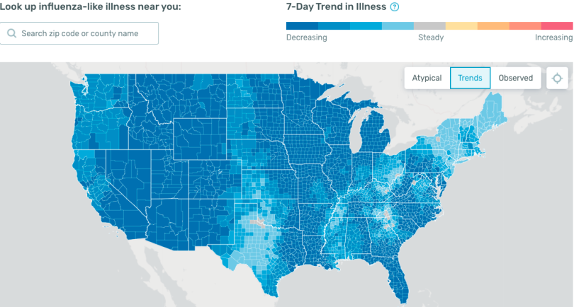
Even more intriguing than the spike in fevers Kinsa data showed in late February and much of March is what is now happening in the “trends” mode of the visualization tool: Over the past seven days, reports of influenza-like symptoms in every state across the country are on the decline, Nehru said.
“If you look at the ‘trends map,’ the entire country is blue. I’m in California and the levels of illness are low; the map is blue, meaning cases of colds and flus are going down,” Nehru said. “All the inconveniences we are going through: Kids are home, people can’t work, they can’t go see their parents; it’s not easy, but we can do this.”
John Regan, the city manager of St. Augustine, Florida, concurs. He shared with Built In a graph based on Kinsa data comparing the influenza trajectories of Santa Clara, California, and Miami-Dade, Florida. The visualization suggests Santa Clara’s early declaration of a state of emergency and rapidly enacted work-from-home guidelines and prohibitions of large public gatherings have led to a downward arc in the influenza curve. Where similar restrictions were imposed much later in Miami-Dade, the trajectory has continued to track upward.
“The key to controlling disease is sentinel monitoring, early detection, and rapid intervention.”
Until recently, Regan said, lack of available data regarding the coronavirus has placed city leaders in a compromising position. Enacting strict social distancing policies without clear data to support their efficacy riles members of the business community who often face harsh economic repercussions as a result. When he canceled St. Augustine’s planned community festivals on March 12, and subsequently banned alcohol sales and closed the city’s tourism transportation network, Regan faced stiff opposition from festival organizers and restaurant owners. At the time, there had been 981 completed coronavirus tests in a state of 22 million people.
“They asked me what data are you basing this decision on. My answer was an absence of data, at that moment,” he said.
Now, that is changing. Regan, an environmental engineer by training, is spearheading a pilot project in collaboration with Nirav Shah, a senior scholar at Stanford University’s Clinical Excellence Research Center and research advisor to Kinsa, to purchase and distribute 600 Kinsa smart thermometers in St. Augustine to create “a more advanced sentinel network for monitoring so that we can have rapid response when we see jumps in fever and be moving more quickly.”
The Kinsa thermometers are currently sold out, he said, but expected to arrive by mid-April.
“The whole thing made sense to me. The key to controlling disease is sentinel monitoring, early detection and rapid intervention,” Regan said. “That’s the basis of epidemiology to control disease. That’s what we’ve been missing in Florida and the national level, the data people in government and decision making can use.”


