The socially distanced holiday season is upon us. In a time where large crowds are strictly prohibited, and many shoppers face anxiety at the thought of going out to procure a holiday haul, e-commerce continues to reign supreme.
But just because online shopping is ubiquitous doesn’t mean every experience is automatically up to snuff. Consider the increased traffic over the next several weeks as a call to amend flaws in the experience you offer.
Design for Recognition, Not Recall
Discounts, flash sales, and coupon codes are one of the most appealing aspects of online shopping. In person, stores often require shoppers to sign up for circulars or loyalty programs to garner discounts. Online, websites and browser extensions turn the entire internet into a (somewhat dicey) smorgasbord of discounts.
But the best approach is for companies to include a coupon directly onto their site. Many sites already do this — when you land, splashy text and images invite you to save big if you shop today using the code they’ve embedded on the image.
The big question, however, is what happens to that code later on in the experience? The way a site’s design approaches coupon codes could create lasting pain points for users. Depending on the website, some e-retailers seem to build their experiences for recall rather than recognition.
Due to humans’ limited ability to handle cognitive load and limited short-term memory, recognizing information that’s already been seen is much easier than remembering information from a short period of exposure. Yet many e-commerce sites often offer a coupon code that is only seen on the homepage. As shoppers traverse product pages and descriptions, the code is usually nowhere to be found. Then, at the checkout page, a box usually prompts users to input a coupon code if they have one.
These deviations, purposeful or not, simply create headaches for users. After the amount of time your shopper has invested in filtering and searching for products, asking them to go back to the start just to copy and paste or — heaven forbid — manually write down a code to use at checkout is simply disrespectful.
One site, ThredUp, goes above and beyond in promoting user recognition. Not only do they keep a consistent banner with a coupon code end to end in the user’s shopping journey, but they also programmatically update the prices of the items using the code inline as the person shops. Customers are enticed not only by a hefty percentage off as a concept, they see in real time how much the code is saving them — all the way through until the end. It’s an example of how up-front a company can be about saving their shoppers money.
To implement a similar strategy, lead with a user-centered approach to coupons and discounts. If there are any reservations within your company about pushing deep discounts to the forefront, remind those concerned that the delight and value delivered in an experience can breed loyalty in a customer base.
Make Expertise Accessible
The bespoke shopping experience is one that has truly suffered due to recent digital-first retail experiences. Replicating the expertise of specialists, some of whom spent years of their time and energy understanding the nuances of products, can feel daunting online. The key is to meet users where they are.
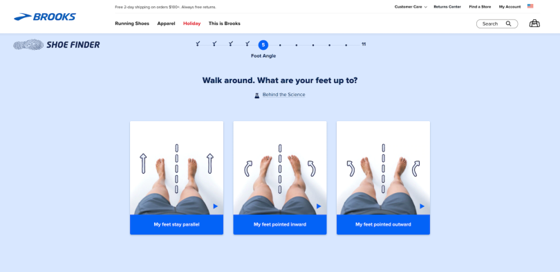
Brooks, a retailer of premium running shoes, offers an incredible example with its shoe finder. The quiz is a guided experience that walks users through a series of questions and exercises to assess which style of shoe best fits their anatomy and goals.

The experience is remarkable not because it has a clear and accessible goal (obtain enough self-reported information to reliably recommend a shoe), but because it does not aim to turn the user into an expert at running shoes. In fact, it’s shockingly free of jargon. Instead, the designers chose to use illustrations, videos, and simple language. This allows the user to mindfully engage in giving good information, which feeds into more personalized recommendations.
Quizzes, videos, infographics, and illustrative examples can make the daunting experience of shopping for highly customized or individualized items into a pleasurable one. Moreover, highly visual and elegantly simplified information helps users feel confident that they’re picking the right product for their needs.
More Is More
The in-store experience of luxuriating in the feel of an item is, for now, largely a thing of the past. To rise to this occasion with digital solutions, it’s time to embrace maximalism in meaningful product information. For online shoppers, every piece of information you can give to help them compare the item to real life is going to help in their decision-making.
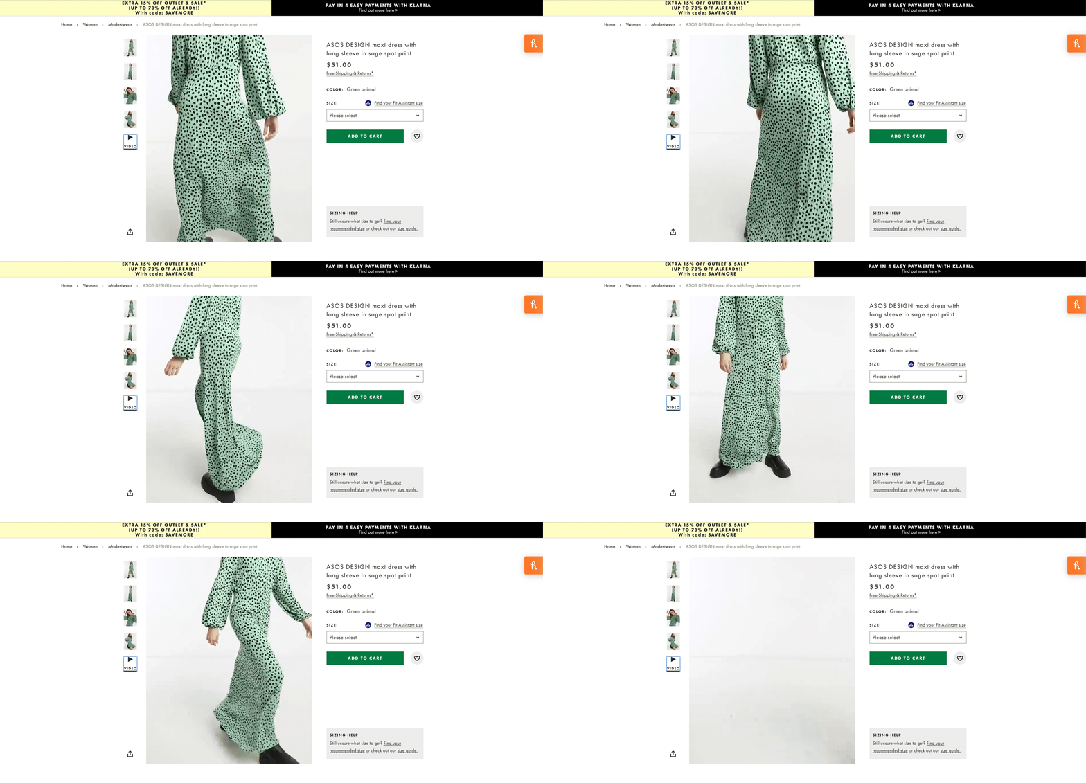
Online fast-fashion retailer Asos does this by using video in many of its product pages. It pairs fashion-forward, stylized photographs of the garments with a video of a model wearing, walking and moving in a given piece of clothing.

This additional, easy add creates a sense of movement and gives users insight into how a garment might fit in real life. Consider similar ways to supplement simple product images with additional details on your own site. From simply adding more thorough product descriptions to interactive augmented reality mock-ups (like Amazon’s “View in Your Room” feature), every additional piece of information empowers your users with information to make the best purchase for them.
Teamwork Makes the Dream Work
With the limitations of in-person shopping, flexibility and innovation for online retailers are going to be key in maximizing the appeal for prospective buyers. One of the best ways to do this is to maximize cross-platform integrations.
Take payment platforms, for example. Many websites offer Amazon Pay and Paypal as alternatives to paying directly through their website. While this may seem like just a business decision, it has a hefty impact on user experience.
Aligning with flexible, pre-verified payment options means users get to avoid the pain point of entering new card information into a system — these integrations let them use methods they already trust and keep current at another retailer.
Additionally, users get to have control over who has their card information. The average online shopper may not fully understand the technical appeal — it’s much safer to pass tokenized data between encrypted systems than to repeatedly enter a credit card number onto multiple websites. What they do understand, however, is that it’s one less website that has their credit card number. Users don’t need to be cybersecurity experts to want to minimize their exposure to risk and fraud in online shopping. These integrations can offer both security and ease for your users.
Key features like joining a membership program, checking out a purchase or sharing a desired product create opportunities to collaborate with pre-existing social media accounts, email providers, and alternative payment methods. In turn, the shopping experience can grow beyond simple cart-to-confirmation flow. It becomes an opportunity to learn more about your user and create avenues for the tools they already use, making a richer and more seamless experience for user and retailer alike.
You can leverage the insights you collect through analytics to examine where there are opportunities to change online shopping experiences for the better. What’s vital, though, is to look at these patterns not only as upgrades or feature expansions, but as an investment in a better e-commerce experience for your users. That’s the sort of mindful innovation that will keep happy customers coming back not only for the holiday season, but all year long.


