

According to gestalt psychology, we need to organize what we see to make sense of the world. Without using patterns to order our vision, we would overwhelm our brain. The Gestalt psychologists formalized those patterns as the Gestalt principles of perception.
The gestalt principles of grouping are part of the most important design theories. Organizing information means understanding. A designer’s task is to make content as easy to understand as possible. Proximity is one of the most common principles. In the following I will provide some examples to show the importance of this principle.
What Is Gestalt?
What Is the Gestalt Principle of Proximity?
The principle of proximity states that we perceive objects which are close to one another as a group. This is true even if the color, size, or shape of the objects differ. The following example illustrates the principle of proximity. In the first image you see one group of circles. In the second image you see three groups (columns) of circles. The only thing that changed is the distance between (or rather, proximity of) some of the circles.

The principle of proximity is stronger than other gestalt principles. You can see below that the circles still appear grouped, even when they differ in shape or color. Thus proximity is stronger than, for example, the principle of similarity.

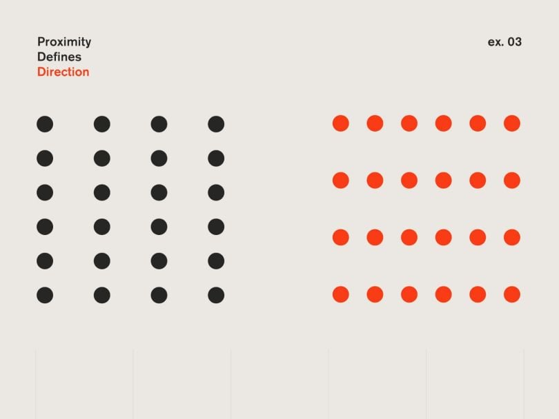
Proximity can help you define the direction of the viewers’ attention. Below you see either rows or columns, depending on the proximity of the elements.
Many designers use the principle of proximity without even knowing or thinking about it. Yet, I would argue, it is always helpful to know why this strategy works. This way you can reason about a design and explain issues to colleagues. And your developer colleague will understand why you need a space of 5px horizontally and 15px vertically between your cards.
The gestalt principles also make for a great checklist when something feels off about a design.
Examples (with Images) Using the Gestalt Theory of Proximity
Typography and Copy
Proximity is a very important part of making a text easy to read. For example, a headline must have more space before it than after. By being closer to the section it belongs to, it feels more connected to it. Line height is another example. Space between lines must be bigger than between words, but small enough so they form a paragraph. The same is true for letter spacing. The spacing must be wide enough so letters are distinguishable but small enough to form words from the individual letters.
Those rules apply in digital and print design alike.
Print Layouts
Even though the focus of this article is on digital work, it makes sense to look at print layouts first. Print is the basis for the layouts we build on the web and it makes understanding the principle much easier. In a magazine’s layout, the image descriptions can be in different positions on the page. Yet, due to the close proximity to only one image, it is immediately clear which text belongs to which image.

By adjusting the proximity of the elements, you form groups of similar information. For example, contact details like phone number, email address and website on a business card. This makes it easier for the viewer to find a piece of information quickly.

Presentation Slides
Presentation slides are somewhat close in layout to print. Slides are often done by non-designers and, as a consequence, suffer from neglecting gestalt principles. For example, when presenting the steps in a project, you need to make sure it is obvious which step belongs to which phase. This makes understanding the slide easy and fast.
Website Menus
Today’s websites are full of content, making grouping the items all the more important. Menus are typically on the left or on the top of the website. Especially for top menus, it is fashionable to add a lot of space between the menu items. This is fine as long as you make sure to have all other content even further away from the items. Otherwise it will be hard to recognise the items and the menu itself.
Content Previews
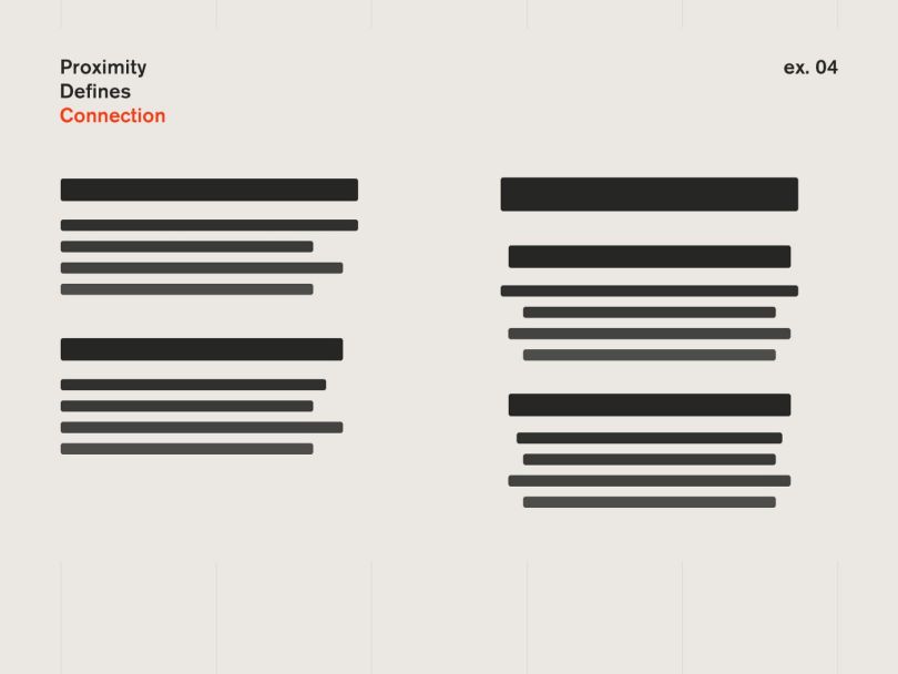
Content pieces like previews or quotes consist of different parts like images, headlines and copy. To make them seem like one item, e.g. an article preview, the space between them must not be too big.
Cards
Whenever you have different groups of cards you need to make sure that the space within a group of them is smaller than the space to the next group.

Forms
Forms are an important part of the internet. Most desired actions, like paying or signing up, use forms. Here user abandonment rates are a problem and creating easy-to-use forms can improve them. With the use of proximity, you can make it clear which label and which description belongs to which field. This will make your form easier to use and your users will be less likely to leave.

App Menus
Many app menus have huge gaps between the icons and the labels. This adds mental complexity to your design as the user needs to organize the interface in their head. Take care to get your proximities right and the interface will be much easier to understand.
Lists in Apps
Every app has some list screens, so learning how to make them better is very valuable. The goal with designing lists is to make the individual items distinguishable. To reduce visual noise, you can use proximity instead of lines between items. Just make sure you have a visibly larger space between items than between the elements an item consists of.

App Dashboards
Dashboards often show stats, be it your sports activities or car usage. When adding a label above or below those numbers make sure to visually group the correct elements together.
Car Dashboards
Car interfaces have to be usable in stressful situations while the user focuses on the road. This is why elements in a car are grouped by proximity to form thematic units.
This is why everything concerning lights is grouped on the left of the steering wheel. Interface elements related to driving are grouped around the steering wheel. Entertainment-related items are in the middle console. And mirror and window buttons are on the driver window, close to where they take effect. This grouping makes it easier to find and remember the elements.
Summary
Proximity is a very powerful gestalt principle that helps you to structure your designs and group content together. While many designers use proximity unconsciously in their designs, it can be a very helpful tool especially in complex screens where adding elements to group content adds too much visual distraction.


