I don’t enjoy contact forms. And I’m not alone. In a 2020 blog post, Tobias van Schneider, founder of Semplice and former lead product designer and art director at Spotify, called contact forms “a relic from web days past.” I found myself nodding along more and more as he cataloged the contact form’s demerits. From the emailer’s perspective, you’re left wondering whether the email actually went through, whether it reached the correct person, the hassle of following up without a record in one’s sent folder, knowing that one’s careful paragraph breaks and formatting will collapse into an undifferentiated blob of copy.
Sure, writing an email isn’t exactly a party either, but contact forms feel less personal still, ruling out hyperlinking and any opportunity for a personal visual touch.
7 Tips for Better Contact Forms
- Make form fields the length of the expected value.
- Place the form high on the contact page.
- Don’t ask for too much information.
- Use ReCAPTCHA, not CAPTCHA.
- Default to a single-step form.
- Confirm. And confirm again.
- Double-check the basics.
“We want people to feel comfortable and be themselves, so we don’t force them to go through a standard process,” said Dennis Lenard, CEO at Creative Navy UX Agency, which eschews the contact form in favor of a posted email, with a mailto link, on its site. “If they like sending emails with their digital signature and company logo, why rob them of that?”
Some research indicates that users might feel similarly. A 2018 survey of about 300 users, put together by Birgitta Rún Sveinbjörnsdóttir, founder of an Iceland-based web design studio, found that 67.3 percent of people use email, rather than a contact form, when both are options.
But contact forms haven’t gone anywhere. And, to be fair, there are plenty of valid counterarguments one could make in their defense.
So Why Do Contact Forms Endure?
The answer is perhaps obvious for those on the receiving end: protection against spam and junk, better conversion and greater convenience — convenience for the message recipient, that is.
The internet is rife with spam crawlers and an unencrypted, posted email is potential chum in the water. Of course, contact forms also get targeted by spambots, but installing a reCAPTCHA can help mitigate those blasts.
Plus, contact forms integrate into customer relationship management systems, like HubSpot and Salesforce, so there’s no need to manually copy and paste contact details into a database. They also tell you more about who and where the email senders are. That’s especially helpful for marketing and lead generation.
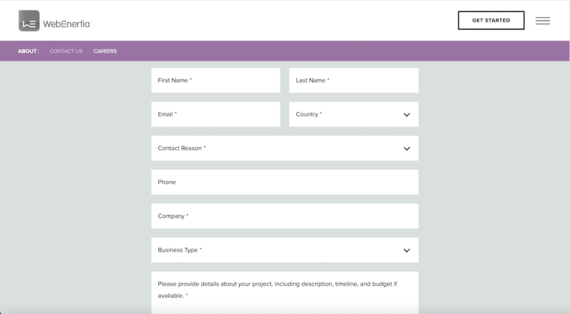
“When someone completes your contact form, they’re directed to a thank you or landing page. If you’re measuring conversion rates on your website — as you should be — this makes it easy to track when a visitor becomes a prospect on your website and helps you track where your best traffic is coming from: Google, an ad campaign, your blog, etc.,” said Liz Li, a UX designer at WebEnertia.
Also, some form plugins allow you to export all data as a bulk CSV file. “This is somewhat trickier to do with emails,” said Jason Lawes, founder of design and digital marketing firm Red Sentence.
Finally, forms streamline logistics for the message recipient. For one, they can automatically direct messages to the appropriate department if set up with qualifying filter questions, in a drop-down menu or radio button — such as “Send to: Sales, Customer Support, Communications.”
Forms also help the receiver by allowing them to get need-to-know information right off the bat. David Hooper is an author and consultant who helps clients develop podcasts and grow their audience. His contact page prompts senders to enter first and last name, then an email, then asks “Do you have a podcast?” with “yes,” “no” and “other (please specify)” options. It’s a question he needs answered in order to understand the potential client. That setup ensures it happens at the outset.
“I can ask for specific info I need without going back and forth with people or having to dig through a form letter,” he said.

A UX Defense of Contact Forms
Those last two points are worth pausing on. Yes, they benefit the receiver, but they also help the user who sent the email by cutting down on the likelihood of follow-ups that could’ve been avoided and by targeting their message to the proper source, rather than a nebulous [email protected].
In other words, some of us may find contact forms mildly irritating compared to sending emails through our own provider, but they do cut the mustard in terms of user experience.
Usability hinges on five components, as laid out by the Nielsen Norman Group: learnability, efficiency, memorability, error frequency and severity, and user satisfaction. In terms of learnability and efficiency, you can’t really argue that a contact form isn’t intuitive to grasp or that (generally speaking) they take longer to complete.
Memorability refers to how easily a user can “reestablish proficiency” after returning to a design after some time away. Even if someone were to somehow avoid contact forms for any significant length of time, they’ll surely know how to hop back on the bike upon reencountering.
As for user error, contact form design is pretty robust in preventing even minor mistakes, with checkboxes and drop-downs to minimize mistyping.
And satisfaction? I and my fellow form skeptics may bristle at the idea of them being “pleasant,” but the design is certainly appropriate to the task at hand.
“Objectively speaking, there’s not really anything wrong with contact forms,” said Jon Haines, a UX instructor at Thinkful and independent design consultant. “In terms of usability, there are things that are objectively bad, but contact forms aren’t one of those things.”
Haines added that mailto prompts “always kind of mess me up.” As a Mac user without a default email app designated, a mailto link prompts him to first choose an email account provider, then authenticate the email account. The other choice in that circumstance is of course copy and pasting the provided email address into your email provider window — arguably as quibble-worthy as any of the contact form shortcomings inventoried above.
And as Lawes, of Red Sentence, pointed out, browsers usually store information like email addresses and names, so oftentimes more than one field is easily autofilled in a contact form.
In short: Contact forms make the UX grade, whether I like them or not.
Tips for Better Contact Forms
All that said, some contact form experiences triumph over others and website designers owe it to users to make the experience as smooth as possible. Here are a few steps you can take to ensure contact forms are more palatable for users, according to experts.
Make Form Fields the Length of the Expected Value
Li pointed to a 2014 study that evaluated the effectiveness of 20 form guidelines, including one that has designers match the size of input fields with the expected length of an answer. Researchers found that these led to faster completion times, fewer submission trials and less eye movement required.
In other words, don’t design a name field six returns deep and don’t make a message field shaped like a narrow ruler.
Place the Form High On the Contact Page
Contact pages often contain other information than a contact form — hours of operation, address information, telephone number, perhaps a Google Maps insert of the headquarters location. That’s all helpful and proper — just don’t bury the contact form beneath them. Make sure the form and primary calls to action stay above the fold, Li said.
Don’t Ask for Too Much Information
Yes, more fields yield more (potentially valuable) information for the receiver but too many not only slows down the process for the sender, it can also feel invasive.
There’s no hard-and-fast rule on the number of fields but be judicious. Do you need a phone number or is it a nice-to-have? How about “How did you hear about us?” It might make more sense to make fields like this not required, if included at all.
If you do ask for more information beyond name and email, use radio buttons, checkboxes and select fields, rather than free-text fields, to make the form easier to complete. But allow free-text prompts after other selections, when reasonable. No one likes their reason for inquiry to be “other.”
Use ReCaptcha, Not CAPTCHA
CAPTCHAs may improve security and ward off spambots, but they’re also an easy way to break your site’s UI — not to mention hamper its accessibility. Use a reCaptcha checkbox instead. You can also try an invisible reCAPTCHA, which is triggered by a user clicking some other button on the form or by an API call.
Just remember that nothing will keep 100 percent of junk from your inbox. “I’ve had forms and emails on multiple sites for multiple clients, and I received spam from all of them — whether it was WordPress, a PHP form or a site I developed 10 years ago with no indexing whatsoever,” said Johnnie Gómez, who ran a design agency for a decade before joining Webflow as a senior brand designer. “You still get some sort of spam.”
Default to a Single-Step Form
Sometimes friction in forms is beneficial to users to help ensure they’re paying close attention to important details. But in general, a contact form should be short and simple. Having multiple steps is probably overkill.
“If a multi-step form has [just] one input per step does it really make sense to have a multi-step form?” said Gomez, who prefers forms over posted emails. In other words, you probably shouldn’t make a user have to click continue after entering a single field, like name, then again after another, like email address.
If, for whatever reason, a company opts for a multi-step contact form, be certain to include a progress indicator, so the user knows how many steps to expect. Otherwise, being in the dark about how long the process will take might be enough to make them bail.
Confirm. And Confirm again.
Nothing turns users against contact forms like failing to receive a confirmation after submitting a message. So make sure the page and form are configured to bring up a clear confirmation on the site after the process. Better yet, send an email confirmation as well. That way the sender has a record in their inbox, should they need to follow up before hearing back. If manpower allows, make it possible for users to also reply to that confirmation.
Double-Check the Basics
A good form plugin should walk you through all the key foundational elements — tab navigation between fields, clear labels, validation error messages when fields are missed or improperly filled. But take the time to quickly verify that all those details do in fact register on the front end.
Why Not Both?
Even with user-optimized forms, there’s only one clear way to make everyone happy: include both. Eileen Mullin, a former web designer at IBM and Merrill Lynch and now a freelance web design and development consultant, is personally not a fan of contact forms — lots of spam, in her experience — but she includes one alongside her email on her contact page, in case the person reaching out prefers the form.
You can cut down on spam by masking the email with ASCII-encrypted text, according to Mullin. “The email address is visible to anyone who wants to copy and paste it, or click the link, but it’s not parsed by a bot on the back end,” she said. Mullin said she uses the email obfuscator available at ManyTools.
Li, of WebEnertia, also recommends using both, and her agency’s contact page includes both. If the posted email turns out to be a spam magnet, even with encryption, you can always remove it.
And we form doubters will have appreciated the effort.


