When Este Geraghty graduated from medical school in 2002, the technological revolution was still in its infancy on all fronts. Web users had only recently ditched their dial-up connections. The first iPhone wouldn’t debut for five years. And geographic information systems (GIS for short) were still somewhat rudimentary.
That last one is something Geraghty knows a lot about as chief medical officer and health solutions director for the human services sector of Esri. The Redlands, California-based company’s mission, per a recent write-up, is “to transform health through the strategic implementation of a GIS platform that improves decision-making, increases efficiencies, and facilitates collaboration at local and global scales.”

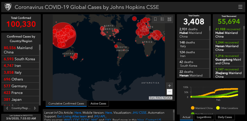
In addition to supporting prevention and rescue efforts during earthquakes and fires, Esri’s GIS software has also been deployed to help organizations track and analyze homelessness, as well as infectious diseases like zika and ebola. Most recently, it’s being used by Johns Hopkins University, the World Health Organization and other groups for real-time monitoring of the coronavirus, which continues to spread throughout the world. Esri, too, just published its coronavirus story map and a resource hub for organizations around the world to stand up localized maps and applications to assist in their response efforts.
Geraghty recently spoke with Built In about how modern GIS systems work and how they can help mitigate the effects of natural disasters or large-scale illnesses.
You’ve long been tech- and data-centric in your medical work.
Yes. I split four years of medical school into five years in order to add another year for a master’s degree in health informatics. That was in the late ’90s, and even then I could see that computers were kind of the future of medicine. The [Centers for Disease Control and Prevention] has been using our software for ages. So have local and state governments, as well as different hospitals. These organizations do great work every day. When a disaster strikes, it’s natural to have a ramp up in effort to respond. In many ways, I’m seeing more geographically based intelligence being delivered than ever before. However, this is just the tip of the iceberg in terms of what’s possible and how it can inform decision-making. I personally believe that our leading organizations can and should do more. To achieve more, they’ll need focused preparation during “blue skies.”
GIS platforms have been around for a long time. How are the modern ones different from those that existed decades ago?
When I started doing this, I actually went and got a degree in it, because it was so complex at that point. It took me 15 classes and some electives to be able to operate the system properly. It’s really been in the last decade or so that we’ve seen GIS become more user-friendly. We’ve seen it migrate from a desktop tool to an enterprise tool, and we’ve seen the development of web GIS, which can be used within the enterprise or individually in the cloud. A lot of my colleagues in public health, especially, have been using desktop GIS for years. They know how to make a map and why a map might be important to their work, but they don’t know that there’s so much more than mapping. They can connect dashboards and mobile survey tools and different kinds of data and analytics to understand their markets and their messaging. And they can create story maps to tell complex stories to the public so that they understand risk communications and health messaging. So the web GIS pattern has democratized GIS. It’s made it much easier and much faster to get to answers or information products, just like you saw with coronavirus.
Can you explain how this platform is specifically used to track diseases and viruses?
When it comes to diseases, the whole question gets trickier. It would be a lot easier to track chronic disease than infectious disease, because infectious disease is fast-moving and you need real-time or near-real-time data. That’s why I think this [tracking of coronavirus] is so significant. It’s the first time I’ve seen an infectious disease tracked on a large scale before. Johns Hopkins started off with Google docs, where they collected and uploaded data from the WHO and the CDC, as well as the Chinese organization DXY and the European Centre for Disease Prevention and Control [ECDC]. And then they used that data to populate their dashboards, which were refreshed a couple times per day.
“I’ve seen tracking of ebola and Zika virus at an international scale — but it was not nearly as fast moving as this, nor was it updated as often as we’re seeing with coronavirus.”
Once their dashboards started getting a lot of hits, our company contacted them and assisted with a few cartography tweaks to help out. It was [also a matter of automating] the data process. In any system, it’s ideal if you can connect directly to [the data source] and let the computer do the update work for you. You have all of these entities that have data to share and you want to combine them into one data resource. The amount of data that’s being shared publicly is far beyond what I’ve ever seen before. I’ve seen tracking of ebola and Zika virus at an international scale — but it was not nearly as fast moving as this, nor was it updated as often as we’re seeing with coronavirus. Also, what I’ve seen previously has been webmaps. I think map-centric dashboarding provides even more information. That’s also new at this scale.
How do you know you can trust all of the data that’s coming in?
That is definitely a problem and a concern, but I can look at all of the dashboards — the Hopkins one and the WHO one and any of the more regional ones — and get a sense of whether the numbers match. When I see differences, I can then try to find a way to explain them. But the general public is not going to go to that length. And right now we know the WHO dashboard, which I would consider authoritative, is focused on laboratory confirmed cases.

There are theories that the Chinese government has been holding back data and the actual cases are many times more than they’re actually reporting.
I don’t disagree that the actual number of cases is probably about five times more. It’s the same with the regular flu every year. We don’t know about the people who don’t get care, only the severe cases that do.
So how does GIS tracking help mitigate the spread of viruses like the coronavirus?
When you look at data like this on a map, the first thing you see is that something is obviously going on in China. You’re watching it grow and spread locally. Numbers get higher. And I think mapping it that way really inspired some of the quick actions that you saw, like the cutoff of air transportation as well as bus and train lines in the area. And while I recognize that this could be a major inconvenience for a lot of people, but it’s also such an important public-health measure to keep people more socially isolated and keep things from spreading. You wouldn’t make those kinds of decisions if you couldn’t see that this was quickly growing and spreading in the region.
Mapping also helps the WHO decide if it’s an outbreak or an epidemic, a public-health emergency or a pandemic. How many countries has it spread to? All of those things make a difference in terms of how you take action to intervene. Besides quarantines and transportation cutoff, it’s also about understanding your infrastructure that is meant to support people who get sick. Which hospitals are at total capacity and when will capacity be reached? And how do you connect people who can’t travel very far to community resources?

What is the main challenge in tracking the coronovirus, or whatever future scenario you’re dealing with, as it spreads?
For me, it's keeping up with all of the information. Sometimes coming up with the data model can be a challenge if it's not structured in a pretty simple way, but we integrate with all kinds of data. More often it’s not data about diseases, but a natural disaster like a hurricane. As part of our disaster response program, we provide free software and support as needed to help organizations in disaster situations. Like during Hurricane Harvey, the Nepal earthquake or the Fukushima disaster. We were part of all of those. We monitor them 24/7 and provide services.
Is dealing with epidemics and pandemics more challenging largely because the real-time data is so voluminous?
In part, yes. But also it’s the fast pace. When people need help, they need it now. Pandemics, like hurricanes, earthquakes and fires are emergencies that require responders to act quickly to support impacted populations. We believe that a geographic perspective can solve some major challenges in these kinds of situations.


