Think about the first time you created a graph. Was it a bar chart, pie chart or maybe a box and whisker plot?
Ever since the 1700s, we’ve seen various evolutions and iterations of how we look to create these types of graphs. Think: color coding, minor 3D, heat-maps, box plots, time-series line charts and more. William Playfair was the founder of graphical methods of statistics and invented several types of now-recognizable diagrams, including the line, area and bar chart of economic data in 1786 the pie chart and circle graph in 1801.
Humans have always had an aptitude to record data in a visual manner to discover trends and anomalies, sharing the impactful results for others to see. But the arrival of the Digital Age has brought more data collection than ever before, forcing organizations within virtually every sector to try to adapt to more time-consuming, in-depth analysis. Why, then, have there been such few developments in the actual styles of graphing and mapping as we know it over the past 200 years?
The Aha Moment
After spending decades considering the limitations of modern data visualization, a group of neuroscientists and officials within the U.S. government recognized how inefficient humans were at understanding and sifting through the massive amounts of new and complex data sets. This became especially problematic for people like intelligence analysts, who were spending countless hours creating two-dimensional charts. There had to be a better way to see all of the data they had collected — and make sense of it all faster.
Through their research, the experts concluded that humans are exceptionally good at spotting patterns, trends, and anomalies visually using key traits such as shape, color, and size. In contrast, humans took longer to analyze raw numbers — and the results were not much better with traditional graphs. Upon further research, they developed what is now known as a “glyph,” named after the pictures and symbols ancient civilizations used to tell stories and convey information. (The Egyptians were onto something with their hieroglyphics.)
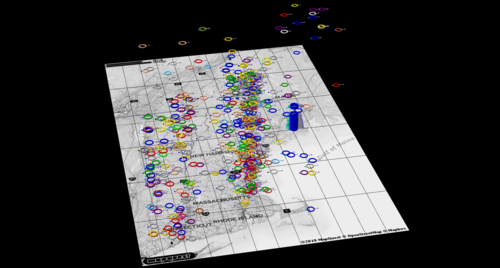
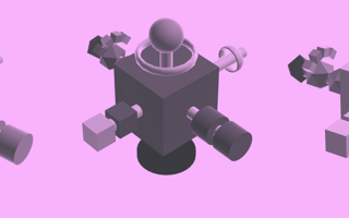
This modern version of a glyph consists of a geometric object, with data mapped to the properties of color, shape, size, and position in order to convey meaning to the user. Think: Big is more, small is less; green is good, red is bad. In this manner, users can more quickly identify patterns, trends and anomalies in multi-dimensional data.

The Future of Charting and Data Mapping
Data analytics aren’t just for, well, data analysts. Most professions utilize charting and graphing in a multitude of capacities for the tasks that their teams must complete — whether that’s for data-driven analysis of sales performance and KPIs or for healthcare researchers looking to cure the world’s deadliest diseases. All of the shapes, colors and sizes of objects are elements that research has shown that the human brain not only recognizes quicker, but the brain maps and understands at a significantly more accurate rate than rows and columns of numbers on a spreadsheet.
This same principle can be compared to an American driving in Germany. As the driver pulls up to an intersection, she sees a red octagon on a pole with white letters. Even though the command is in German, the driver’s first instinct is to stop at the sign, because she correctly maps the shape, color and size and understands the sign’s universal meaning. Research has shown that this is a process that the brain completes nearly 60,000 times faster than basic text alone. Therein lies the magic of the premise of glyph technology.
Insights That Leap Off the Map
Since their inception, glyphs have helped uncover actionable insights across hundreds of industries all over the world by applying this same visual-mapping concept. And through our revolutionary new data visualization software at SynGlyphX, we’ve been able to both save our clients huge amounts of money and help them make game-changing discoveries in their fields. Here are some examples:
- An ecommerce retailer discovered fraudulent sales transactions that represented millions dollars of recoverable revenue — in data they were mining for completely different purposes (i.e. they discovered the proverbial “unknown-unknown.”)
- Gannon, a top university, identified factors to help keep students enrolled in school — leading to lifelong success for those students and millions in retained tuition revenue for the school.
- A former NFL general manager conducted a mock draft and identified a late-round draft pick that went on to have a very successful football career.
- Medical researchers at Duke University discovered a “potentially life-saving” insight in data that had previously been missed by traditional analytics.
Viewing data at such a large capacity allows researchers to catch countless anomalies quicker, even utilizing glyph technology in our growing understanding in AI and machine learning to make individual decisions for the betterment of our collective future.
We’ve truly come a long way with the technology we use for demography, mapping and charting of data since the days of William Playfair. But when it comes to the actual stylization of these plots and maps themselves, we’ve only scratched the surface.
The tech giants have begun to automate nearly every aspect of human life within the last 10 years. This has infinitely improved the time it takes to produce a bar chart today versus the manual chart creation of William Playfair’s day. At the same time, we have more data available to us today than we did yesterday, and the volume of data available for analysis grows exponentially each day. We need new and more powerful tools that allow more people (not just data scientists) to quickly make sense of this data — so that they can discover actionable insights that can change their world.


