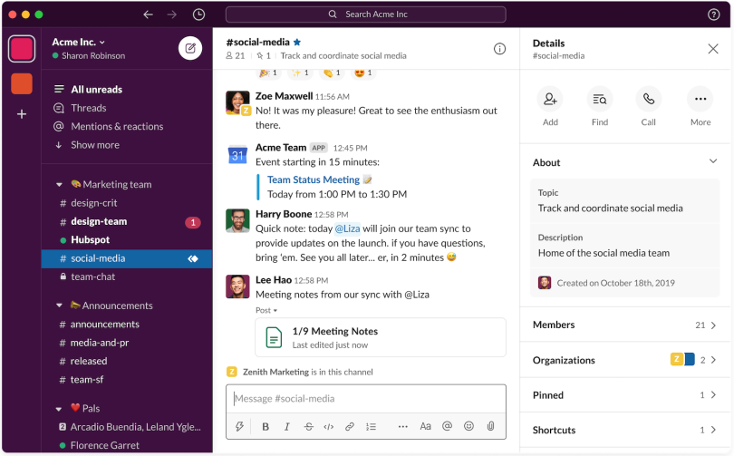
For most digital natives, or even Gen X cuspers like me, it doesn’t take long to figure out Slack. Messages light up. You read them and weigh in. Or you don’t, if that’s your preference.
There are emoji for showing your feelings, hashtags for channels and @ symbols for mentions — the kind of visual lexicon that has existed on various social platforms for more than a decade. A text box at the bottom of the interface almost begs to be typed in. For anyone with a half-working FOMO detector, there’s little chance of not jumping into the fray.
Capitalization, and the rules of English grammar, are clearly not Slack’s priority. In style and tone, it reminds one, above all, of an amusing text thread with some college buddies. Office conversations in a channel can quickly morph from the merits of the Oxford comma to weekly goals, to sourdough starters. And when somebody sends something important, a search bar at the top of the interface makes it easy to find later.
Ethan Eismann, who took over as Slack’s VP of design in July of 2019, said none of this is accidental. Where historical productivity tools, such as email, have focused on easing content creation, their designers haven’t paid enough attention to the cultural milieu in which work is produced. They’re poky and old-fashioned. Conversations among teams get siloed. People spend more time agonizing over professional courtesies and grammatical etiquette than the substantive content of the messages they’re drafting.
“On the other hand, if you look at the content of the Slack workspace or team you’re in,” Eismann said, “there’s likely information being shared about your work schedule, or when an assignment is due. But you’ll see, as well, there are reaction GIFs and emojis being used. People’s real personalities shine through.”
“When we have the opportunity to have a personality, we take it.”
That goes for the platform too. “When we have the opportunity to have a personality, we take it,” Eismann said.
Cultivating the voice and spirit of Slack’s brand is one of Eismann’s key focuses. He leads a 50-person team of product designers and content strategists who focus heavily on language to differentiate Slack from what he describes as a cold and sterile “sea of software-as-a-service or productivity tools.”
If anyone should understand how to do this, it’s Eismann. After cutting his teeth as a design manager at Adobe, where for eight years he led digital imaging teams and managed the development of a range of design tools, he spent four years leading Google’s Commerce UX team. This was followed by a two-year stint at Uber, where he managed a 200-person global product design team, and another two-year tenure at Airbnb, where, as design director of stays, he managed the end-to-end customer journey of guests booking homes and rental properties.
Then a new door opened at Slack. Convinced he had a lot to learn from its CEO, Stewart Butterfield, he took the leap.
Eismann dabbles in all kinds of things, from beekeeping to composing electronic music, to dragging his two children to the San Francisco Botanical Garden on weekends. His diverse interests, or rather the hours they occupy, is another reason he made the jump from Airbnb: Slack’s mission, as he told it to me, “to make people’s working lives more simple, more productive and more pleasant” resonated with his values.
“If we can help people be more productive and have a better experience, a better ergonomic experience as well as a better cultural experience using Slack, that, to me, is time extraordinarily well spent,” Eismann said.
“If we can help people be more productive and have a better experience ... that, to me, is time extraordinarily well spent.”
It’s been an interesting ride, to say the least. Eismann said the 2,000-person company started rolling out a new interface on March 18, just as the coronavirus was forcing more and more teams to work remotely. With that in mind, the design team accelerated the planned roll-out for new and existing teams who will see the new interface soon, if they haven’t already; the mobile version is being released this month.
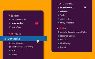
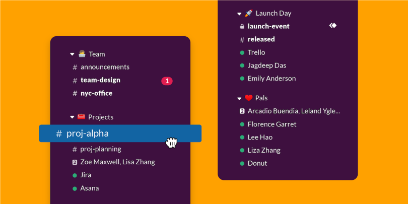
Some features of the redesign are largely cosmetic, such as 11 new color themes, including “Eggplant” and “Banana,” and a new option for sidebar-width customization.
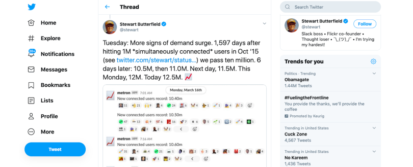
But Slack also has made the interface more approachable for a growing user base. A news briefing compiling a storm of tweets from Stewart Butterfield on March 25 reports “Slack recently hit a record of 12.5 million simultaneously connected users,” and “from February 1, 2020 to March 25, 2020 (approximately 60 percent of the way through the first fiscal quarter), Slack added 9,000 new paid customers, an 80 percent increase over the full quarterly total for the preceding two quarters.”
As Butterfield tweeted that day: “In some senses, we were made for this. Slack’s not specifically a ‘work from home tool’; it’s more of a ‘create organizational agility’ tool. But an all-at-once transition to remote work creates a lot of demand for organizational agility.”
“An all-at-once transition to remote work creates a lot of demand for organizational agility.”
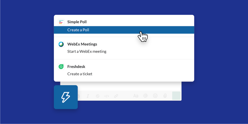
Moving crucial functionality, like the search bar, to a single field at the top of the interface, and reconceptualizing the Compose button, which now includes a large field for drafting messages and a lightning bolt icon to unlock a menu of shortcuts, integrations, and workflow tools, were likely aimed at meeting the needs of newer, presumably less savvy, users. But how would they be perceived by longtime Slack disciples?
Harry McCracken, an editor at Fast Company, recently compared the new search bar to that of a traditional web browser and described the Compose feature as “email-ish.” This is where our conversation really got going.
Slack seems fairly intuitive already. Why change it?
We have millions of users across different ages and levels of sophistication with technology. We wanted to make sure, as we went through the process, that it actually benefited everybody, from new users all the way to very sophisticated ones. We have small organizations using Slack and companies like IBM, which has over 400,000 people. The challenge with the design was really focusing on how to best improve the experience for everybody.
How did you walk that line?
We had a number of design principles that were fairly foundational. One was “don’t make users think.” Make sure the experience is as intuitive and clear as possible at every step of the way. If it is clear what you can and should do and what comes next, we’ve done a good job. Some of this is labeling icons, making it more clear what certain functions do, and then reorganizing the interface into more meaningful groupings.

How do you vet user suggestions and decide on which to apply?
We very rarely will just take specific customer directions. But we will listen to a customer’s needs. For example, a customer might say, “I need the ability to quickly reference people who are mentioning me in Slack.” That’s a legitimate need. We’ll dig deeper: Why do you need to know that? “Well, it’s because when I’m monitoring the health of a system, I need to see people notifying me so that I can respond as quickly as possible.”
Another case might be: “I’m new to Slack. I’ve been using email for the past 20 years of my life. I just want to create a message and send it to somebody. How do I do that?” And in that case, we’ve created a new composer flow and a button that actually helps make this more intuitive. So the workflow of message composition has been dramatically improved for people who are relatively new to Slack.
What were some user suggestions you tossed out?
That’s a really interesting question because we never really toss out ideas. An idea that might not necessarily be feasible today, or best for today, could actually be a great idea two years into the future. Maybe the technology isn’t there yet, or maybe our customers’ state of a need isn’t at that point yet. Or the state of interface design itself might evolve.
For example, if you look at the iPad, the latest version of iOS for the iPad has a bunch of new windowing options. Those are new paradigms, and now we see those paradigms being adopted by users in different apps. Another example: If you were to design a videoconferencing experience, the design patterns you might establish today would be completely different than those you would three months ago.
Tell me about your process for prototyping and testing new features during the redesign.
Essentially you have a group of designers and engineers working super closely together, with a product manager interpreting the needs of customers. Some data came from our customer success team. We also had a shared channel established with the Champion Network, a cohort of sophisticated Slack users from 30 different companies, and we heard the perspectives of new users that we sent through usability studies. And then we had internal folks at Slack who would give us feedback.
We’d deploy something, like the grids of faces that appear in the new People browsing feature. Users in our Slack Champion channel would say, “that’s a nice improvement, but we want a more advanced filtering option.” So we’d do another iteration on a prototype, and send the prototype back to them.
Because the desktop interface is very easy to update in code, we would have engineers build the designs quickly. Often, within hours of the design being established, there would be a live prototype with live code, which we would deploy back to users in the Slack Champions network. And we did that for about three or four months. I’ve never developed software with that close a touch with active customers who had a real stake in the outcome.
How does Slack use Slack to help manage its workflow?
Some basics that are fairly straightforward: Every project or topic on which we have multiple people engaged will get its own channel, and almost every channel is public.
We have channels for broadcasting announcements across the company. We have channels for individual teams. We have a private channel just for the design team for things like sharing trends. We do AMAs now that we’re remote working for 15 minutes on Friday, with one designer a week. It’s really, really hilarious.
What tools do you use outside of Slack?
For calls with multiple parties, we’ll use Zoom. Then, on the design team, we’ve standardized Figma as our design tool of choice. That works really well for remote teams because everything is accessible and anybody can get into the files, and you can see people sort of co-designing. So we’ll design in Figma and then have conversations about the designs in Slack.
Lastly, we’ve started to explore asynchronous video tools. We haven’t really landed on one that we use predominantly, but it’s been interesting to see this rise in the need for tools that allow people to be a bit more expressive or efficient in their communication. With these tools, you’re able to record yourself doing something or talking about a topic, and then share with folks. That can give them a deeper level of insight into what you’re thinking without needing tickets. So these asynchronous video tools may be more important going forward.
You’ve been having digital sprints. Can you tell me about a recent one? What worked well? What didn’t?
Sprints have an output, typically a prototype of a solution. The question is how to do that process of alignment and conversation and prototyping remotely. Oftentimes, it’s really intense. We don’t have whiteboards in a physical space, so we’ve moved the process into the virtual space. MURAL is one product we’ve had some success with. Everybody’s able to put their own sticky notes on the virtual whiteboard, and we’re able to do exercises you typically do within sprints virtually.
It is super important to have these sprints highly organized by a facilitator, who maintains a schedule for each of the steps. And, in general, when we’re working remotely, it’s extremely important to be considerate of people’s time. Many people at Slack are primary caregivers. In the world where kids are at school and we’re at work, it’s easy to separate work and life. Now we have kids who are home, and many people who might be in design sprints have to spend time with their families.
The last part is participants themselves really have to focus on being engaged. At home, you can be easily distracted. I can pick up my cell phone and scan the news right now and you wouldn’t know it. Whereas when we’re in the same room together, if I pick up my phone or get on my computer or my laptop, you’d be welcome to call me out.

A new shared channel feature allows people from different companies to communicate with each other in Slack. What was the thinking behind it?
Shared channels can connect independent organizations in the same Slack workspace, so they can exchange messages and files. That can help break down boundaries and increase the flow of information across companies. In this new world of remote work, where it’s impossible to have that face-to-face with folks, I think that connection is more important than ever. Communicating fluidly and easily can really tighten the bonds between organizations.
As of January 30 of this year, more than 32,000 companies had created shared channels. At Slack, we’ve been using shared channels with the Slack Champions Network. That use case is so powerful. The speed of getting feedback from our customers when we were redesigning the interface was critical to the project’s success.
We have other customers who are using shared channels in a similar way. For example: Fastly, a company that offers a premium support package for enterprise customers, has a Slack channel set up with every one of its enterprise customers.
Can you tell me about Workflow Builder? How can this feature be used by remote teams?
Workflow Builder is a visual tool that allows people to build these customized, automated workflows in minutes. And you don’t have to have coding skills. You can automate routine processes like employee onboarding or travel requests, or sharing status updates across multiple different channels, or even requesting equipment.
At past companies, in order to request a piece of equipment, a cell phone or something, I’d go to a Wiki first to find a website, and if I found the website, many times the interface wasn’t intuitive. And often I got kicked over to some requisition tool that the company was using. Eventually, I would just get fed up and walk to the help desk and make the request in person because that’s more efficient. Today, you can’t walk over to that person, right? With workflow builder, you can automate a workflow.
You can access the tool via the shortcuts menu in the new design. It pops up in a dialogue that asks you what kind of equipment you need. It submits your response to a channel where people are able to access equipment, and the process is done right. So, even in a world that wasn’t remote, what would have taken potentially 30 minutes to complete is now a two-minute task. That’s huge.
What’s the most pervasive misconception people have about design?
It isn’t just about the picture. Anybody can draw a picture. Design really comes down to understanding who you’re designing for, the needs of the person that you’re designing for. Especially when it comes to building software, it’s about the team working together. So the designer’s role is to facilitate an understanding of the user’s needs and then translate that into an image or a moving model that helps people accomplish their goals.
The ultimate goal is that the thing that is designed gets out into people’s hands. And so, certain design tools that allow you to draw pictures have really helped with that process. But the actual process of design, the debates that go on about it, the concepts that go into it, the ideas that go into it, all that’s facilitated by a tool like Slack.

