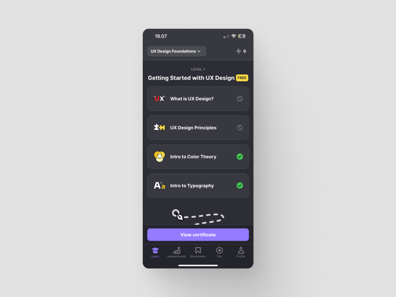
In recent years, the adoption of dark mode UI in web and app interfaces has skyrocketed, with 80 percent of users preferring it to light mode across operating systems.
From smartphones to mobile and web apps, many digital products offer both light and dark modes for users to choose from. And as the trend continues to gain momentum, UX designers and business owners must understand the real impact of a dark mode UI on user experience. To dispel common myths and embrace the realities, let’s delve into five key aspects that shed light on the fascinating world of dark mode.
5 Common Misconceptions About Dark Mode
- Dark mode is better for our eyes.
- People universally prefer dark mode.
- Dark mode is more eco-friendly.
- Dark UI is always more accessible.
- Dark mode is a one-size-fits-all solution for UX design.
Myth 1: Dark Mode Is Better for Our Eyes
Reality: Although the visual appeal of dark mode is undeniable, its benefits go beyond mere aesthetics. Dark UI can significantly enhance readability, especially in low-light conditions, so people who often use their devices before bedtime might enjoy dark mode better. Keep in mind, however, that no scientific research has proven that dark mode design is essentially better for your eyes.
Although dark UI reduces the amount of blue light produced by screens, the typical levels of blue light coming from devices are insignificant in terms of risk of harm to the retina.

Myth 2: People Universally Prefer Dark Mode
Reality: So far, there’s no research to back this myth. User preferences vary, and although many people prefer it, not everyone is a fan of dark mode. Some users may find light mode more comfortable or visually appealing. I’ve personally seen some older people who prefer to use light mode.
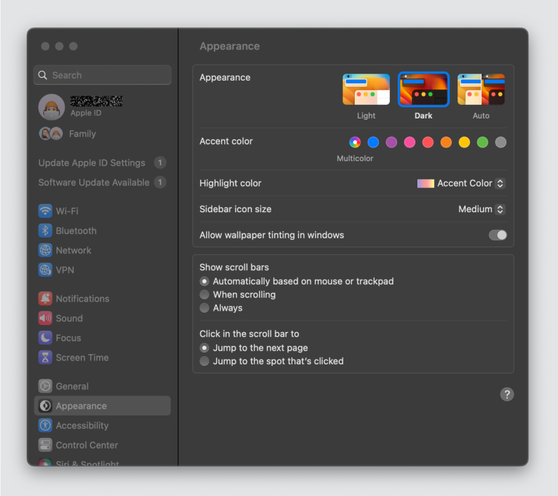
To cater to diverse preferences, consider providing a toggle option that allows users to switch between dark and light modes based on their preference. This flexibility empowers users and contributes to a more user-centric design.

Myth 3: Dark Mode Is More Eco-Friendly
Reality: Some people believe that dark mode saves your battery life and is thus more eco-friendly as it preserves energy. This only applies to OLED or AMOLED screens, however, because the black pixels don’t consume any power. If your device has an LCD screen, it uses the same amount of power whether the whole screen is black or colorful.
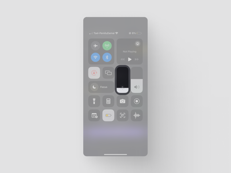
With that in mind, I believe we shouldn’t oversell dark mode as eco-friendly. In fact, if you do want to save battery, lowering your screen brightness is a more effective move.

Myth 4: Dark UI Is Always More Accessible
Reality: Although dark mode is often associated with improved accessibility, it’s important to recognize that accessibility is a whole other design aspect. Some users with visual impairments — for example, sensitivity to contrast and certain types of color blindness — may find light mode more comfortable.
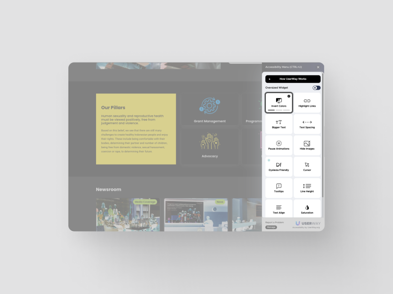
In terms of accessibility, UX designers should adopt a comprehensive approach and consider a spectrum of visual needs. Providing options for customization, including contrast adjustments and alternative color schemes, ensures that the design accommodates diverse user requirements and promotes a genuinely inclusive user experience.

Myth 5: Dark Mode Is a One-Size-Fits-All Solution for UX Design
Reality: Dark mode’s effectiveness depends on various factors, including the nature of the project, brand identity, and the target audience’s preferences. With that in mind, the decision to implement dark mode should align with your overall design and business goals and enhance user experience.
Rather than setting up dark mode as a default, UX designers should approach it as one of several UI options. Conduct usability testing to gather feedback from users across different demographics. This ensures that dark mode is a deliberate and well-informed choice, contributing positively to the user experience, and not merely a trend or forced design preference.
So, Is Dark Mode Really That Impactful?
The impact of dark mode on user experience extends beyond its trendy appearance, but it also comes with limitations. By understanding the realities behind these common myths, UX designers and business owners can make informed decisions that prioritize user satisfaction and inclusivity.
Whether opting for dark mode, light mode, or a flexible combination of both, the key is to tailor the design to meet the specific needs and preferences of your target audience. Dark mode is just one tool in the UX designer’s toolkit, so let’s not overemphasize it and remember to always embrace user-centric design principles.


