If you want your content marketing to stand out, make it something people can play with.
Consider Black Mirror: Bandersnatch, an interactive film released by Netflix. On its own, Bandersnatch is a so-so movie, many critics said, but since it allows viewers to select which narrative path the protagonist takes — in the vein of a choose-your-own-adventure book — it became a hit.
Its ability to stand out in a sea of content signals an appetite among audiences for something interactive.
What Is Interactive Content?
Interactive content offers a unique way for creators to capture audience attention and present information in an engaging, participatory and inherent shareable format — whether it be through a lighthearted, BuzzFeed quiz or a FiveThirtyEight-style interactive infographic.
A whitepaper about energy usage is boring, but an interactive map that lets a hovering mouse reveal each state’s consumption is interesting. A blog post listing things to do while vacationing in Barcelona is boring, but a quiz that tells you what Barcelona hot spot you are is interesting. An article detailing an investment firm’s accolades is boring, but a calculator that shows you how much money they’ll save you for retirement is interesting. Interactivity elevates the fun factor of content while still presenting the same information to the reader.
Marketers use interactive content because it’s effective in collecting first-party data and generating leads, in addition to being fun. Similar to how a prospect might be asked to provide their email address and company name to unlock a gated whitepaper, interactive content can gather voluntary information and qualify leads for sales.
Interactive content takes many forms, and each tries to accomplish different goals. To give you some inspiration, we’ve rounded up some of the best examples across the most popular formats.
Quizzes
Quizzes encourage audiences to tell you all about them — their personalities, habits, pain points. They can take several forms, and can generate anything from a score to a spirit animal.
Creative Types, Adobe

This personality quiz from Adobe invites readers to answer a series of multiple-choice questions — “Are you a ruler or a scribbler?” “Dip your toes in or dive headfirst?” “Would you rather be in a cocoon or a beehive?” — that ultimately reveal what type of creative person they are. The quiz is interspersed with short videos and concludes with information about your creative type.
Financial Spirit Animal, Borrowell
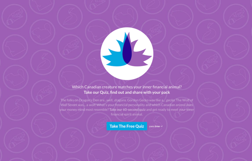
Borrowell, a credit education company, uses this Financial Spirit Animal quiz to capture prospects’ emails. It’s similar to a BuzzFeed quiz, asking the reader to answer several personality-related questions. This time it’s all about your spending, saving and investing tendencies (information Borrowell can use to follow up with you with personalized messaging).
How Well Do You Know Your Users?, Amplitude
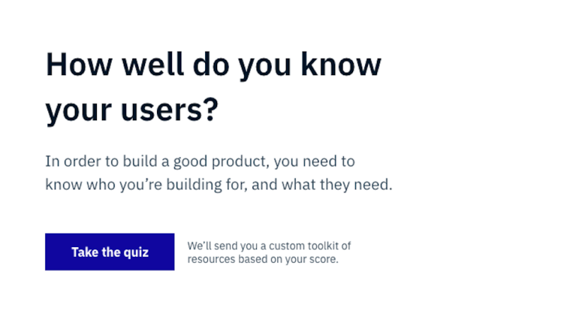
This quiz from Amplitude, a product intelligence platform, says it’s “designed by product managers for product managers.” It requires an email address, and promises to deliver a custom toolkit of resources based on a quiz-taker’s score. The title is enticing too: Who would turn down a chance to show off how much they know?
How to Talk to a Vaccine Skeptic, Verywell Health
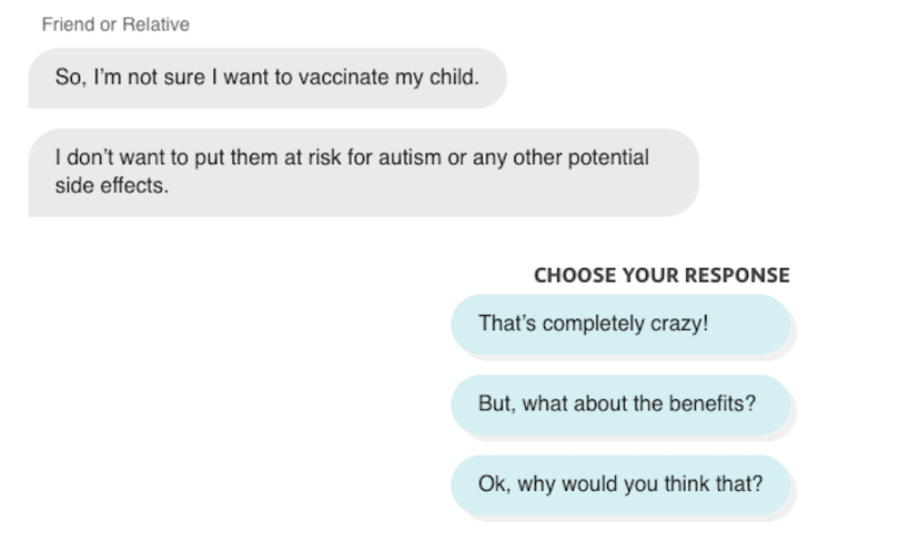
Verywell made a different kind of quiz, one that simulates a conversation between the user and a “vaccine skeptic,” where you have to choose the best responses to the skeptic’s claims. It also provides blocks of information and context about the topic along the way. It’s a way for a publisher to serve its audience content in a unique format.
Marriott, Family Fun in Scottsdale
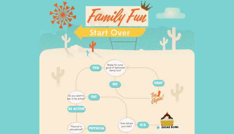
Another choose your own adventure with no wrong answers. The hotel chain’s animated infographic suggests what activities users try while vacationing in Scottsdale, Arizona — based on what their family typically enjoys. It’s a more interactive and interesting experience than reading a listicle with the same information. And it positions Marriott as an authority on local attractions — not just a place to stay.
Games
People love playing free games, even if they’re branded and full of ads (See: McDonald’s Monopoly). It can be an effective way to drive brand awareness and generate good feelings toward a company.
Finger on the App, MSCHF
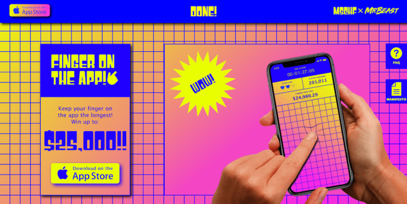
The Gen-Z-focused company MSCHF partnered with famous YouTuber MrBeast to create a game called Finger on the App, where users compete for prize money by seeing who can go the longest keeping their, yes, finger on the app. It’s silly, inherently viral, and drove lots of attention to the brands who made it.
A Quick Puzzle to Test Your Problem Solving, the ‘New York Times’
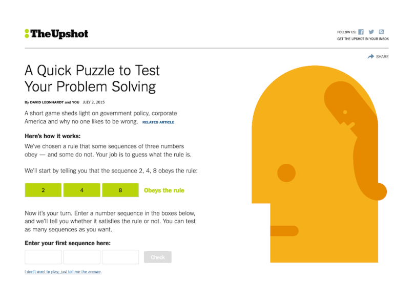
The average reader might not stop to read an article giving an overview of confirmation bias, government policy and corporate governance. By introducing the main point of the article through an interactive brain teaser, as the New York Times does here, the reader is hooked, invested, and more willing to click through to additional related articles that it links out to.
Moving QR Code, Burger King
Burger King ran TV spots challenging viewers to capture an image of a QR code bouncing around the screen in the style of a 1990s screen saver. They could redeem the offer for a Whopper through the BK app. The simple competition drove people to download the app, and have fun along the way.
Calculators
Calculators let users plug in personal numbers to get custom results. They allow brands to demonstrate how their product or service can help people save time or money. It feels more immediate — and personal — than a blog post on the same topic might.
Fashion Footprint Calculator, thredUP
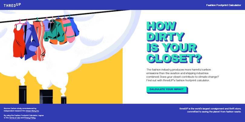
This calculator by thredUP asks people about their fashion habits — how often they buy new clothes, shop secondhand, do laundry — and uses the information to calculate their CO2-related “fashion footprint.” The experience provides relevant information about waste in the fashion industry, and it concludes by calling users to reduce their footprint and offers a promo to thredUP’s consignment and thrift store.
Retirement Income Calculator, Vanguard
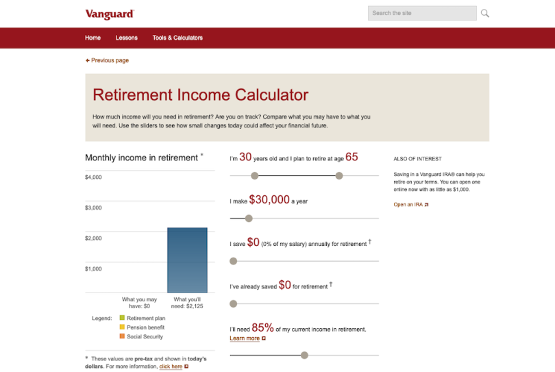
Retirement income calculators, like this one from Vanguard, let people use sliders to see how small changes in their financial habits can affect their long-term wealth. The information is customized to the person who uses it, and it can explain the importance of savings in a way that’s more engaging than a generalized article ever can. The calculator includes a CTA to an IRA with Vanguard.
Impact Calculator, Impossible Foods
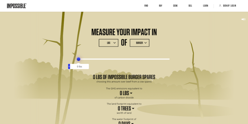
This simple tool calculates how much water, clean air and trees are spared by eating plant-based burgers rather than beef ones. The animated forest on the page flourishes the more you move the slider, visually reinforcing the idea that more Impossible meat makes for a more healthy planet.
Interactive Videos
Videos are already more visually engaging than written content, but they still benefit from increased interactivity. Watching a story unfold, and participating in its outcome, helps educate users in a captivating way.
How to Make Passwords Secure, AARP
This animated video from AARP breaks down best practices for choosing a secure password. It includes multiple-choice questions interspersed throughout, letting viewers advance only when they answer correctly.
Outage, IBM
This short film portrays a power outage in a city, and asks viewers to assume the role of an engineer and fix it. They are presented with a series of possible actions to take, and watch their choices play out through scripted video. Only one path will solve the problem. After the video is over, the viewer can read more about the technology IBM used to help end the city-wide blackout.
Choose Your Wild, Toyota
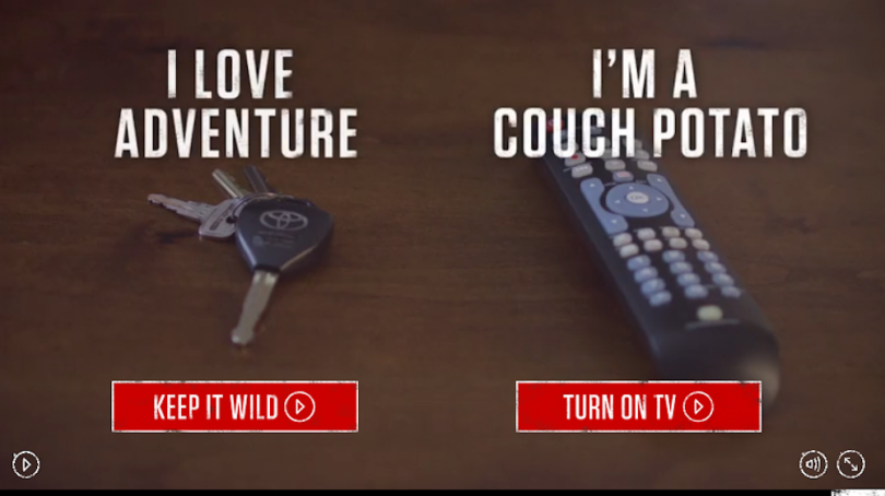
In this interactive video, viewers are tasked with choosing what path they want to take on a virtual test drive. In the process, they receive an overview of different terrains and adventures the Toyota 4Runner is designed to handle. This video also allows Toyota to collect information about what kinds of activities appeal to their audiences.
If Light Pollution Cleared, Under Lucky Stars

Technically speaking, this is not a video, but a series of photographs of different city skylines. The viewer can pull a slider across the screen to reveal how much more of the sky would be visible without light pollution. The content was produced by Under Lucky Stars, a company that makes personalized star maps.
Interactive Infographics
Infographics are attention-grabbing visualizations that present statistics and information in a clear and compelling way. Interactive ones take it even further, allowing users to click links or manipulate the graphic in some way.
Color Innovation, Viavi
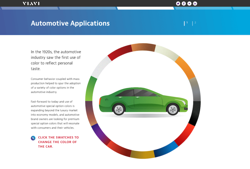
Viavi makes custom colors and special effects for brands. This infographic gives a visual overview of the history of color trends in the fashion and automotive industries, educating readers on the depth and complexity of color choices. It also invites readers to click on the pictures to see the colors change. The bottom of the infographic includes a call-to-action button for Viavi’s services.
AI-Driven YouTube Video Opportunities Analysis, Butter Works
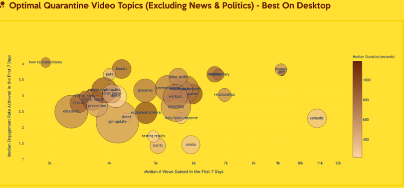
Butter Works is an outsourced video department that uses AI to determine what videos to make and where to distribute them. Its interactive bubble charts show what video topics have been most popular during quarantine. The user can zoom in and out, scroll along axes and hover over data points to glean more information. The project demonstrates Butter Works’ authority in data-driven video development.
A Model Hotel, Symmons
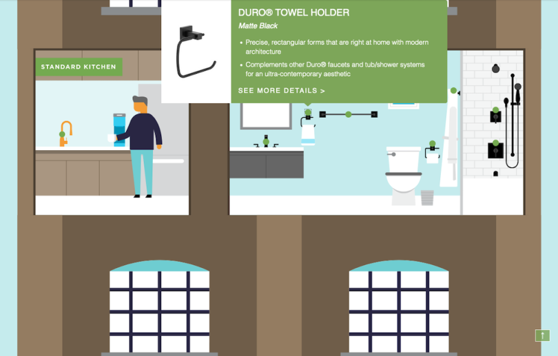
Symmons is a kitchen and bath manufacturer that wanted to target hotel construction projects. So the company made an interactive infographic, an animation that lets the user click on various fixtures within a hotel room to reveal an information box with Symmons’ offerings.
Assessments
Assessments require users to answer questions or provide information in exchange for feedback and insights. This type of interactive content allows marketers to learn about user pain points, and helps users understand where they can improve.
Website Grader, Hubspot
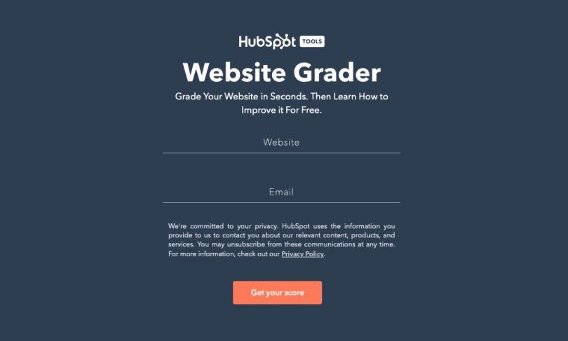
Hubspot’s Website Grader is precisely what it sounds like. A user punches in their website URL (and email address) and in return receives grades for their site’s SEO, mobile, security and performance. Hubspot captures users’ emails before handing over the results, and once it does so, it offers a free trial for Hubspot’s CMS Hub.
Clarity Grader, Visible Thread
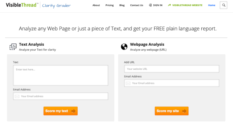
This assessment tool from VisibleThread, a software company that scans documents and websites looking for liability concerns, lets users copy and paste a block of text, which it then analyzes and scores based on readability.
Will a Robot Take Your Job?, BBC
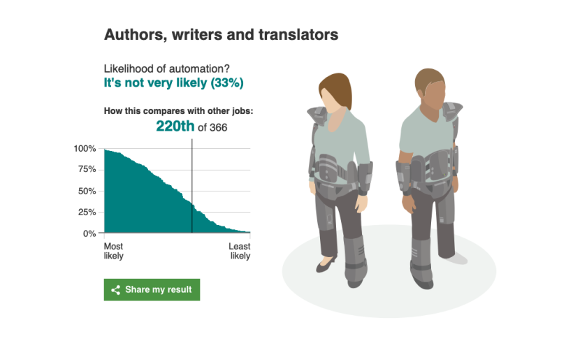
The BBC created a landing page to house some of its content about AI’s effect on the future of work, and affixed a search box for users to enter their occupations. It then spits out a percentage saying how vulnerable the job is to being automated out of existence.
Blacklight, The Markup
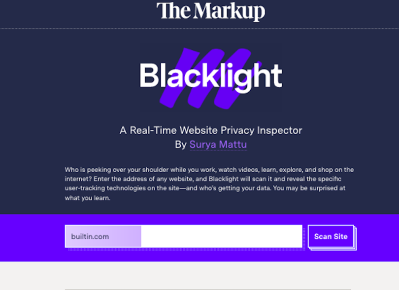
Want to know how many third-party cookies your favorite website uses? Blacklight will tell you. It’s a real-time website privacy inspector on The Markup, a nonprofit news website that produces investigative journalism focused on big tech companies.


