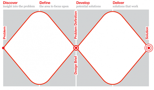
The Double Diamond design process is a design process model developed by the British Design Council in 2005. Divided into four phases — discover, define, develop and deliver — it is probably the best known and the most popular design process visualization.
The main feature of Double Diamond design thinking is its emphasis on “divergent” and “convergent thinking.” In other words, the team develops many ideas before refining and narrowing down to the best idea. This process happens twice in this model: once to confirm the problem definition and once to create the solution.

While this is all fine, I have always had some problems with the Double Diamond.
What Is the Double Diamond Design Process?
Problems With the Double Diamond Design Process
The Double Diamond completely separates the analysis, discovery and definition of the problem from the ideation and the delivery of the solution(s). It’s a very linear process but this isn’t how great designers really work. Designers often start with some solution in mind, and there’s nothing wrong with that (as long as they aren’t too attached to their first ideas). Most design problems are wicked problems, which means we can’t understand them properly until after we formulate a solution. The proposed solution then stimulates the research and influences how we frame the problem, which informs and shapes how we visualize the solution, and so on.
In the middle of the process there is something called a “design brief” or “problem definition,” but any written documents or specifications aren’t really good starts for a design. They are boring, lifeless, uninspiring and often dead on arrival.
Prototypes are a much better starting point as both a way to visualize the solution and define the problem.
The Double Diamond process gives much more prominence to the design brief than to the design concept, a crucial element of the entire design process. In other words, the Double Diamond reinforces the big research up-front as the best practice for all design work, which often doesn’t make any sense.
So, for a while now, I’ve been thinking about how to create a better visualization of my own design process in the simplest way. Here’s what I came up with.
Beyond the Double Diamond Design Process
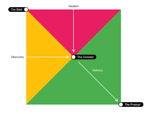
Let’s call this the The Three Triangles Process. (And please forgive the colors, I think I was inspired by the new Slack logo. )

My process consists of the three triangles representing the three main activities of every design process:
- Discovery: analysis of the problem space
- Ideation: thinking up the solutions
- Delivery: implementation
There are also three main artifacts or milestones:
- The Brief: the initial design problem or visualization of the outcome
- The Concept: the initial prototype of the selected solution, but also a tangible (re)definition of the problem
- The Product: the final go-to-market design
1. Brief
We start with the brief, but this is only the beginning, and we all know briefs aren’t usually very good. At this stage in the process, designers really need to step aside to explore the problem and different possible solutions through analysis and ideation.
2. Discovery and Ideation
Unlike the Double Diamond, in the Three Triangles process, discovery and ideation run in parallel from the start. These aren’t separate stages; one necessarily informs the other.
Discovery may consist of client workshops while gathering requirements, analyzing the current state of affairs, user research, market research, analysis of available the technology, simply seeking inspiration . . . the list goes on.
Ideation is the process of thinking up and prototyping different solutions. This step involves thinking about features, interactions, information architecture, processes, content, UI — and the most fundamental components — the target group and business model. We start exploring many different directions (“divergent thinking”) to finally select the one most promising idea (“convergent thinking”). That’s what these triangles symbolize.
Double Diamond design makes it look like divergent and convergent thinking are mutually exclusive — as if we only use divergent thinking for a few weeks, and then switch to convergent thinking. This is of course not true at all. We must use these two modes of thinking in tandem. While, at the beginning of the process, divergent thinking prevails, ultimately we need one answer, so convergent thinking helps us eliminate, structure and organize our potential solutions. But that’s not to say we’re ever completely in divergent thinking mode or vice versa.
2. The Concept
The single most promising solution is the concept, which is the idea we share in the form of a simple prototype (e.g. a mockup of the main screens of an application). This is the final outcome of the discovery and ideation stages. At this time, all stakeholders should agree: “This is it, this is what we should be doing!”
3. The Delivery
The concept is the design direction, but in most cases it’s still nebulous and quite far from the final product. Designers have a lot of work ahead of them to flesh out the concept, make it more detailed, specific and feasible. We still need to move from “this can work like this, or like this, or like that . . .” to one final answer for every question. This is the goal of the delivery phase, where all scenarios, processes, screens and states need to be hammered out.
4. The Product
And at the end of the delivery phase we should have the product ready for the market.
I’m still working out this model idea, but there are some things I rather like about it:
-
The discovery and ideation stages run simultaneously, not separately.
-
The design concept plays a central role.
-
The delivery (or implementation) stage is the largest of the three triangles. Just as in real life, this stage is usually the longest and the most challenging part of the design process.
-
Product testing with users can take place throughout the process, not just at the end of it — from discovery and ideation to delivery.
-
It’s all very simple!


