Shortly after learning his wife Bibi was pregnant, Shalin Amin put his San Francisco apartment on the market. Amin considers himself an adept problem-solver, and not without justification. Years earlier, as head of design at Uber, he worked closely with Travis Kalanick, co-founder and former CEO at Uber, helping guide the direction of an end-to-end ride-hailing app some claim has revolutionized transportation and ushered in the gig economy.
But renting out his apartment online was much harder than he imagined. His friends suggested a handful of sites, but his experience using them was less than ideal. For the most part, they catered to renters, not landlords. In other words: They weren’t speaking to the supply side of the equation, which Amin recognized as a mistake, thanks to his tenure at Uber.
“It was just as painful as doing taxes,” he said. “You don’t know what you’re doing, you’re searching the web, and there’s no guidance, no transparency, no empathy.”
Eventually, he listed the apartment on the rental site Zumper. After it was leased, Taylor Glass-Moore, one of the company’s co-founders, reached out and asked Amin for his thoughts on the site’s design. When he responded with an overview of his impressions, Zumper’s executive team offered him a position as chief experience officer.
It took a bit of convincing. Amin had recently left his role at CloudKitchens, a delivery-only food start-up launched by Kalanick, which was based in Los Angeles. And his wife had given birth to a daughter, which meant he wanted to spend more time with his family at his home in San Francisco.
“It was just as painful as doing taxes. You don’t know what you’re doing, you’re searching the web, and there’s no guidance, no transparency, no empathy.”
Still, he was intrigued by the marketplace Zumper had built, and offered to consult on a project with a member of the company’s internal design team. Much like in his early days as a consultant for Uber, he was impressed by what he saw.
“The team at Zumper was the thing that got me,” Amin said. “They’re super passionate, they’re hungry to do better work. They just haven’t done it at scale. And so this is where my experience at Uber can apply to what we’re trying to achieve at Zumper.”
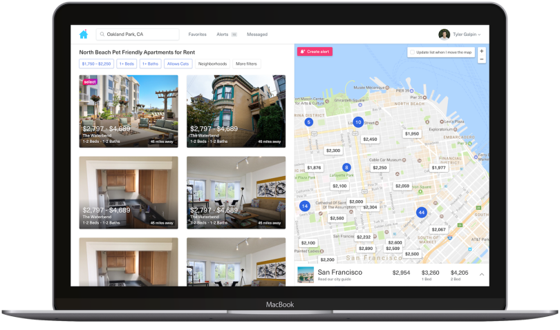
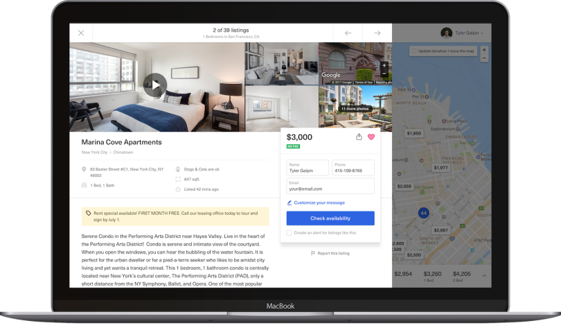
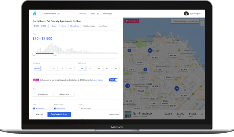
With 80 million users and five offices across the country, Zumper bills itself as “the first end-to-end marketplace that offers a complete digital experience for renters and property owners,” according to a recent press briefing. It gives renters the ability to search for apartments and apply, book and pay for them online. For residential landlords and multi-family building owners, it provides support finding tenants and collecting rent.
Up against competitors like Zillow, Redfin and Apartments.com, Zumper tapped Amin to build out its team and oversee its marketplace.
That is undoubtedly a daunting challenge in a software sector critics claim could benefit from greater segmentation and improved user experience design. Writing for Medium, Ben Staples, a product manager at Nordstrom, notes that a prospective renter searching for an apartment on four top-performing sites, Zumper included, can’t filter listings by the date they’re available.
Amin, though, is well aware of these gaps. In fact, that’s part of the reason he took the job: “I love companies like Zumper in that they’re in this industry that technology hasn’t taken a firm grasp on,” he told me. “I love these kind of messy problems.”
Born in Nairobi, where he lived until the third grade with his father, a warehouse manager, and his mother, a seamstress, Amin first became enamored with tech after a summer trip to Sydney, Australia. A college junior at the time, he discovered Jonathan Davis’ work on Macromedia Flash. That inspired him to build socialize.it, a mobile-first photo album startup born of an idea he had at a friend’s wedding when he saw guests capturing images the bride and groom might never see.
He’s long had a taste for the visual: As a product and brand consultant in San Francisco and New York, he’s designed user interfaces for companies like eBay, Condé Nast, Warner Music and the Wall Street Journal. And much of what Amin did from a design standpoint to help scale Uber — creating a polished end-to-end user experience — is what he is now called to do at Zumper.
On the interface level, that means using personalized messaging and subtle design cues to help regulate supply and demand in a two-sided marketplace, where the needs of distinct user groups don’t always run in parallel. When is the last time, for instance, you’ve heard a renter sing the praises of their landlord?
“I love these kind of messy problems.”
I was eager to speak with Amin, not only because of his new role as Zumper’s CXO, but also because, as a former Uber driver myself, I’d experienced both sides of Uber’s two-sided marketplace. And while riding in an Uber can be an almost unconscious exercise as you are picked up and all but magically conveyed to your destination, sitting in the driver’s seat is a completely different thing.
Riders cringe at the sight of surge pricing. Drivers salivate over it. Orange and red bubbles light up on the map and you head toward them in urgent pursuit of an elevated fare. You learn very quickly, as a driver, that you get paid $.60 per mile, $.21 per minute (Chicago rates as of January of 2020) and very little idling near a bar at midnight waiting for a late passenger. But if there’s a surge, a quest, or a multiple-trip bonus, you can get paid a lot more.
Amin understands these distinctions well.
“For me, personally, initial drivers and motivators [at Uber] were the fact that my dad, who was an immigrant, couldn’t find a job,” Amin said. “He had several jobs here and there, but he didn’t speak English very well. And to come to Uber, where we amassed an entire industry for people to get jobs on the fly, without having an educational background, making money for their families, that was the thing that drove me on a day-to-day basis.”
Zumper offers people something similar, he told me: a place to live or a chance at greater financial independence. I talked with him at length about what it takes to grow a two-sided marketplace, and his plans for shaping the future of design and user experience at Zumper.

What was the state of Uber’s mobile experience when you started?
It was 2012. We’d just launched in a few cities: Paris, Seattle, San Francisco and New York. The team was probably around, anywhere between l50 to 100 people — somewhere in there. So it was fairly small. And there was one designer at that point. The app was basically the iOS standard kind of experience.
What did you do to move the app forward?
I was doing the rider app, and, basically, there were three core problems.
One, there was no sense of choice. We knew we wanted to move into serving multiple options, not just the black car option. We wanted to move downstream, include more people in the experience, and drive down costs. Originally, sedans and SUVs were both classified as Uber Black options. When the team saw increased bookings by separating them by vehicle type, they asked the question, “What other use-cases were we not considering?”
That question inspired the options available today: UberX, XL, Select, Black and SUV, reflecting a range of vehicle types and prices.
The second thing was to make sure we were designing an app that matched the brand experience both online and offline. In essence, elevating the brand experience of our app to reflect the refinement of the black car experience, which was originally offered offline as a concierge taxi service.
The third thing is, as more competitors popped up, people were copying the user interface and the app experience because we were defining a new product category as we went along. So Travis was like, “Build me something that is very hard to replicate.” And I was like, “Well, that’s going to be hard, but, OK, we’ll try that.”
How did it go?
So we launched the app, and it had a slider at the bottom and cars moving on a map. And when we launched it, the tenor of the response was like, “Holy crap, this thing is amazing.”
So when I met with Travis later during that process, he said: “Shalin, what struck me was not just the response we got, but how you went about making the product internally. How you got our engineers to have a voice in the product and process, how you captured so many things.” And essentially, we kind of made magic, right?
We ended up with this app where the design hid within the background. It was intuitive and designed for clarity. And Travis was basically like, “Take that process and apply it to the rest of the products that you make at Uber.” That was the start of me joining full time as head of design.
Ultimately, the team grew to 20,000 people. I was there for six and a half years, almost, and worked on everything from redesigning the rider app to the driver app, to building a team, building a brand, refreshing it, building an in-house agency, getting a chance to work with Spike Lee. It was just crazy times.
How did you build support for Uber to adopt a human-centered design approach across the organization?
Most companies take one of two approaches to growth. The first is to iterate your way into success incrementally. The second is to overhaul everything. Travis’ approach was the latter.
Sometimes you have CEOs who say: “We can’t stop this train from moving. So just help us fix what’s there and make it incrementally better.” But there comes a fundamental point where you have to make big decisions about what you’re trying to achieve short term versus long term.
It’s like moving from child to toddler to teenager to adult. Your personality changes, and you have to get set up for the next phase of your life, right? There are similar things that happen within a product experience. Getting product-market fit is one thing. To deliver growth at scale, you’re going to need a new way to talk to customers.
How did the app’s design reflect that shift?
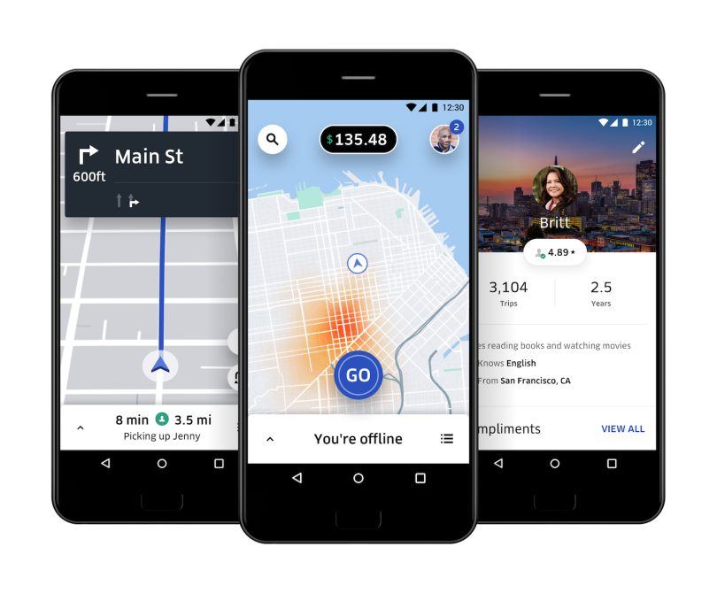
The first app was very dark, heavy and black — it was ultra luxurious. Knowing that we wanted to move downstream, we needed to figure out, visually, how we could make it a little more inclusive and approachable, but still have the brand qualities of being elevated, refined and polished.
Lyft’s approach is very friendly, bright and colorful — maybe for a younger audience. We had to look at the competitive landscape and kind of say, “Where do we fit into that?” And we had to appreciate the history and where we came from. We came from black car. And so we were moving downstream, essentially, whereas Lyft was trying to go upstream.
We kept to our roots — what made us great, what made our technology great: our engineers and our data scientists. So, with things like typography, we were very tech focused. We used a type called FF Clan, which isn’t super friendly, it doesn’t have a lot of curvature. But it’s very precise, very German-ish, in that sense.
Those attributes helped establish the brand we were going for, while allowing us to move from an all-black experience to something that was all white. That was a fundamental shift we made to signal a change and appear more approachable.
Then, cars moving on a map. That was something most companies wouldn’t do because it took, like, eight back-end engineers to make it over nine months. But that fundamentally changed the game. It infused something that had never been done before, and it provided context and direction. It was useful for a rider to understand where the cars were coming from. Do I need to go to the other side of the street, if a car is coming one way, versus another?
The map view was, essentially, a single screen that told the story of what Uber was. Vehicles at the bottom, cars moving on a map, and a time indicator.
What was the role of surge pricing in regulating the marketplace?
The complexity of surge pricing was a big factor. It centered on messaging, clarity and not using “dark patterns” to make sure people understood the concept. Now, it’s not a big deal. Everybody gets it. But, initially, we used to sweat those details every year in December to gear up for New Year’s Eve, because that’s when surge pricing happened at its highest levels.
Our objective was to be as transparent as possible around what a trip will cost. We’ve seen similar demand-based pricing happen in airlines and hotels. But, I guess, the way we were doing it wasn’t rubbing people the right way. So talking to our consumers and figuring out the best approach was always an ongoing discussion. It was a pain point for us internally, as well as externally, and something we deeply wanted to solve.
How did you solve it?
It was a combination of time and adding friction into the process. Making it more difficult to request a ride [during a surge]. It goes against everything most startups think about, which is conversion rate — get users through the checkout flow as fast as possible and close the sale. Instead, we wanted to create a view to stop you in your tracks. Big numbers. Copy as clean and minimal as we could put it, but still indicating what’s going to happen and what it will cost. And so we started off with 2.5X, a signal that the ride would cost two and half times more than it typically would during a demand surge.
We didn’t have the software back then to do upfront pricing. That came along in the third version of the rider app. But it grew out of the same drive for more transparency and clarity around what something was going to cost. We wanted to be very upfront and frank about that.
How did the driver app evolve over time?
We had an entire research team that would go out and talk to riders and drivers. We would do SEO research, we would do usability testing. And then we’d bring people into the office and be like, “Hey, what do you think of this or that?” And that’s how we generated ideas. We would also generate it from PMs and engineers.
But, ultimately, it came from asking drivers about their goals. Ninety percent of them are like, “I want to make a lot of money.” The other few were like, “I want to get to know other people,” or “I’m retired and looking for something to do.” The interesting thing was that we never really had these defined personas — especially early on. We were trying to build something for everyone. We only started to iterate on these edge cases later on.
As far as quests, I think they came from our growth team, which said, “Look, we have a pool of folks who don’t really know when to stay online or when you go offline. They don’t understand what the supply and demand dynamics are within our market.” Quests are basically ways of keeping you online or taking you offline when there are peaks and when there are lulls, respectively.
Do you see parallels between Zumper’s two-sided marketplace and the one you helped grow at Uber?
Absolutely. Zumper has done a great job of building supply and demand. Now it’s all about, “How do you build the experience that really makes it an end-to-end marketplace?” There’s a lot of work to be done on that front.
Can you give an example?
Inventory is super, super important. But it goes beyond inventory. It’s about liquidity, and then the quality of the inventory and the ability to match it to customers.
Building trust and safety is also super important. Uber did a lot of great things in terms of building credibility in the marketplace. There was the trust and safety of driver ratings, anonymized phone calls and knowing what you could expect with an Uber Black driver versus an Uber X driver. So, operationally, there was a lot of governance within that world.
And it was operated by a set of rules. If you denied too many rides, you basically got taken offline. You weren’t adding value to the network, and you were basically trying to fish for the longest ride, or maybe a trip to the airport.
That’s something that Uber has taught me that I would love to figure out within this world of Zumper. It’s not just about inventory, but also the set of rules that govern the marketplace to create good actors and provide additional value.
And then repeat usage — having a network effect. To use the simple example of a telephone: one person having it is not very useful, two people having it is slightly more useful, and with 1,000 or one million people having a telephone, it becomes infinitely better. With increased usage, there is much greater value for the individual to be on one platform.
How do you plan to help Zumper become a truly end-to-end experience?
We want to ultimately deliver value to our customers: renters, landlords and multi-family businesses. That’s the task at hand.
I’ll give you an example. As a landlord, I would post my home on Zumper, Zillow, Apartments.com, Craigslist, and so on. I’m trying to find as many leads as possible, and I don’t care where I get them from. There’s no brand loyalty or reason for me to choose a certain platform over another.
I’m trying to get somebody to fill my apartment, so I was desperately seeking information. What does this journey look like? Once I post a listing, what are the next steps? So I would get a lead and say: ‘OK, how do I qualify this lead? How do I know if this is the right person? What are the fair questions I can ask? What can’t I ask? What would be discriminatory? There’s a learning moment there.
And there are the needs the renter has, beyond just kind of getting a place to live. Is it today, tomorrow? What is the size? What are the criteria that go along with it? So creating an end-to-end experience is basically trying to match the needs of those two folks.
In a two-sided marketplace, the needs of users — say, renters and landlords — don’t always mesh. Are there any lessons you learned at Uber that apply to the rental market as well?
In the very beginning, Uber was very rider focused. We focused on riders because we thought that demand would drive supply up, but we quickly realized there’s always this unequal weight difference because the number of drivers on the road is tied to time of day, day of the week, seasonality and so on. So we had to focus more heavily on the driver side.
Essentially, we built two teams: one that was rider focused, and one was that was driver focused. And they had separate missions: to bring supply or demand into the marketplace. And then we had mechanics in place to equalize the need. And one big equalizer was surge pricing. If you have too much supply, too many people asking for rides at once, how do you balance that out without people feeling like, “Oh, I can’t get a ride when I want it.”
Uber’s model is a little different from Zumper’s in terms of frequency. People use it all the time, whereas renting a place happens every year to 2.5 years. So the stakes are a little different, but I think, in this case, again, it’s about how the demand side drives supply. And, eventually, we’ll see whether we can flip that the other way around.


