It has been nine months since enterprises across the country transitioned their workforces to be remote.
Businesses of all sizes were forced to adapt almost overnight, and many had to deal with the rush-order integration of modern technologies at massive scale. The path to remote work may have been rocky, but now that companies have settled into this new normal, they have more technological capabilities — and thus more access to data — than ever before.
SaaS-based analytics tools mean that everyone, everywhere can access the same data in real time, come together and collaborate for business decision-making without needing to be co-located in an office. Unfortunately, access to data means nothing without being able to organize, analyze and base decisions off the findings. In order for businesses to remain competitive in this new world of work, they will need to implement a strong data strategy that ensures the right data gets to the right decision makers in near real-time.
Now that nearly everyone has the technical infrastructure necessary to capture this data, there has never been a better time for a business to unlock its full potential — starting with HR and the return to office. HR data is among the most valuable to an organization because it provides insight into what can be the most expensive business expenditure: human capital.
While a few companies have already announced a COVID-19 vaccine, it will take time to scale production. Pfizer and Moderna alone estimate being able to immunize millions of Americans combined by the end of 2020, beginning with healthcare workers, essential workers and people with pre-existing conditions. This leaves many millions — hundreds of millions — more living in limbo.
Amid this uncertainty, having easy access to a visualization — fueled by HR data in near-real-time — will be key to any return to work strategy. Using the points below as a guide, businesses can build a visualization that keeps tabs on the communities where they operate and the current needs of its workforce, affording the company the flexibility to pivot as needed.
Why Visualizations?
Visualizing your data correctly brings perspective, context and comparison at a glance. Humans are conditioned to be able to recognize trends and correlations, which is why building analytics from your data makes it easier to consume and more powerful than trying to understand information contained in spreadsheets. These visualizations enable HR departments and decision makers to quickly reference data in a consumable format and stay apprised of any risks to their workforce in near real-time.
Picking the Right Visualization for Your Data
Choosing the correct visualization is critical to the success of a dashboard. This extends both in the use of colors and the kinds of visualizations themselves. Making a sheet of KPIs all one color, for example, does not help the reader determine what they are looking at. A common frustration is the use of pie charts where they always represent 100 percent overall but may only be showing a portion of the data. It’s often better in that case to use a stacked bar chart.
In our analytics apps we stick to color conventions that mean the user instinctively knows they are looking at recruitment, employee or attrition data, based on the color of the chart or KPI. Another pitfall is ensuring all your KPIs add up — it sounds elementary, but it’s easy to miss.
Enhancing the Basics
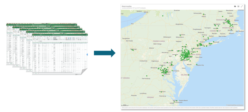
Learning how to augment the data HR already has is a good start. Demographic and location data is something all HR departments should be able to access while adhering to privacy guidelines. With this information, practitioners can quickly differentiate who should return to work first and who should work remotely indefinitely based on their daily commute.
This mapping process can be useful for a variety of other situations as well. Natural disasters like fires and hurricanes do not understand the borders and boundaries we put people in, such as state and city lines and offices. To be able to lay out employee locations and draw around them without regard to our human “fences” is invaluable in understanding who may be affected by an event. Trying to do the same task in an Excel sheet would take hours of ZIP code analysis.

Demographic data can even be combined with geospatial data to provide a more holistic overview or risk factor for each individual worker. Given we know that COVID-19 has a higher risk of fatality for some groups of people, HR will naturally want to be able to see those people and have access to them quickly. So aside from being able to map out where people live, their age and gender will also help inform any communication priorities too.
Alongside this, some of the most valuable information your department can both collect and serve for decisioning against in any analytics package will be any pulse survey data you take during this period. With this, HR can identify clusters of people with similar sentiments and needs to be addressed.
Incorporating Outside Data Sources
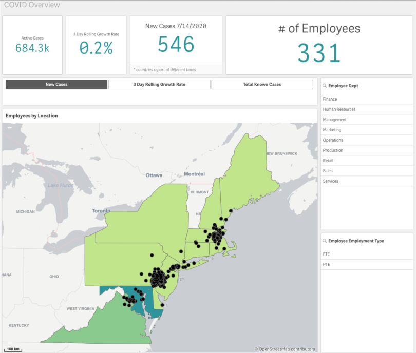
There are quite a few reputable outside data sources available to include in a chart like this. For example, we used data from Johns Hopkins University, as they have proven to be among the most credible sources, to the point that nearly all the international news feeds reference them as their data source. They also fulfilled the next important consideration: There were many ways of easily transferring the data. Throughout the pandemic, JHU has been out in front in the collection and distribution of that data.
Here’s the same map as above, but with COVID data from JHU layered in over the top:

In summary, most businesses have a return-to-work strategy in place. However, these strategies need to go beyond contact tracing to also include the following five considerations:
- The development and monitoring of a living map that shows geolocation risk levels and any work exposure is critical. COVID-19 resurgence means that knowing where your people are today is as important now as it was in February and March.
- Those closing offices and other work locations face the need to track where employees are living and working. Those crossing state borders may find tax implications of no longer working at the employers’ locations (which may be in Pennsylvania, New Jersey, New York, etc.).
- We are seeing employees moving from high-cost to lower-cost housing, given they no longer need to be present in the office every day. The Bay Area estimates a roughly 20 percent migration from within cities to more rural settings. This has an impact on compensation en masse, which tech can significantly speed up in terms of decision making and implementation of comp strategies.
- Employee engagement is taking a new level of importance. As people are not congregating in offices anymore, measuring and building upon success is critical to keeping the workforce motivated and productive. ERGs, social groups, mental-health apps: These are all very high on most forward-thinking companies’ agendas right now.
- Even moving recruitment to a fully digital experience is part of this (not) back-to-work strategy that companies need to do. Interviews, tests and, more critically, onboarding all present significant challenges as we think about how new employees — or even promoted workers — adapt to their new roles and teams and become productive.
Right now, there is no playbook. COVID-19 had a beginning, we are in the middle, and we do not know exactly when it will end. We only know whatever we go back to will not be the same as it was before. The downstream effects of this pandemic will be extremely interesting, and those with the ability to analyze data around their employees will be in the ideal position to evolve their engagement strategies and ensure that what is important to their workforce is top-of-mind for their business.


