

Quartiles are statistical objects that represent four equally divided intervals for data observations. These calculations are a useful way to compare different parts of the data such as maximum, minimum, median and outlier values. These statistical values are essential for comparing groups. For example, if we look at the quartiles in U.S. incomes in 2022 these values will be much more spread out than if we just consider incomes of oncologists in New York City because the range of all incomes in the first is much wider than the second. Quartiles would allow us to detect that an oncologist in New York making an annual salary of $50,000 would be an outlier. Even more, this salary may be so far off from the range of typical values, an analyst or data scientist may conclude that it is a bad value that may be the result of human input error.
Although this example seems intuitive, calculating quartiles is a statistically rigorous way to measure and compare the spread of values in data. Given this rigor, quartiles have many industrial applications including comparing company compensation, performing customer segmentation, detecting fraud in financial markets, and comparing ticket sales in the entertainment industry.
One of the most common ways to carry out such analysis is to use the quantile method in Pandas, which is useful because it can calculate any type of quantiles, such as median, tertiles (3 groups), quintiles (5 groups) and all the way up to percentiles (100 groups). Further, the Seaborn library is a Python visualization tool that allows you to visualize quartiles through boxplots.
Another use of quartiles is in analyzing subgroups of data. The Pandas quantile method also makes analyzing quartiles in subgroups within your data straightforward. Consider customer billing data for a phone and internet service provider. This data may contain information such as customer tenure, gender and service type. Quartiles at varying levels can give insights into which factors most influence customer retention. Using quartiles, you can gain insights that can help answer a wide array of analytical questions. For example, quartiles can help us with all the following questions:
- Do customers with fiber optic internet service keep their service for longer than those with DSL?
- How does gender correlate to length ofcustomer tenure?
- Are there significant differences in monthly charges for customers who stay versus those who leave?
Quartiles and their visualizations can help us tackle these questions in an analytically rigorous way.
Here, we will be calculating and analyzing quartiles using the Telco churn data set. This data contains customer billing information for a fictional Telco company. It specifies whether a customer stopped or continued using the service, known as churning. The data is publicly available and is free to use, share and modify under the Apache 2.0 license.
Calculating Quartiles: A Step-by-Step Explanation
Reading in Data
To start, let’s import the Python Pandas library:
import pandas as pd Next, let’s read our data into a Pandas data frame:
df = pd.read_csv('telco_churn.csv')Now, let’s print the first five rows with the head() method:
print(df.head())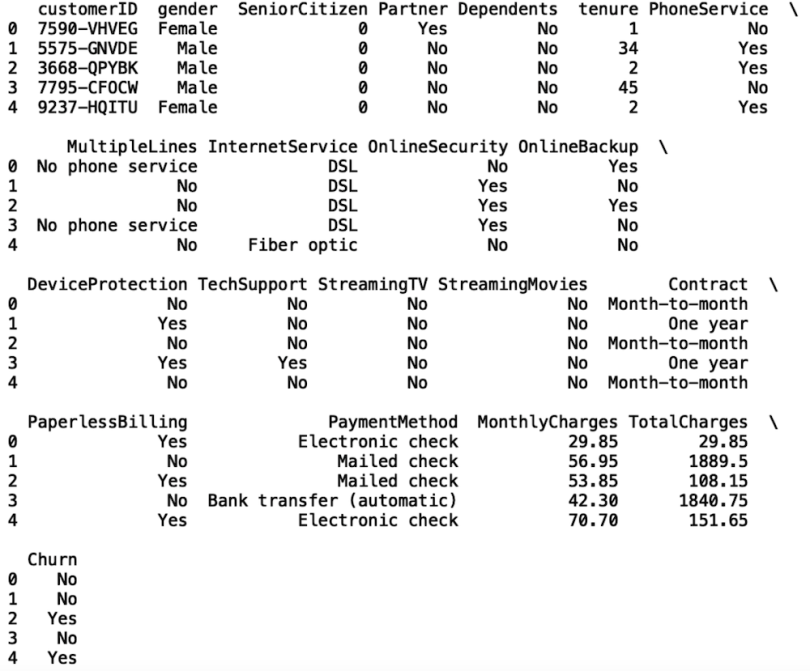
Quartiles correspond to data observations that have been divided into four intervals. They have the following definitions:
- First Quartile (Q1): This corresponds to the 25th percentile. This means that 25 percent of the data is lower than Q1 and 75 percent of the data is above Q1.
- Second Quartile (Q2): This corresponds to the 50th percentile. This value is also called the median. This means that 50 percent of the data is lower than Q2 and 50 percent of the data is above Q2.
- Third Quartile (Q3): This corresponds to the 75th percentile. This means that 75 percent of the data is lower than Q3 and 25 percent of the data is above Q3.
Using Pandas to Generate Quartiles
Calculating quartiles with the Pandas library is straightforward. Let’s calculate the quartiles for the tenure column, which is shown in months, across the entire data set. To do this, we will use the quantile method on our Pandas data frame object. We pass in 0.25 as the argument for the quantile method.
print("First Quartile (Q1) for Tenure: ", df['tenure'].quantile(0.25))
We see that the first quartile for tenure is nine months. This means that the 25th percentile for tenure is nine months, meaning 25 percent of customers stayed with the company for fewer than nine months.
Let’s calculate the second quartile. We do this by passing in 0.5 as the argument:
print("Second Quartile (Q2) for Tenure: ",
df['tenure'].quantile(0.50))
We see that the second quartile for tenure is 29 months. This means that the 50th percentile for tenure is 29 months, meaning 50 percent of customers stayed with the company for less than 29 months.
Finally, let’s calculate the third quartile. Here we pass in 0.75 as thee argument in the quantile method:
print("Third Quartile (Q3) for Tenure: ", df['tenure'].quantile(0.75))
Here, the third quartile for tenure is 55 months. This means that the 75th percentile for tenure is 55 months, meaning 75 percent of customers stayed with the company for less than 29 months.
Using Pandas to Generate Quantiles
The quantile method’s name refers to a statistical quantity that is a generalization for dividing data observations into any number of intervals. With quartiles, we divide data observations into four intervals. But with the same method, we can just as easily divide the data into five intervals (quintiles), 10 intervals (deciles), or even 100 intervals (percentiles). The choice of how data observations are split depends on the application, which is why having a general method for performing these splits is useful.
For example, to generate a decile, we simply pass arguments into the quantile method within the range 0.1 - 0.9. The value 0.1 corresponds to the 10th percentile (i.e., 10 percent of data observations fall below this value) and 0.9 corresponds to the 90th percentile (90 percent of data observations fall below this value). Let’s calculate the 9th decile, also called the 90th percentile, in tenure:
print("Ninth Decile for Tenure: ", df['tenure'].quantile(0.9))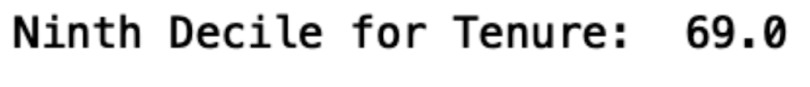
Quartiles and Quantiles for Data Subgroups
Generating quartiles for subgroups is also useful. For example, maybe we’d like to compare the tenure of customers with fiber optic to the tenure of customers with DSL. Let’s calculate the quartiles for each of these subgroups. First, let’s filter our data frames on the internet service columns to create a data frame for customer with DSL and another for those with fiber optic:
df_dsl = df[df['InternetService'] == 'DSL']
df_fiberoptic = df[df['InternetService'] == 'Fiber optic']
Now, let’s look at the third quartile in tenure for DSL and fiber optic:
print("Third Quartile (Q3) for Tenure - DSL: ",
df_dsl['tenure'].quantile(0.75))
print("Third Quartile (Q3) for Tenure - Fiber Optic: ",
df_fiberoptic['tenure'].quantile(0.75))

We see that Q3 values for DSL and fiber optic customers are the same; for both DSL and fiber optic, a tenure of 56 months is greater than 75 percent of customer tenure values in the data.
We can also look at the ninth decile:
print("Ninth Decile for Tenure - DSL: ",
df_dsl['tenure'].quantile(0.9))
print("Ninth Decile for Tenure - Fiber Optic: ",
df_fiberoptic['tenure'].quantile(0.9))

Here we see a small difference in the ninth decile for DSL and fiber optic. For DSL, 90 percent of customers stay with the company for less than 70 months. For fiber optic, 90 percent of customers stay with the company for less than 69 months.
Since the data we are working with corresponds to customer churn, let’s see if there are any differences between those who leave and those who stay. Let’s check if there are any differences between monthly charges for customers who churn versus customers who stay. Let’s create filter data frames for each group:
df_churn_yes = df[df['Churn'] == 'Yes']
df_churn_no = df[df['Churn'] == 'No']
Next, let’s calculate the third quartile in tenure:
print("Third Quartile (Q3) for Tenure - Churn: ",
df_churn_yes['tenure'].quantile(0.75))
print("Third Quartile (Q3) for Tenure - No Churn: ",
df_churn_no['tenure'].quantile(0.75))

We see that, for customers who churned, 75 percent stayed for fewer than 29 months. For those who stayed, 75 percent stayed with the company for less than 61 months. This illustrates what we already expect, which is that customers who leave have significantly lower values for tenure than those who stay.
Let’s consider the monthly charges column for customers who churn versus customers who stay:
print("Third Quartile (Q3) for Tenure - Churn: ",
df_churn_yes['MonthlyCharges'].quantile(0.75))
print("Third Quartile (Q3) for Tenure - No Churn: ",
df_churn_no['MonthlyCharges'].quantile(0.75))

Here, we see that Q3 for monthly charges for customers who churn is $94.20, while for those who stay, Q3 is $88.40. From this, we can conclude that 75 percent of customers who churn pay less than $94.20, while 75 percent of customers who stay pay less than $88.40. This may suggest that customers who end up leaving the service are being overcharged.
Visualizing Quartiles with Boxplots
Oftentimes, generating visualizations that clearly represent statistical quantities that are of interest is useful. One good way to visually represent quartiles is through boxplots. The Seaborn Python visualization library makes generating these plots easy. Let’s start by importing the Matplotlib and Seaborn libraries:
import seaborn as  sns
import matplotlib.pyplot as plt
sns.set()
Let’s generate a box plot for tenure across the entire data set:
sns.boxplot(df['tenure'])
plt.show()
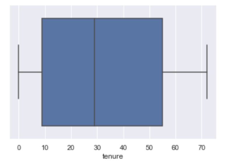
We can inspect the quartiles by looking at the blue box. The left side of the blue box corresponds to the first quartile (Q1), the black line in the middle is the second quartile (Q2, also called the median) and the right side of the blue box is the third quartile (Q3).
Another thing we can do is define a function that allows us to compare quartiles across categories:
from collections import Counter

def get_boxplot_of_categories(data_frame, categorical_column,
numerical_column, limit):
    keys = []
    for i in
dict(Counter(df[categorical_column].values).most_common(limit)):
        keys.append(i)
    df_new = df[df[categorical_column].isin(keys)]
    sns.boxplot(x = df_new[categorical_column], y =
df_new[numerical_column])
Let’s call this function with our full data frame, the churn column as the categorical column, and the tenure column as the numerical column. The limit for the number of categories displayed is set to five:
get_boxplot_of_categories(df, 'Churn', 'tenure', 5)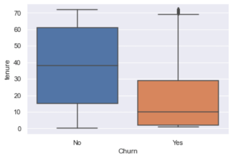
We see that the tenure values for Q1 and Q3 are greater for customers who stay than customers who churn, which we expect. Let’s generate this plot for monthly charges and churn:
get_boxplot_of_categories(df, 'Churn', 'MonthlyCharges', 5)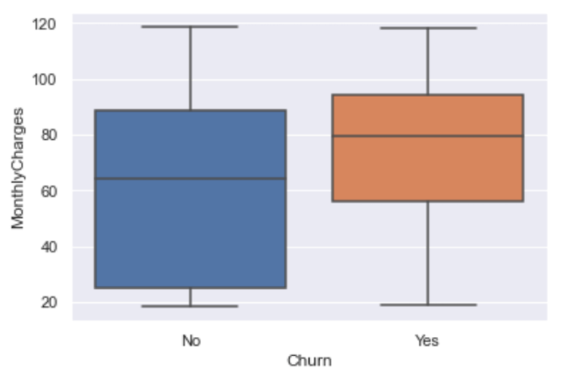
We see that Q1, Q2 and Q3 values for monthly charges are less for those who stay than those who churn. We also expect this because, as we saw earlier, customers who stay with the company are generally those who are paying less in monthly charges than those who leave.
The code in this post is available on GitHub.
Calculate Quartiles Now
Quartiles and quantiles are useful for comparing groups within data. The spread in values can differ dramatically across groups and categories in data observations. Understanding how numerical values in data is distributed within groups can aid data scientists and analysts in understanding differences in customer demographics. This analysis can help companies identify high value customers who are more likely to continue purchasing services or products. Companies can use this information to continue to target high value customers while also targeting the casual or infrequent buyer with deals and promotions as a part of a robust customer retention program.
Frequently Asked Questions
What are quartiles in statistics?
Quartiles are values that divide a dataset into four equal parts, marking the 25th percentile (Q1), the 50th percentile or median (Q2), and the 75th percentile (Q3).
How do quartiles help in data analysis?
Quartiles show how data is spread, making it easier to compare groups, identify outliers and detect unusual patterns such as possible input errors.
How can quartiles be calculated in Python?
The Pandas .quantile() method allows calculation of quartiles and other quantiles. For example, df['tenure'].quantile(0.25) returns the first quartile of the tenure column.
Can quartiles be used to analyze subgroups of data?
Yes. Quartiles can be calculated within subgroups — for instance, comparing customer tenure by service type or churn status to uncover differences.


