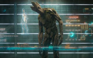
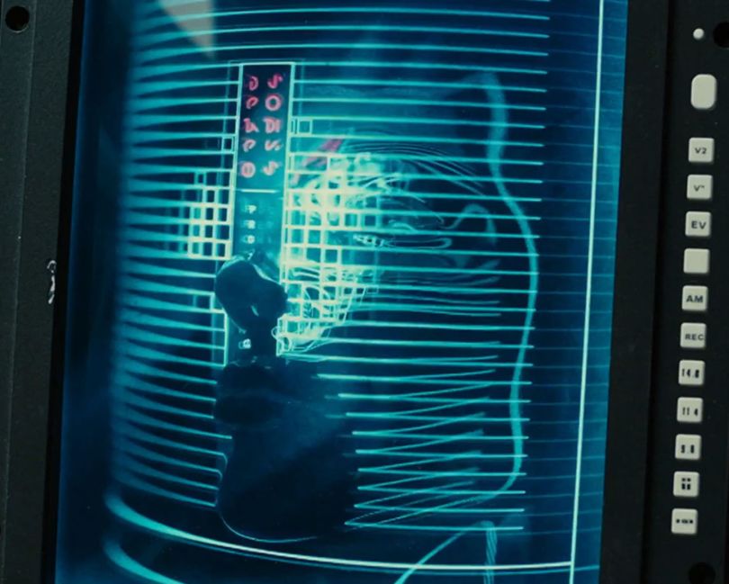
When Marti Romances first read the director’s brief for Guardians of the Galaxy, he thought it was perfect. Director James Gunn had a vision of another galaxy, in which interfaces bore little resemblance to those on Earth — a world of holographic biometrics, alien languages and gelatinous, jellyfish-like interfaces.
“He said: ‘Look, let’s start here: You’re going to be designing interfaces for people that come from another galaxy. So if we, as humans, understand what those look like, we are not going to be answering the brief,’” Romances said of Gunn’s vision.
To imagine these 3D projections from a modern-day perspective, in other words, was to miss Gunn’s point — he was calling on the design team to create visualizations the likes of which humans had never seen.
But while these graphical interfaces were conceived for sci-fi cinema, Romances, who is director of Territory Studio, saw room to bring them into real-world products.
“This thing that we created for another galaxy is pure speculation, but it could actually be very good,” Romances told me. “What if we could visually represent data from the revenue of a financial institution or the energy from a car?”
“This thing that we created for another galaxy is pure speculation, but it could actually be very good.”
Charts and tables are nothing new. But creating these visualizations in 3D game modelers, such as Unreal Engine, changes the user’s perspective — and the depth of information that can be conveyed. Imagine a two-dimensional graph showing the value of a stock investment over a year. Now imagine adding a third axis. Suddenly, the past 10 years’ earnings can be sliced and compared in a volumetric accordion fold-out.
These are the kinds of animated graphics the San Francisco-based consultancy, known for its work on films and video games, has been creating for clients in recent years. The satellite office of the London-based creative agency develops graphical and augmented reality interfaces for products ranging from contact lenses to smartwatch displays to autonomous vehicles.
Its most recent work includes the 33-inch LED display on Cadillac’s first fully electric SUV, the LYRIQ, the flagship of General Motor’s $27 billion effort to create 30 new EVs in the next five years. In a sign of the project’s significance, General Motors CEO Mary Barra announced the company’s collaboration with Territory Studio in her opening keynote speech at the Consumer Technology Association’s annual trade show and conference, CES 2021.
Romances, who was born in Barcelona and began his career as a graphic designer, said the interior display graphics and augmented reality features of upcoming GM vehicles trace a direct line to the speculative interfaces Territory Studio created for sci-fi films like The Martian, Ad Astra, Ex Machina and Blade Runner 2049, as well as several Marvel Studios movies, including Avengers: End Game and Spider-Man: Far From Home.
Part of the studio’s apparent appeal to GM — not to mention Land Rover, Faraday Future and Jaguar — is its focus on form before function.
“Instead of thinking function first, you invert that process to: Let’s cover a narrative, or let’s cover an idea and make sure that it is aesthetically pleasing,” Romances said.
Reskinning NASA’s Mission Control Center
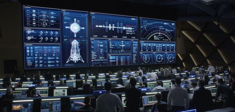
Consider the studio’s work on The Martian, directed by Ridley Scott. Set 20 years in the future, the film tells the story of NASA’s crusade to bring astronaut Mark Watney home from Mars. Territory Studio reorganized and reskinned an 18-by-16-meter bank of LED monitors in the Johnson Space Center’s mission control center to make it more accessible to lay viewers.
Though the data is scientifically plausible and based on close consultation with experts at NASA and the European Space Agency, the design takes artistic liberties with the colors and visual hierarchy of a bank of some 100 screens. The result, Romances said, is a user-friendly interface that leads viewers’ eyes naturally to information important to the narrative.
“The [engineers] that are in that room, trust me, they’ve been trained to know every single one of those numbers. But we’re not telling a story to the [people] in that room. So the point is, as a visual designer, you have to come up with a visual solution that will allow everyone in the cinema to understand,” Romances said.
Critically, though, the same visual storytelling approach applied in The Martian can help users navigate technologically sophisticated consumer products — leading the eye more quickly from A to B.
And, often, the inspiration for these products, including the Cadillac LYRIQ’s interior display, is even further afield.
What Does Tony Stark’s Body Suit Have to Do With Auto Mechanics?
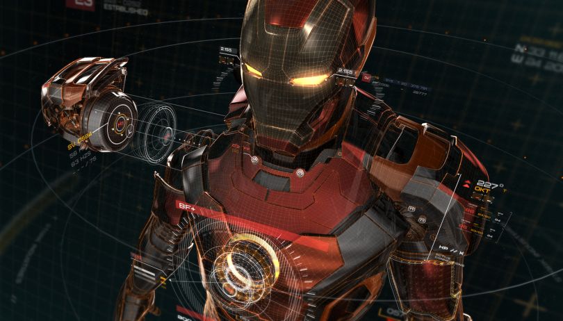
The futuristic minimalism of the LYRIQ takes cues from the graphic animations emanating from Tony Stark’s body suit in Marvel Studios’ Avengers: Age of Ultron. Romance’s team developed Iron Man’s graphics package, along with the screens inside his lab, in close collaboration with Marvel’s costume department. They draw on the superhero’s interest in advanced engineering, robotics and artificial intelligence.
The three-dimensional, schematic quality of the graphics — the way they seemingly lift from the screen, expand and rotate 360 degrees to reveal the arterial circuitry inside Stark’s suit — is found not only in the LYRIQ, but the latest concept designs Territory Studio is developing for GM and several other auto manufacturers.
Just as Tony Stark’s suit reveals body damage, Romances told me, the motion graphics inside these pipeline vehicles can pinpoint the location of mechanical problems and give drivers a detailed picture of what’s wrong.
“If you have an issue with the suspension in your car, right now, probably all you get is an icon that says, ‘There’s an issue,’” Romances said. “It’s binary, on or off. We’re translating all these [indicators] into a system that is able to render 3D data, 3D parts of your car, and show you in real time what the issue is.”
As cars become more technologically advanced — driving autonomously, self-updating their software packages and sensing the surrounding environment with laser reflections and cameras — visualizations are becoming more important to earning users’ trust. This has led to a curious realignment of industry silos. Companies like Nvidia and Android now have automotive divisions, while companies like Cadillac have internal UI teams.
“We’re looking at how something can be made a bit sexier, at a quality level you would expect from a Marvel film, not engineering standards.”
For Territory Studio, this evolution has been mostly a good omen, fueling a range of projects. While some manufacturers hire the design team to create short animated films that introduce drivers to a car’s safety features, others are interested in screen renderings of seat adjustments, concept designs for battery-charging displays or interfaces that “see” the world like autonomous vehicles.
“There’s a lot of opportunity now to change things,” Romances said. “We’re packing iPhones in our pockets that are more powerful than the computational power [many of] our cars have. With cars, there’s more at stake. We should pay even more attention to these products that are so important to us.”
When it comes to autonomous vehicles, much of Territory Studio’s conceptual design work relates to safety. How do you show riders that a car has detected passing pedestrians? How do you signal anticipated lane changes? How do you educate the public about the Society of Automotive Engineers’ six levels of driver assistance technology and what they convey about a car’s capabilities? These are critical user-experience questions that could have a significant impact on the public’s comfort with driver-assisted and fully self-driving cars.
Many times, however, automotive UI is as much about style as it is about safety. The 3D console of the Cadillac LYRIQ, for example, is not only a digital information panel, but a fully fledged entertainment system. Time-sequenced lighting springs to life above sleek iridescent panels. Drivers can select personalized music mixes and mood lighting. Rear-seat displays resemble the latest mobile tablets.
“We’re looking at how something can be made a bit sexier, at a quality level you would expect from a Marvel film, not engineering standards,” Romances said.
The Interface Revolution
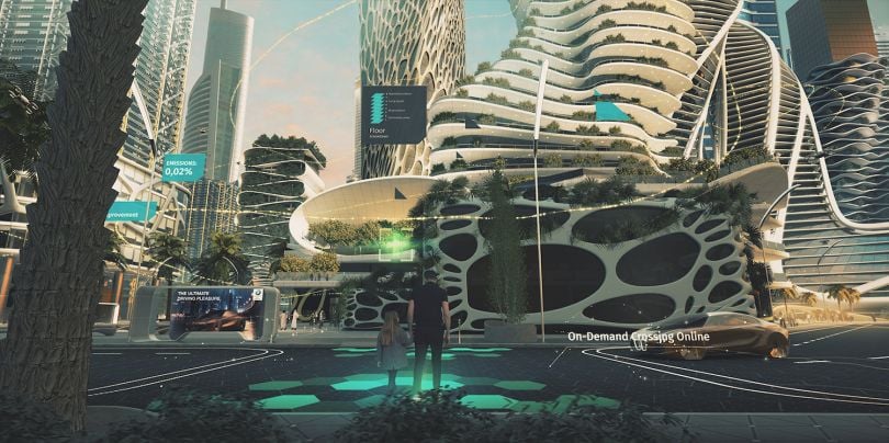
Auto companies aren’t the only ones keen on introducing sci-fi and video game-inspired interfaces. The increased rendering speed of complex visualizations through software tools such as Cinema 4D and Autodesk’s Maya has opened a path for wearable-makers like Huami, prosthetic companies like Atom Limbs and tech giants like Amazon to experiment with real-time integration of motion animation.
Advances in hardware are even more dramatic, Romances told me. Production-ready graphics quickly rendered and iterated inside VR headsets, powered by software like Unity and Unreal Engine, do not require extensive engineering tweaks. That means fantastic scenes like those in Steven Spielberg’s Ready Player One — another recent Territory Studio project — are within reach for a much larger proportion of interface designers.
“The difference over these last 10 years is that we would imagine something — ‘Oh, boy, on paper, it looks amazing’ — but guess what, our technology is not ready. We don’t have enough computational power in this product or service,” Romances told me. “So what we had to do was work with a team of engineers that dissected and cut and, most of the time, Frankensteined our vision into something that could fit in the frameworks they have established.”
That is no longer the case. A video game or film design that formerly took an hour to render can now be reactive, in real time, at 30 to 60 frames per second. So instead of thinking, first, of what a user might apply an interface to do or its development constraints, the design team at Territory Studio starts with a vision of what is possible — the proverbial moonshot. Subsequent iterations revise the idea to fit a client’s budget and aesthetic tastes.
In Avengers: Age of Ultron, director Joss Whedon wanted a helmet visualization that was more than just a costume embellishment. The resulting iterations helped economize the narrative: A map projection emerging from the helmet conveyed a geographic shift in the story.
“They probably went through 500,000 iterations until they said, ‘This is the one.’ There is a 3D modeler that will do that. But then they will send us the 3D asset. And we will say: ‘What’s the best way to visualize that? Let’s open the helmet. Let’s animate that,” Romances said.
Every Design Team Is an Interface Design Team
New car lines have a relatively long production life — roughly five years. So, developing a visual language for their digital interfaces is a crucial and risky part of the design process. Digital agencies, like Territory Studios, often represent one piece of an integrated team.
At General Motors, Romances told me, an interior design team comes up with systems for materials selection and lighting features. Exterior designers develop clay models to sculpt the shape of the vehicle before modeling it with 3D software. Internal UI teams work with outside consultants to create the console interface.
In some ways, the extended command chain mirrors that of a film studio. Instead of a producer or show runner overseeing an art department and teams of costume designers and script writers, you have a creative director for an entire car, or the product lead behind the interface design, calling the shots.
“The person who’s directing the whole interior of the car, or the whole digital platform, is going to be the one giving thumbs up or thumbs down,” Romances said. “They know because they’ve been there for years, and they know how these things work.”
Then again, sometimes veteran automotive engineers need a nudge to push them outside their comfort zones.
“We’re not going to see things from the functional point of view, we will see something almost as an object of desire.”
“I think the reason automotive companies are embracing us is because we come with a different approach,” Romances said. “We’re not going to see things from the functional point of view, we will see something almost as an object of desire.”
For Romances, an avid gamer whose early career included interface work on Activision’s Guitar Hero and DJ Hero and Nintendo’s Just Sing, the spread of user-interface design into mainstream consumer products is a sign the studio’s business model can scale. While Territory Studio continues to pursue new film projects and has a long list of video game credits — including a retro punk logo and graphics package for CD Projekt Red’s Cyberpunk 2077 and the game box art for the PlayStation 5 title Godfall — the firm is rapidly expanding its footprint.
Clients now call on Territory Studio for screen graphics, visual effects, game design, product art or creative advertising. The studio recently worked with Amazon to develop commercials advertising its AI-enabled data visualizations for the National Football League and collaborated with Atom Limbs on a prototype of an exoskeleton for a prosthetic limb. That’s in addition to a consistent flow of screen and branding work for streaming companies like Netflix and HBO.
Ultimately, the increased focus on screen graphics and human-machine interaction in manufacturing and product design may open more room for specialized UI roles. If it’s become a cliche to say every company is becoming a tech company, what may be less widely publicized is that every design team is becoming an interface design team.
“Here’s the thing: I always talk to my friend in London, [an interface designer] who’s working on films. He was working on Gravity. And I learned what he was doing was modeling 3D feet — like the toenails. He’s the best foot modeler in the world,” Romances said. “And that shows you the level of expertise you will find putting together a project, like in films or video games, for one of these characters to come to life.”

