User onboarding is arguably the most crucial phase of the product journey. Get it right and you have a new customer, a new source of recurring revenue, and, potentially, an advocate who will promote your product to others. Get it wrong and you may never see or hear from that person again — except, maybe, when they’re dunking on your product on Twitter.
That’s why Giorgio Caviglia, head of UX and design at Trifacta, takes onboarding flow so seriously. He oversees the design of the company’s marquee offering, a cloud-based platform data engineers at companies like PepsiCo, Bank of America, and Kaiser Permanente Health use to scrub and manage their data.
Through predictive artificial intelligence and graphic visualizations, the tool spotlights spreadsheet errors and omissions and suggests potential corrections users can make.
“A classic example, for instance, is a data column that contains dates with different formats. Trifacta is very good at helping standardize this sort of information, with a very comprehensive visual user interface that resembles Excel,” Caviglia said.
Maybe that doesn’t seem like groundbreaking technology, but imagine you’re a data engineer at a large multinational company charged with moving files from Google Cloud Storage to a data warehouse. You want the data to be standardized and reliable, but often when it arrives from third-party providers, it’s a chaotic mess. Worse, cleaning it up isn’t really the kind of strategic thinking the company is paying you for.
“Somebody will have a month, day, year format, somebody will have a year, followed by a date. Somebody will be from Europe, somebody will be from the U.S.,” he explained. “So you can imagine the amount of potential information and value that risks being lost, because of these small but significant changes.”
Trifacta’s software is designed to streamline the process. But before it can be useful, teams need to adopt it. To get them to do that, the new user onboarding experience has to be as straightforward as possible. Otherwise, they could easily jump ship for a competitor’s offering.
Caviglia shared with Built In three strategies that Trifacta applied in its recently revamped onboarding flow to increase the product’s user acquisition rate and percentage of first-time users who complete a task.
3 Strategies to Revamp Onboarding
- Keep the registration screen visually spare.
- Drop users into the core experience.
- Treat product tips like life rafts, not anchors.

Keep the Registration Screen Visually Spare
A new user’s onboarding experience with Trifacta starts before they engage with the product — often with a free trial promotion embedded in an email or social message.
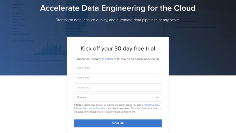
Clicking a link to the free trial takes the user to a short five-line registration form requesting their work email, first and last name, country and state. The reward for completing the form is a 30-day free trial. It’s the only action a user can take on the screen. You either sign up or return to the landing page. But the form requires no payment information and is kept simple to capture as many new users as possible.
“You really want to remove doors that, maybe, somebody can get lost in, or signals that can distract them. Sometimes adding a couple of more fields means a 20 to 30 percent drop in activation.”
The process is very much like Slack’s, Caviglia told me. Users who complete the form jump to a screen where they can create a workspace tied to a URL. Soon after a user’s first session, a dialog box offering starter, professional or enterprise-level subscription packages appears near the bottom of the homepage. Automated marketing messages are triggered when the trial ends to offer users an opportunity to re-up with a subscription. While some attrition is expected after the trial expires, giving users a taste of the experience encourages long-term adoption.
“When people talk about growth experimentation, I think they are realizing that the first-time user experience is crucial,” Caviglia said. “And you really want to remove doors that, maybe, somebody can get lost in, or signals that can distract them. Sometimes adding a couple of more fields means a 20 to 30 percent drop in activation.”
For users who arrive at the website organically, a sparse landing page also funnels users to the free registration screen. The page is a good illustration of the principle of “less is more” — not just in the Miles Davis sense, as an aesthetic mantra, but as a way to use white space to direct users’ attention to the key target: in this case, registration.
The screen’s focal point is a light blue button that reads, “Start free.” Aside from a header bar at the top of the page, and the greeting of a chatbot and several client logos at the bottom of the fold, it is the only text that appears on the screen of a standard browser before scrolling.

Drop Users Into the Core Experience
For good reason, design teams are often tempted to include a comprehensive description of a product or release within the onboarding flow. They are excited about what a product offers and want to share its capabilities with new users.
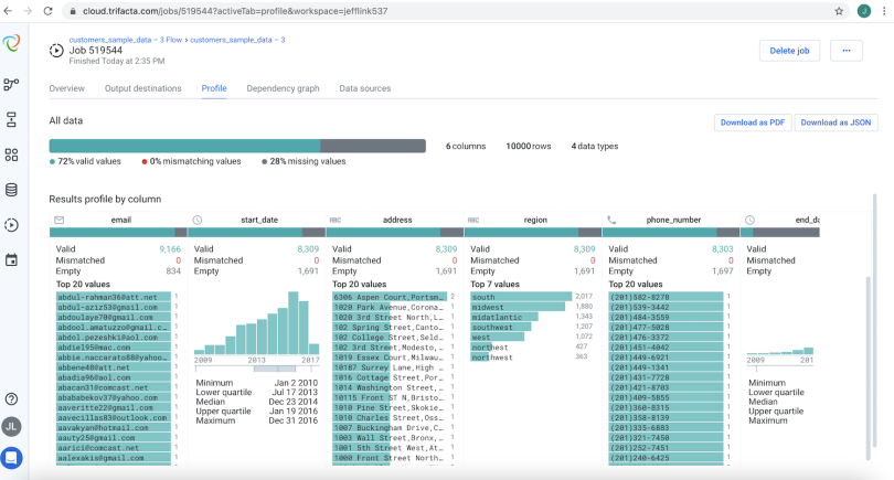
But Caviglia said it’s better to let users experience the product themselves in situ, or in place. Once users have registered, they land in a blank, drag-and-drop canvas, flanked by toolbars. A side panel option allows them to drag an active spreadsheet into the space to upload it. From there, they can quickly experiment with the product’s tools for cleaning and organizing data, such as a run button that uses preinstalled “recipes” to transform Excel-like sheets into digestible data profiles revealing valid, mismatched or empty fields.
“Immediate feedback is powerful. Once you upload a file, you can see how you can apply these transformations and cleaning steps to your data and see a final result and how that looks when you run it at scale.”
Users can also view sample flows for filtering social media data to isolate messages with valid user IDs, or for translating sales opportunities into actionable revenue forecasts — examples of how the software can inform higher-level business goals.
“Immediate feedback is powerful,” Caviglia told me. “Once you upload a file, you can see how you can apply these transformations and cleaning steps to your data and see a final result and how that looks when you run it at scale.”
In all this, clear messaging is key. An early iteration of the upload function required users to hit a button that said “wrangle” to work with their data. The word “wrangle” conveyed a more nuanced description of how the software actually functioned. But even this simple verb choice proved too confusing and led users astray. The team simplified the button’s language to read, “continue,” which significantly improved activation rates.
They also made an exhaustive effort to minimize clicks. At first, the upload button sent new users to a drop-down list of saved files, similar to what appears in a Dropbox user profile. But this extra step distracted new users, most of whom only had one working file. Dropping them directly into the spreadsheet was more effective.
“This is very interesting in the sense that [seeing a list of file uploads] might make sense for an existing user. But we didn't believe it made sense for a new user,” Caviglia said.
To remove friction for new users without access to a working spreadsheet, or impatient users who didn’t want to spend time hunting for one in the cloud or on a hard drive, Trifacta developed a set of demo sheets to sample inside the product.
Collectively, these changes led to a more than 5 percent increase in new user registration based on data collected from Amplitude.

Treat Product Tips Like Life Rafts, Not Anchors
When new users arrive in a spreadsheet, a product tour provides a high-level view of the workspace and how it can be used to organize and analyze data. It’s a delicate balance, Caviglia told me: Trifacta’s design team wanted to give users the chance to play around, but they didn’t want to leave them lost or confused.
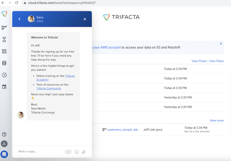
Automated pop-up messages — triggered the first few times users arrive on the site — have a personalized touch, featuring the faces of customer service agents who offer brief tips to orient users to key toolbar functions. These agents, known as concierges, can also be contacted directly, via in-app chat or a quick help button.
In addition to these messaging features, users can access self-service data management courses or, via an integration with the in-app messaging platform Intercom, manually select icons that pique their curiosity to view more detailed tool tips. But while there is enough information to keep users confidently moving forward, there is only just enough information.
Because the design team believed the Trifacta’s machine learning capabilities distinguished it from competitors, they chose to emphasize these aspects of the design in the tour.
“You don’t want to tell the whole story of the life or the product, because users rarely click more than three or four pop-ups.”
One pop-up, for instance, highlights a suggestions feature that leverages Trifacta’s recommendation engine to offer data record style tips culled from the patterns of other users. Similarly, a button to extract text in row and column fields — a list of customer ZIP codes, for instance — is highlighted to show the software’s usefulness for quickly parsing data without the need for Excel-like formulas.
“If you’re an analyst and your boss asks you which of your customers in a particular region is doing more activity in your product, you don’t want to waste your time trying to write a regular expression, you want to give somebody an answer,” Caviglia said.
The key takeaway, he told me, is that product tips should be used sparingly — as life rafts, not anchors.
“You don’t want to tell the whole story of the life or the product, because users rarely click more than three or four pop-ups,” he said. “User experimentation is key, and this is a very important aspect of what we do at Trifacta: the loop between previewing and acting on data is really helpful.”


