

Blending Culture, Craft and Digital Innovation
When customers wait for their orders to be made at many coffee retailers, they scroll through social media or check emails; but at Blue Bottle Coffee, they go on a journey through culture and art, designed to spark curiosity and connection.
Blue Bottle’s newly redesigned mobile app has redefined the order waiting process, offering customers the chance to view awe-inspiring images of Japanese art, such as Yanagawa Shigenobu’s famous woodblock print, “Celebrated Waterfall,” while they wait for their order to be made.
This immersive element is just one of many exciting features offered by Blue Bottle Coffee’s new mobile app. To bring the app to life, the company partnered with the team at Work & Co, a design and technology dedicated to helping brands enhance their digital presence.
Designing a Brand-Aligned Mobile Experience
A cross-disciplinary team at both Work & Co and Blue Bottle made up of product leaders, designers, engineers, and brand experts came together for the project. Myhra Mirza, design director at Work & Co, played a key role throughout the mobile app redesign process.
“Among many priorities, I wanted to ensure that the visual design and framework of the app felt closely aligned with the minimal yet tactile feel and welcoming atmosphere evoked by the Blue Bottle brand and its cafes,” she said. “We wanted to spark this same feeling within the app, while also helping customers order that all-important next cup of coffee quickly.”
Leaning on various tools and a “one-team model,” Work & Co’s team members worked closely together across disciplines while staying in sync with the Blue Bottle team, ensuring that the new app reflected the heart of the Blue Bottle Coffee brand.
While the project was challenging, the partnership was not. Because according to Mirza, Blue Bottle Coffee and Work & Co have one thing in common: They both deeply value quality and design.
“Every member of our team cares deeply about craft and impactful user experience, and strives to uphold quality,” Mirza said. “I think that is a rare thing to find within a company.”
“Every member of our team cares deeply about craft and impactful user experience — a mindset that drives every app, website, and digital product we create.”
Below, Mirza shares more about how Work & Co collaborated with Blue Bottle Coffee to redesign the global coffee retailer’s mobile app and how it reflects Work & Co’s unique approach to building new solutions.
About Work & Co
Work & Co is a design and technology company that partners with companies including IKEA, Apple, PGA TOUR, Gatorade, Google and more to launch digital products that transform businesses.

Evolving Blue Bottle Coffee’s Digital Experience
Describe the impact of Work & Co’s partnership with Blue Bottle Coffee.
Blue Bottle has long been known for its dedication to craft, both in the roasting of its coffee and its beautiful cafes across the United States and Asia. Our focus was on evolving the brand’s digital experience. While Blue Bottle had a mobile app specifically for ordering pickup, we worked closely with their in-house team to redesign and elevate the mobile platform to feel more true to the Blue Bottle brand and in-store experience.
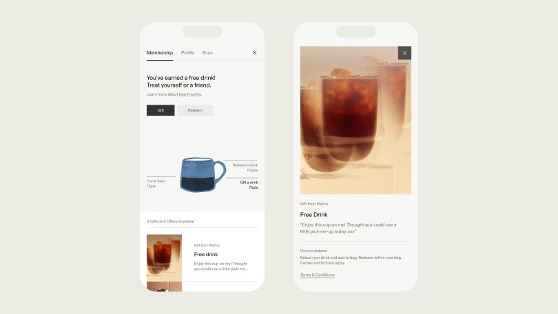
One of the brand tenets we wanted to make sure shone through was the emphasis on care and hospitality that customers experience at Blue Bottle cafes. Our goal was to translate that feeling to the digital space while increasing mobile ordering and engagement by making pre-ordering more intuitive. We also learned that, for many loyal fans, coffee is more than a beverage; it’s a ritual. So, our reimagined experience enriches the full journey of a customer, with a more streamlined navigation that echoes the brand’s commitment to simplicity and a refined color palette and rich photography. One of the biggest impacts of the new app is that it introduces a new membership program that makes the coffee ritual more rewarding and shareable.

Building With UX Precision and Collaboration
What role did you play in creating the reimagined mobile app, and what tools or technologies were involved?
My role was primarily in the concepting and detailed design phase of the project, as well as collaborating across Work & Co teams throughout the development and visual QA process. Among many priorities, I wanted to ensure that the visual design and framework of the app felt closely aligned with the minimal yet tactile feel and welcoming atmosphere evoked by the Blue Bottle brand and its cafes. We wanted to spark this same feeling within the app, while also helping customers order that all-important next cup of coffee quickly.
We used Figma for design, and the app was built using Flutter. Dev Mode in Figma was one of the best inter-collaborative tools we utilized for this project. It required the designers to spend a little more time than usual getting designs “dev-ready” and leaving notes about changes, but ultimately, it helped our teams run more seamlessly and efficiently. It was easier for our developers to identify changes that we made within the design and allowed us to have annotations associated with designs, making it easier for all team members to communicate and understand design intent.

Turning Challenges Into Creative Opportunities
What obstacles did your team encounter — and overcome — along the way?
Given the brand has such a strong, recognizable visual identity extended across its packaging and physical spaces, a key challenge when it came to the mobile app design was ensuring we could translate that brand into the digital space. When designing for digital, we have to take into account different factors than for physical package design, like accessibility and legibility. We worked closely with their teams to help develop a digital style that truly aligned with their brand, while also taking these digital design factors into consideration when it came to decisions around typography and color to ensure we created an intuitive and navigable digital experience. Blue Bottle is a company that truly values design, which presented a really exciting opportunity for collaboration for our team, and their openness to our ideas really helped keep our team motivated.

The Power of the One-Team Model
What teams did you collaborate with in order to get this across the finish line? What strategies did you employ to ensure that cross-functional collaboration went smoothly?
Blue Bottle’s in-house brand and tech teams partnered closely with Work & Co to lead the design, product strategy, front-end development and QA of the app. A distinction about the way Work & Co approaches product design and development is our one-team model: We push against silos to bring team members across disciplines together to collaborate on projects with clients from start to finish. Having development present from the outset rather than having them join after design was finished encouraged consistent, open communication and collaboration across teams and kept us honest in what was achievable within our constraints. We held regular sync-ups with the team at Blue Bottle, who similarly formed one cross-functional team with leaders across their organization. This was key for them to ensure implementation in their cafes was successful.
“Having development present from the outset rather than having them join after design was finished encouraged consistent, open communication and collaboration across teams and kept us honest in what was achievable within our constraints.”
Craft, Collaboration and Consistency
When you think of other companies in your industry, how does Work & Co compare when it comes to building and launching new products? What’s different about your workplace?
One of the biggest distinctions about our team and process is our uncompromising focus on quality. Every member of our team cares deeply about craft and impactful user experience, and strives to uphold quality. I think that is a rare thing to find within a company. On top of that, bringing development into the process in unison with design — versus as a waterfall or handoff process — ensures cohesion at every step to help us bring the best possible product to market.
Frequently Asked Questions
What inspired Blue Bottle Coffee’s mobile app redesign?
The goal was to evolve Blue Bottle’s digital experience so it felt as thoughtful and refined as its cafés — transforming a simple pre-order tool into an immersive brand experience.
How did Work & Co approach the design process?
Using a “one-team model,” designers, engineers and brand experts from both companies collaborated from start to finish to ensure the app reflected Blue Bottle’s minimal, tactile brand identity while enhancing usability.
What are some standout features of the new app?
The redesigned app lets users view curated Japanese artwork while waiting for orders, streamlines navigation, introduces a membership program, and enriches the customer ritual with elegant visuals and refined interactions.
What tools and technologies powered the redesign?
The team used Figma and Flutter, leveraging Figma’s Dev Mode for seamless collaboration between design and development teams.
What challenges did the team overcome?
A major challenge was translating Blue Bottle’s strong physical brand into digital form while maintaining accessibility and legibility. Through collaboration and attention to typography, color and usability, the team created a cohesive and intuitive experience.
What makes Work & Co’s approach to this project distinctive?
Its one-team philosophy and uncompromising focus on craft and quality set it apart, ensuring every product is built through unified design-development collaboration rather than a traditional handoff process.


