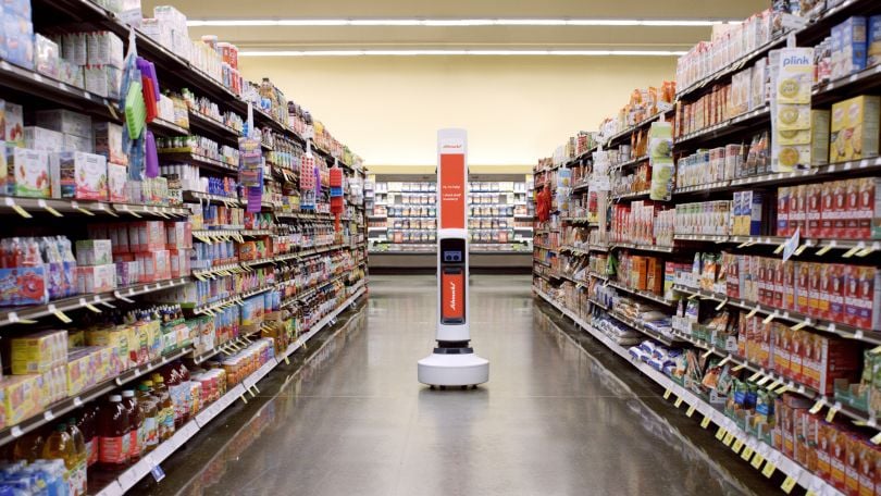
Imagine this: As you make your usual rounds in the grocery store, a tall, white, rectangular statue suddenly floats past you down the aisle. It’s some kind of robot but it’s so quiet, you barely notice it’s there.
A store clerk comes up to ask if you need help finding anything.
“What’s that robot for?” you ask.
“That’s Tally,” the clerk replies. “It keeps track of inventory for us.”
“Interesting ... do you have any coconut water left?”
The clerk looks down at her tablet. “According to Tally, we have exactly one case left, right over here,” she says. You follow her, glimpsing Tally silently floating down another aisle.
Tally is made by San Francisco-based Simbe Robotics to do its job without disrupting shoppers or store employees. According to co-founder and chief design officer Jeff Gee, the only way to accomplish that is to take a close look at the people who will be interacting with the robot.
“Your thinking really has to go deep to understand the space, and you can’t disrupt the shoppers or store employees,” Gee said. “When it comes to human-centered design, you have to empathize with your audience.”
What is human-centered design?
Human-centered design (HCD), also sometimes called design thinking, is a design framework that takes human behavior and human needs into account through every step of the design process. It can be used to design hardware, software, services and even organizations — as long as human beings are kept at the center throughout the entire process.
The idea of human-centered design was conceptualized by Herbert Simon at the Stanford University Design School. Simon first mentioned design as a way of thinking in his book, Sciences of the Artificial, in 1969.
As opposed to designing in a way intended to maximize the efficiency or capabilities of the technology itself, HCD strives to solve the problems that the user is experiencing.
“The best way we can discover new options or limitations is by using human-centered design.”
HCD is based on the idea that many social problems, such as climate change and homelessness, are difficult to solve due to the incomplete or changing requirements needed to address them. What’s needed, Simon suggests, are collaborative solutions that take into account the nuances of human behavior. HCD does this by prioritizing the understanding of human behavior and the problem at hand, empathizing with the affected group and creating innovative products and systems that can be adapted as their needs change.
IDEO, headquartered in Palo Alto, California, is credited as being the first design agency to truly monetize the concept of human-centered design, apply it to technology and bring it into the mainstream.
In 1980, IDEO designed the first usable mouse for Apple’s new computer, the Lisa, taking into account the tactile click of the button and creating a rubberized ball for ease of movement. It’s created a framework for understanding how human-centered design works in practice.
How does human-centered design work?
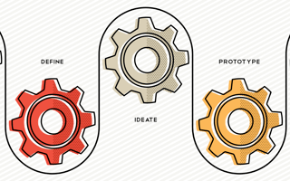
The three phases of the human-centered design process, according to IDEO, are inspiration, ideation and implementation. During the inspiration phase, you spend time with the people you’re designing for in order to understand and empathize with their needs. Typically, this is done through interviews, observation sessions and tours, or by immersing yourself in the world of the user. You then use the inspiration and empathy gained to develop a point of view and begin thinking about how your research will translate into the product or service you’re going to design.
During ideation, your newly developed point of view will help you start building tangible products. One of the goals of the ideation phase is to come up with a wide range of ideas — some might be too difficult to realistically implement, but the point is to think as creatively and freely as possible. During prototyping and testing these ideas, you’ll see your product in action and make changes depending on how well the needs of your users are being met.
“Human-centered design means that you don’t just give people new tech, you give them tech they can use.”
The implementation phase is the release of your product into the world, and the point at which you’ll observe how it’s received. Implementation also includes telling the story of your product through marketing and creating a business model to sustain it. The most effective human-centered design framework allows you to continue measuring, observing and iterating over time. Human needs change and your product should be able to address those changes as they arise.
Empathizing with your users
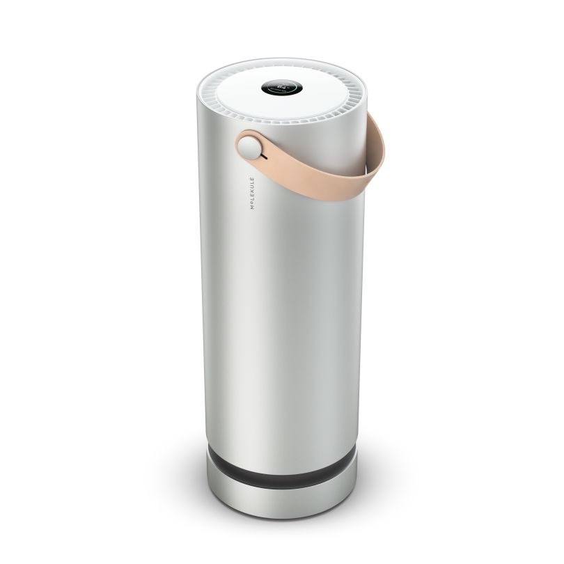
When Peter Riering-Czekalla was designing the Molekule air purifier, he thought a lot about how the technology would be adapted into the everyday life of the user — in this case, allergy sufferers, or people who are regularly subjected to poor air quality.
“Human-centered design means that you don’t just give people new tech, you give them tech they can use,” said Riering-Czekalla, who is VP of product and design at Molekule. “Engineering teams miss the mark if they can’t fit the tech into people’s lives.”
The San Francisco-based company uses photo electrochemical oxidation (PECO) technology to clean the air by eliminating pollutants at the molecular level. It was developed over 20 years by research scientists to help allergy sufferers, and it was Riering-Czekalla’s job to design housing for the technology. The device had to be easy to use but also look nice in someone’s living room or bedroom.
“People don’t want big plastic boxes, they want to dress their home in things they feel content with,” Riering-Czekalla said. “We created a form for that tech.”
He started the inspiration phase by spending time with allergy sufferers in their homes and learning why traditional air purifiers were not meeting their needs.
One of the biggest pain points he discovered during his research was the hassle of filter replacement. Many people do not replace the filter in their air purifier as often as they should. Riering-Czekalla and his team looked into the reasons behind this and discovered three main pain points — users don’t know when the filter needs to be replaced, they don’t always know where to buy the right kind and they don’t know how much they cost.
All this friction prevents people from replacing their filters, which means their air purifiers are not properly cleaning the air or preventing allergy flare-ups.
Molekule’s mission is to deliver clean air to all users, Riering-Czekalla said, so he made it a priority to address these issues. When you order the device and signup for an account, the company predicts the annual cost, tells you when to replace it, and delivers the filter to your house.

While taking a human-centered approach to designing the Molekule air purifier, Riering-Czekalla said he also realized the user experience can be very emotional. During the Sonoma and Napa wildfires in late 2017, many asthma sufferers couldn’t set foot outside, and even the indoor air quality dropped. Those using Molekule were able to reduce their symptoms and breathe more normally.
“Human-centered design isn’t just about giving them something that solves the problem functionally,” Riering-Czekalla said, “it’s also addressing their emotional needs.”
When design gets emotional
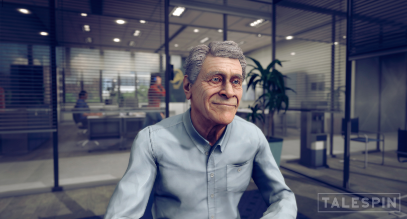
At VR / AR company Talespin, based in LA, product manager Remmelt Blessinga helped design a virtual human named Barry that teaches managers how to compassionately let employees go when necessary. In the Barry simulation, users will witness a VR person argue, express emotions and ask questions all while roleplaying at being fired.
For example, If you say: “Your attitude has left me no alternative than to terminate your employment,” then Barry might respond: “I just don’t understand. All I wanted was the best for this company. Can we just back up for a second and talk about this?”
Sometimes people get very upset during the Barry simulation, Blessinga said, but he was intentionally designed that way. Talespin created Barry using human-centered design to help employees improve how they interact with management, colleagues and customers in particularly difficult and emotional scenarios.
“VR becomes real and personal for the people that enter it, which is one of the reasons it is such an effective learning tool,” Blessinga said. They want Barry to evoke an emotional response because that’s what makes the experience memorable to users.
Barry is powered by AI and uses natural language processing to understand what users are saying, and the VR headset tracks their gaze, body movement and facial expressions. This helps both employers and Talespin understand how effective the simulation is.

“User testing showed us that funny or sad content stayed with the trainee longer,” Blessinga said. “Now, we develop modules where the virtual humans get angry with you, joke around, and get very irritated, just like real people would.”
Prototyping and testing, which are part of the ideation phase of human-centered design, are critical to Talespin’s work in the virtual and augmented reality space. “The best way we can discover new options or limitations is by using human-centered design and trying things out carefully and thoughtfully,” he said.
“The design has to be comfortable and meaningful to the user, [which] often leads to multiple iterative cycles before we settle on something like a final appearance of the virtual human and its dialogue,” Blessinga said.
This can be challenging because, typically, a video game character getting upset isn’t something that would personally cause an emotional response in a user. But Talespin is purposefully trying to evoke that emotional response, which can be very real.
“From an ethical design standpoint, we’re careful to make the experience emotional enough to convey the impact of what the user has done,” Blessinga said, “but not too emotionally intense to cause any harm.”
Intentionally hidden design
Sometimes, the best way to design from a human-first approach is to create a product that won’t be noticed by humans at all. That was Gee’s intention when designing Tally.
“With Tally, we were thinking about ergonomics,” he said. “It has to be unobtrusive, friendly and it can’t disrupt the flow of the store.”
During the implementation process, Gee and his team thought a lot about the people Tally would be serving. The robot was intended to help store clerks but it also interacts with customers, and they wanted to ensure neither would be disturbed.
“Tally has similar behavior to our own,” Gee said. “We avoid people so as not to interrupt them.”
The feedback Simbe Robotics has received is that, many times, people don’t even notice Tally. “We take extra steps to make sure it’s being unobtrusive and doesn’t impact the day-to-day pattern of how people shop,” Gee said.
The soft side of human-centered design
A human-centered approach is often used in software design too. When Salesforce designs its platform for internal users, it often references user stories to better understand the problems that need solving. Salesforce admins spend time with their users to observe their workflow and pain points, then work backwards to address the process first and the technology solution second.
San Francisco-based Dubberly Design is focused on making both hardware and software easier to use. Dubberly practices “interaction design,” which focuses on how a person accomplishes a task and then designs the right tool to make that task easier.
It’s often easier to quickly implement changes in software compared to hardware. Software designers that take a human-centered approach are able to incorporate user feedback with every new release cycle.
Where is human-centered design headed?
The future of designing from a human-first approach will involve a lot of experimenting and iterating, these experts say.
When it comes to new technology like VR and AR, no one has written a rulebook about how they should be designed, according to Blessinga.
“Talespin is a true pioneer [because] we are constantly doing internal testing, working closely with clients to get end-user feedback to improve our scripts and realism,” he said. “We then refine our design to make sure the right lessons stick with the user.”
“I see technology advancing in more silent ways, not maliciously of course, but tech that solves our problems without having to pay attention to it.”
Gee of Simbe Robotics is confident that the future of human-centered design will mean creating technology that fits into our lives more seamlessly and unobtrusively.
“Today, Tally is a robot, but in the future it could be something like a camera system,” he said. “Imagine the store itself is the robot.”
Gee said he thinks we’ll start seeing more tech that works in the background of our lives. “I see technology advancing in more silent ways, not maliciously of course, but tech that solves our problems without having to pay attention to it,” he said.
The human-centered design of the future could mean products and services that we don’t notice at all. As long as that’s what humans need to solve their problems.


