Data visualization designers Nadieh Bremer and Shirley Wu began collaborating remotely long before the rest of us did — and the results were similarly ahead of the curve.
Bremer, who is based in Amsterdam, and Wu, who is based in San Francisco, first met in 2016 at a Boston data-viz conference, where they discovered a mutual disappointment at having little time for personal projects. They soon decided they should press ahead and do something about it together, even if geographically separated.
They determined to complete 12 data visualization projects each, across a dozen themes, ranging from movies to travel to nature. The goal was to finish one theme (and one project each) every month — an ambitious target that slipped only during the tail-end projects, which commanded more time.
Still, the end result, Data Sketches, was a marvel — a series of unexpected data sets visualized in unexpected, playful fashion, many of which captured audiences well outside traditional data-visualization circles. Now, Bremer and Wu have made the project into a book (February 9, Taylor & Francis Group), as part of the AK Peters visualization book series.
Of course, on the page, the visualizations don’t retain all their enlivening interactivity and movement. But that’s replaced with rich context and introspection. The book gathers edifying (and beautiful) artifacts, such as detailed notes and sketches, and both designers chronicle each project with patient walk-throughs of the process and insightful technical lessons. (Each project is also still available online in its original presentation.)
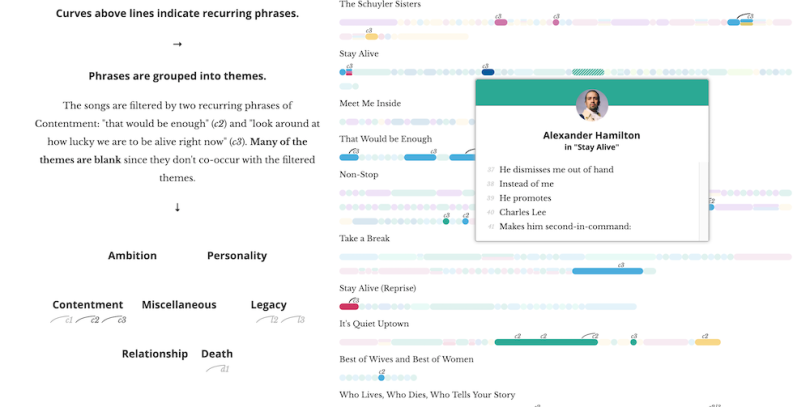
It’s a visually spellbinding record of Bremer and Wu embracing new approaches and even jabbing at the boundaries of their tools. Bremer, for instance, “hacks” empty space into a chord diagram to visualize the number of words spoken by each character throughout the Lord of the Rings trilogy. Wu, meanwhile, learns Three.js to incorporate 3D layouts into a visualization of all the women Nobel laureates, then a total of 51, represented as crystals and sized in proportion to influence. That’s after experimenting with D3’s force layout to make data points dance across the screen before settling into place to visualize every line in Hamilton.
We spoke with Bremer and Wu about balancing creativity and clarity in presentation, the evolution of their toolkits, the pros and cons of democratized data visualization programs, and learning to love (or at least appreciate) sketching.
In the introduction of the book, Alberto Cairo writes about the push and pull between orthodoxy and eccentricity in data visualization. Do you think there’s an overemphasis on orthodoxy? And how can visualization designers look for more opportunities, maybe even within more professional contexts, for creativity and eccentricity?
 Shirley Wu: There are definitely certain audiences where we should stick to something more like the Edward Tufte and Stephen Few school of thought — spartan and just trying to communicate the data. There are audiences where that’s very necessary, where there’s a certain amount of seriousness tied to it. For a lot of business statistics, the audience is like, “If it’s too shiny, I don’t believe it, because it doesn’t look serious.”
But outside of what I think is a quite small slice of the audience population, I think creativity and eccentricity gives a lot. Often, the data visualizations we end up doing try to communicate to a wide audience. And for a wide audience, that little bit of playfulness, delight and eccentricity adds so much to the experience and makes people enjoy going through the visualization more. And even for data visualization designers in their profession — even if it’s, like, trying to get business folks to adopt some new visualization — I feel like that little bit of delight or creativity can really hook in new users, like how really good, delightful [product] design hooks new users and gives them a feeling of attachment to that product.
That’s interesting. It reminds me of how we’ve seen many climate change visualizations that are very creative despite the serious subject matter.
SW: Yeah, I think even if the topic is serious, it doesn’t mean that we can’t give it a respectful, playful flavor.
 Nadieh Bremer: Also, people often underestimate how important it is to grab people’s attention by making something that looks visually appealing. That’s basically the first step that you need to overcome. If you’re creating visualizations for a more general audience, you first need to hook them in before you can try to convey the insights. Creativity is very important to make your visualization more memorable, but always in an effective way. The creativity, style and beauty should be the extra layer on top and shouldn’t take it into a weird area where the design is bigger than the story you want to convey.
I wanted to pick that apart a little. Shirley, in the Hamilton project write-up, you mention getting more comfortable with adding subtle, sometimes even flashy, touches to maximize delight. And Nadieh, for your Olympics project, you write about adding visual channels — for medals that were also world records — while also keeping overall “extras” to a minimum. How exactly do you go about striking that balance between information and elements of delight? Is it trial and error? Is it “I know it when I see it?”
NB: For me, it’s more trial and error. Generally when I start a visualization, I have no idea how the design is going to look. I more have rough sketches of how I want to lay out the data. And the visual style really comes throughout the process — endless iterations to see what works, what makes it better. I see myself as the first point: Am I happy? Does this feel right? And the more important the project becomes, the more I ask other people for their opinions as well. Of course, the client being a very important one, but with Data Sketches, our data viz friend group was often asked for feedback.

SW: The substance and trying to communicate the information comes first. I don’t have a hard-and-fast rule, because I think there’s value in something that doesn’t encode any sort of data or information, but is purely there for making someone feel good. I would never do that at the expense of the information I’m trying to communicate. [But] making it bounce around in between sections doesn’t detract from the data, it just adds a little bit more.
Having said that, I do have a maybe-unpopular opinion. I actually don’t think that every single piece of data needs to be mapped in a pixel-accurate manner If we fudge it a tiny little bit — because it’s maybe overlapping, and that’s not aesthetically pleasing — as long as it’s near where it should be, that’s OK with me.
“People often underestimate how important it is to grab people’s attention by making something that looks visually appealing. That’s basically the first step that you need to overcome.”
That’s where it’s fuzzier in terms of aesthetic versus accuracy. I’m willing to fudge the accuracy a little bit if it’s more aesthetically pleasing, because nobody’s going to be counting like three pixels or five pixels.
You mentioned sketching earlier. It seemed the approach to sketching evolved a little bit over the course of the project and book.
NB: I do always try to sketch. There’s basically one type of data set that I found I’m unable to sketch, which is networks. That’s because the best way to visualize a network is very much as a part of the connections within the network.... But generally, I sketch out ideas beforehand of how I abstractly want to lay out the data: Do I want to use circles or rectangles? Do I want to connect them with lines or flows? That’s always, always a big part.
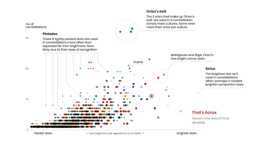
But the one [rule] I do have is, the bigger the data set, the sooner you need to go from rough-sketch idea to trying it out on the computer. If the data is very solid — for example, for Figures in the Sky — I knew how the constellations were supposed to look. I know how Orion looks. So I had a good grasp and could sketch quite far. But with other data sets, if they’re very big, there are so many ways that the data can behave slightly differently from what you might expect. So even if you have a rough idea, first try it out. See if that rough idea works. Then, you can go back to sketching and see, “How am I going to refine this, maybe with some nice-to-haves, with ways of adding a bit more detail?”
SW: My background is in software engineering, so [sketching] is weird for me. I only started sketching because Nadieh said we should have a sketch section [Laughs]. But it actually turned out to be really good for my process. It really helps flesh out ideas. Previously, I would just go straight to code. Code was my hammer for everything. And I wasted a lot of time.
I used to hate sketching because it adds so much more time, and I thought it didn’t add to the end product. It does take time, but it actually reduces the code time because I don’t wander around in my code as much, because I have this solid idea.
Having said that, I agree with Nadieh. The bigger the data set, the faster I need to get to the computer, and then iteratively go back and forth between seeing the data on the screen and going back to the sketching. The design and the data analysis steps are very woven together for me. I use a lot of, like, charting tools now to do my analysis.
You sometimes would set your own internal deadlines even beyond the monthly targets, such as making sure you had the Olympics visualizations done before the Olympics arrived. It sounds like you approach personal projects with a similar sense of rigor as you would for client work.
NB: When we started, our only goal really was to have some fun with creating more elaborate data visualizations and combine that with the fun of collaborating.... But we’re still both perfectionists. So even though we were doing it for fun, we definitely wanted to do our best. I really wanted to have the Olympics projects out before the event so that it would be the right time for people to go through it and have a conversation about it. But we never thought it would actually get traction beyond our social group of friends and data viz people.
That actually kind of turned into a downside in the end. When we did get traction, we felt more pressure. The next month has to be even better than the previous month. It kind of turned into a creative block toward the end. We didn’t go in with this idea of, “Oh my god, important people are going to see this or maybe careers will be impacted” [laughs]. But I’m very happy that it had positive side effects, as well, like us both having now-profitable freelance careers. That’s majorly due to having done Data Sketches. So I’m not complaining.


You get into this in the book, but can you give a quick rundown of some of your go-to tools and libraries, and whether those go-tos evolved during or after the project?
SW: I’m a software engineer by training, so when I first started in 2016, JavaScript and the text editor were my solution for everything. In my earlier chapters, I mention that I literally did my data collection in a text editor. And I think I wrote CSVs out by hand. I don’t know what I was thinking!
Reading Nadieh’s write-ups and talking to her about her process made me realize, “I am being so stupidly stubborn.” I think software engineers have this weird pride of like, “Oh, I do everything through code because I’m hardcore like that.” And the process with Data Sketches made me realize, no, that’s really dumb.
So over the years, I expanded from just code to include things like Excel for data collection and Observable and Vega-Lite together for data exploration. And instead of coding all my sketches and experiments in D3 from scratch, to test an idea, I’ll first put it into a line chart or Vega-Lite and explore that way. Then once I have something, I use iPad apps to sketch out ideas. And then, finally, I’ll go into code. And the code part, I think, largely remains the same — D3, and for JavaScript libraries, I went from React to Vue. We tried WebGL and Three.js.
That was another part of this project: We wanted an excuse to explore new techniques. My tool set has expanded a lot, and for that, I’m very grateful. Now I’m just constantly trying to find the tools that will make things faster. And smarter.
“The only thing that bothers me about the way that data viz tools have become easier to use is that sometimes people are thoughtless about how they use the tool.”
NB: My mindset was, use the tool for what it does best instead of trying to find one tool that does everything. So I generally use R to do my data preparation. And data gathering can be anything from downloading the CSV or JSON file from online to making it manually — and then using Excel for manual stuff, but then straightaway into R to get a sense of how it looks. I also just use plain pen and paper to sketch ideas. But throughout Data Sketches, I got into iPad sketching apps.
In terms of coding, I’m very vanilla. I don’t use Vue or React; it’s very much plain JavaScript. And if it’s static, which I did for one or two projects, I actually take what I made with code — and I code using Visual Studio code, usually with Chrome or Firefox — I take it back into Illustrator or, these days, Affinity Designer. I switched from one to the other to add parts that are very hard to do coding-wise, like legends or annotations. And I learned a lot of new techniques, such as HTML5 Canvas, throughout Data Sketches.
Shirley, that reminds me of your Presidents and Royalty project write-up, where you mention having made your first scrollytelling from scratch, because you wanted to understand how it worked. Are you now more focused on working quickly and less on wanting to know the nuts-and-bolts intricacies?
SW: That’s a really good point. Some things that I find particularly interesting, the first time I do them, I want to understand them from the ground up. And I oftentimes will do it from scratch. Then, after that, I’m like, “OK, what are the tools I can use to make this much faster?”
Much of what you do involves deep customization, but there’s also been a boom in drag-and-drop data viz tools in recent years. Do those sorts of tools make you cry a little bit inside, or do you applaud them for democratizing the field for less advanced practitioners?
NB: I can definitely understand why Tableau is very big. And some people have really managed to wrangle Tableau into some very nice data visuals. But I wouldn’t say it was easy to do it that way, because you are constrained to the boxes and options that the developer has made for you. If you want to be more creative, you have to go lower and lower.
A lesson I learned very well during Data Sketches is that I felt like I was pretty low level for using D3 and JavaScript. But then I learned how D3 creates some of these shapes for me. So I learned how to create my own SVG shapes — basically, that layer that D3 does. When I opened that, I was able to do so much more creatively. I could create visual shapes beyond what was in the D3 library. There was a layer below the layer, and I’m sure there’s a layer even below that that I haven’t even touched yet.
That doesn’t mean that in Tableau, you can’t do creative stuff, but it’s not really meant for that. It’s more based on hacking the tool than actually expressing yourself with the tool.
 SW: I don’t use Tableau, and I’ve never really used the higher-level charting libraries for end production. Again, I use Vega-Lite a lot for exploratory. The expression I use is that it’s easy to make easy things, but really hard to make hard things with Tableau and charting libraries. Whereas, for D3 or even lower level, it’s hard to make easy things but easy to make hard things.
To me, Tableau is a great taster. There are people who get really deep and make some amazing things in there. I do have complaints about Tableau’s performance. I get really annoyed about how slow its interactions are. But if people get into Tableau, and they’re like, “Oh, I want to make it more creative,” and they jump into D3 ... I recently saw an article about someone who was like, “I’m a Tableau master, but I wanted to do D3. Here’s the way I transitioned.” That’s really cool of Tableau, being kind of the gateway drug into data viz. If more people get in that way, I think that’d be super cool. And then they can buy our book. But in seriousness, I think it’s a really great gateway.
The only thing that bothers me about the way that data viz tools have become easier to use is that sometimes people are thoughtless about how they use the tool. I really realized that last year when the COVID[-19] numbers were starting to spike last March. And the number of extremely bad charts that came out — just because the data was readily available, and the plug-and-play tools were readily available — and people were like, “I’m gonna just put this data in here without much thought and get my 10 seconds of fame.” That really bothers me.
Do you have a favorite individual project or projects from Data Sketches?
NB: My favorite is definitely Figures in the Sky. It was my last project and also one of the biggest ones. As an astronomer, [I liked] having my final project for Data Sketches be about astronomy, and visualizing something that really I haven’t seen before — but also something that feels very shoved under the bed in a way, where other cultures are never really represented very well in the sky. And I’ve had so many people — teachers and people working in astronomy — say they’ve been using it to teach people about different cultures in the sky. So it’s really the long stretch of how much fun it was to create and work with this data set. I’m quite happy with how it turned out visually, but also with how it has seemingly impacted other people.
SW: For me, I think the biggest one is Hamilton. I probably spent the most time on it willingly. I was just so interested in and connected to the topic. Because of that, I think when I released it, there were so many people that also connected to it. Like Nadieh was saying, I got so much response. To this day, one of the favorite tweets I got was someone saying how she was going to show it to her son, who she was learning CS with. I didn’t realize that I could make things that will resonate with people and show that code can be really fun and beautiful. And I love the fact that it was a bonding moment for a mother and son. That’s what makes these personal projects feel so worth it. There’s literally no other motivation for making them other than interest in the topic, but when someone else [responds, it] feels so good. It’s also the one that people mention all the time, even years later.
That’s one; I actually have two others. One is Myths & Legends: Legends. It was the first time I did 3D data viz, but also because of what I learned, which is that out of some 900 Nobel laureates, only 57 are women. I was like, “What is with this extreme discrepancy?” ... That made me realize the kind of data topics I want to work with.
The last one is the very last one I did, which is my One Amongst Many, the physical installation. It’s so different from what I usually do, and it’s going toward the direction that I want to experiment with more.
* * *
Responses edited for length and clarity. Images courtesy of Taylor & Francis Group except when noted otherwise.