

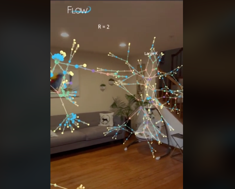
Last November, TikTok user Michael DiBenigno, known as The Data Guy, shared a popular data visualization that diagrammed the difference between two ways of perceiving COVID-19 spread. One depicted exponential growth, with every infected person passing along the virus to two more people; the other representation more accurately captured how the virus really travels, by taking into account super-spreader events.
The difference between the two diagrams in the clip, which has been viewed more than two million times, is particularly apparent thanks to how the graphics multiply: rendered in three dimensions, floating in space inside a living room, suspended in augmented reality.
Both graphs were visualized as networks — the same kind an organization might use to plot, say, social networks or corporate structures. DiBenigno created the graphics using Flow Immersive, the 3D AR and VR data visualization platform he co-founded.
The company is one of a few, including Immersion Analytics and Virtualitics, exploring how transporting traditional data-viz techniques — think line plots, network diagrams, point maps — into extended reality can amp up engagement and interactivity compared to traditional presentations.
That may seem like an obvious way to bring together data visualization and XR (extended reality), but, in fact, represents a bit of a shift. Experts who study what’s sometimes known as immersive analytics often point out that AR/VR data visualizations are a natural dovetail for so-called situated environments. Think of a surgeon being able to view medical data through Google Glass-like lenses while performing a procedure, or any similarly hand-on jobs where data access would be beneficial, like farm, factory or construction work. That future might be closer than anticipated, with a new wave of smart glasses looking very plausible.
The push to mainstream XR data viz into more traditional office environments is still evolving, but DiBenigno sees his social media success, paired with a long-nurtured professional services client base, as validation that the space will advance. (Flow launched a private beta version of its web-based editor last week and expects to launch the full version within the next few months.)
So does immersive analytics have a home as a future-forward data presentation tool? And how would companies actually use it?
Determining Use Case: Communication vs. Analysis
DiBenigno stressed to Built In that Flow’s version of immersive analytics is ideal for data storytelling, rather than deep data analysis. It works best, say, for presenting data as a narrative to non-expert audiences, like executives or potential customers — it’s certainly not replacing any BI dashboards.
“It’s a very different thing: How do you share opinion and not just share a visualization?” he said.
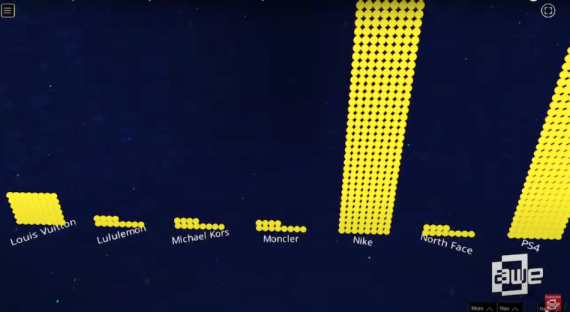
Here’s an example: At the 2019 Augmented World Expo, Flow co-founder and CEO Jason Marsh shared a data story created and used by one of its professional-services customers, BlackRock. It shows a 3D vertical bar graph followed by a 3D line graph, both visualizing brand sentiment information. There’s no y-axis, so viewers can’t get a sense of precise figures. But the soaring, upward perspective that shoots up one of the larger bars, representing Nike, underscores the broader point with a sense of drama: This apparel brand is generating way more chatter than others.
The narrative aspect is noticeable too in a demonstration built around the Texas winter power crisis. The structured flow calls to mind the scrollytelling format one might find on a digital news outlet. It’s easy to see the appeal of translating that to a business environment, even on just a 2D display, without having to dive into something like three.js or d3.js.
Explaining further, DiBenigno cited Jonathan Schwabish’s Better Data Visualizations, in which the author breaks down data viz as “a mix of science and art” — sometimes intended to help readers “more accurately perceive the absolute values of data and make comparisons,” and sometimes about creating “visuals that engage and excite the reader, even if they do not permit the most accurate comparisons.” The purpose is most often effective and engaging interaction, not the facilitation of raw analysis, DiBenigno said.
That’s not to say the XR spectacle needs to be used at every meeting. “I don’t think it makes sense to do everything in AR or VR,” said DiBenigno, acknowledging that the old-fashioned tools like PowerPoint will always have some place. But “when you can add interaction [and] a spatial aspect to the data, to animate and incrementally build stories — those all go toward better communication with data.”
The idea of communicating an overall story, rather than attempting to firmly impart individual details may be more broadly relevant to AR- and VR-assisted 3D data visualization.
In a study that received honorable mention at InfoVis 2020, researchers from Monash University and Microsoft explored the concept of making data communication feel more visceral through the use of virtual reality. They developed several environments in which to “experience” different data sets, including an in-stadium immersion into Olympic sprint and long-jump events. All the study participants reported a better qualitative understanding of the sports data, and none argued that knowing the precise numerical values involved was an important takeaway.
“Who will remember the values all the time, for everything, that’s crazy!?” said one of the participants.
Engaging Your Audience With Interaction
Tim Dwyer, a co-author of the “data visceralization” study, leads the Immersive Analytics and Data Visualisation Lab at Monash. He told Built In that the interactive potential of immersive data visualization represents a fundamental shift from the active presenter/passive audience dynamic.
“You can create a much more egalitarian kind of shared experience,” he said.
Dwyer also helped lead a recent project in which researchers built a prototype system that detailed energy usage data of a campus grid. It combines a host of physical, 3D-printed building miniatures, dotted across a tabletop, along with an AR component. Virtual energy data towers above the mini structures, lending the information easy-to-assess spatiality, and picking up the building models reveals more site-specific consumption details. (Outside academia, companies like Hiverlab and BadVR are incorporating AR/VR data visualization into monitoring data for the built environment.)
The project was designed to be casually collaborative and layperson-friendly — “a much more experiential way to learn the data than simply setting up PowerPoint,” Dwyer said. “And I think you come away with a deeper understanding of the scenario than if you were to sit through slides.”
The project’s use of Blockitecture-esque physical models isn’t really practical for group presentations at your given SaaS company, but it underscores the draw of interactive data exploration that immersive analytics can bring.
That interactivity will seemingly be a major part of whatever foothold XR data viz gains in knowledge-worker environments. In the aforementioned BlackRock example, Marsh, the Flow co-founder, also points out that each dot on one of the graphs is clickable, allowing viewers to interact with the data during the presentation.
“The core goal is to get past this feeling of having the presenter be the sage on the stage,” he said.
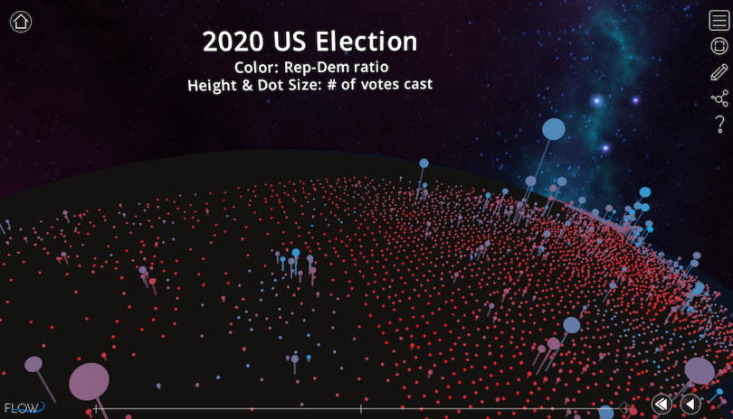
To get a sense of this myself, I toured this Flow map visualization of 2020 U.S. election data together with DiBenigno, another illustration of the “land doesn’t vote; people do” lesson. There’s a sense of drama as dots emerge from the map to better illustrate the number of votes cast in a given county, and again as the colors change hue to account for how red, blue or purple a county is. And being able to zoom and click on different dots/counties certainly felt more active and collaborative than 2D, non-interactive illustrations of the same principle, even effective ones. It also certainly felt more active and collaborative than a slide-deck talk.
The experience would’ve been richer still, DiBenigno promised, with mobile AR devices rather than our laptops, and it would’ve been richest of all with AR or VR headsets — allowing us to walk around the content and see one another’s movement through the space. But that’s the tradeoff between immersion and reach, he said. And if AR/VR data tools are to really penetrate office culture, they’ll have to span the spectrum of lower immersion/higher reach (desktop views) to higher immersion/lower reach (headsets).
3D in Data Visualization: A Tricky Relationship
Desktop-viewed 3D graphics may prove an effective gateway toward truly immersive data viz, but they’ve long been a thorny subject in visualization. More precisely, 3D that can be considered unnecessary has been thorny.
As Tamara Munzner noted in her influential Visualization Analysis and Design, 3D can cause problems. Those include occlusion — meaning some data elements or objects block others — and perspective distortion — that is, it becomes hard to compare distant elements to closer ones since their placement on the plane affects size. Interactivity can assuage those concerns somewhat, but it won’t necessarily make value comparison as straightforward as a two-dimensional visualization.
That’s less of an issue for companies like Flow, who hold that XR data viz is best-suited for engaging viewers with broader “data narratives” than comparing exact values. But it remains to be seen how exactly the translation of traditional data-visualization techniques into the XR realm will unfold in full. Such considerations wouldn’t be moot for more analytical use cases.
But broadly speaking, Dwyer urged the immersion-curious to not let generally sound advice on 3D to curdle into a conservative streak, especially if that might lead people away from more genuinely immersive display environments.
There is, after all, reason to be hopeful about the upsides of XR. Research has shown that 3D virtual learning environments may aid learning more effectively than conventional ones — although the careful design of those spaces and experiences is paramount. DiBenigno invoked the idea of the memory palace, the spatial mnemonic device of “storing” ideas in “rooms” of the mind. (VR memory palaces have also been shown to help recall.)
There are still critics of even AR/VR 3D visualizations, including Stephen Few, who’s written several skeptical posts. But their numbers have reduced in recent years, Dwyer said, to his encouragement.
“Researchers should be pushing the limits and not be bound by convention,” he said. “We should really explore all avenues of how to fully engage.”


