


Edward Tenner grinds his coffee beans by hand. He could save time and a fair amount of clean-up effort by investing in an electric grinder, but he has little interest in doing that.
For Tenner, author of The Efficiency Paradox: What Big Data Can’t Do and a distinguished scholar in the Smithsonian’s Lemelson Center for the Study of Invention and Innovation, there is a slowness and deliberateness to the task that is intrinsically satisfying. It’s the same sort of “aesthetic friction,” he said was likely on the minds of engineer Hildaur Neilson and Arnold Neustadter, head of the business products company Zephyr American, in the years leading up to their 1956 patent of the Rolodex. While not the first rotary card bookkeeping system, it’s almost certainly the most celebrated.
One of the crucial innovations that distinguished the Rolodex from earlier incarnations, as Tenner described in the erstwhile I.D. Magazine, was a friction clutch consisting of “two disks, one with eight small holes around its rim, the other with three spring-loaded ball bearings, also evenly spaced.”
“I still have one,” he told me. “And the clicking — this conversion of something that’s continuous and smooth into something discrete — is kind of satisfying, even though it’s more difficult to turn.”
But what do coffee grinders and Rolodexes have to do with online user experiences? Quite a bit, according to Tenner.
For a long time, the ruling manifesto among UX designers was “don’t make users think.” The design approach, borrowed from the title of usability consultant Steve Krug’s book, favored simplicity and directness. For UX designers, that meant limiting excess clicks, removing visual distractions, streamlining navigation and generally reducing the number of decisions users have to make.
When Friction Should Be Used in UX Design
- To prevent errors. Timely confirmation messages can slow users down before they take consequential actions, such as booking a flight or sending money electronically.
- To give users a break from heavy or addictive content. Gentle nudges encouraging users to take breaks from heavy content, or think twice about doom scrolling into the wee hours, can provide psychological safety and comfort.
- To enhance learning and cognition. Slow search engines, arresting fonts or images, and check-in questions or quizzes, can increase understanding and retention of key ideas by arousing the user’s attention.
- To increase feelings of accomplishment. People like games and mental challenges. There’s a reason Twitter has a character limit and IKEA lets customers build their own furniture.
- To encourage behavioral change. Health and well-being apps often ask users to pause and reflect on their progress toward goals. Such reflection, studies show, can increase users’ motivation to commit to difficult lifestyle changes, like altering their diets or exercise routines.
- To boost user loyalty. Onboarding games and exercises that orient users to the operability of a platform can increase their satisfaction and likelihood of retention weeks and months later.
But while removing friction from interface elements that obstruct users’ intentions — like a confusing checkout flow or a help page that leads you down a head-scratching rabbit hole — is still considered good practice, attitudes among designers have shifted about the value of friction in websites and apps.
“I think about friction as pacing,” said Antonio García, head of design at Table XI, a Chicago-based product innovation firm. “And where it’s appropriate to be intentional and deliberate in how someone moves through a digital experience.”
“Is it friction? Or is it reflection?” asked Rosa Arriaga, an associate professor at Georgia Institute of Technology’s School of Interactive Computing, who has applied psychological theories to examine how mobile technology can improve asthma and diabetes management.
“Being reflective and reflecting on a given process necessarily leads to a better understanding,” she continued. “If we think about cognitive behavior therapy, the gold standard of mental health, there is an aspect of reflecting on what, at a very basic level, is stressing you out. And that, necessarily, means that you have to stop and think.”
Error Messages and Content Advisories Are Only the Tip of the Iceberg
By now, the design community has embraced friction for a number of good digital uses, García said, from preventing users from making mistakes when sending money, like adding “that extra zero to a Venmo transaction,” to alerting them when they’ve neglected to add an intended attachment to an email or are about to expose their Chrome browser to malware or relinquish their personal information to a third-party app.
In an article in Smashing Magazine, titled “Designing Friction for a Better User Experience,” Zoltan Kollin, a design manager at IBM Budapest Lab, notes more than a dozen uses for friction, many of these user-friendly techniques related to error prevention and enhanced privacy and security, but some of them more insidious sales tactics (including “adding too much friction to the cancellation flow”).
Spotify’s recent announcement that they are adding a content advisory to podcasts that discuss COVID-19, a decision that follows a wave of controversy surrounding Joe Rogan’s podcast, “The Joe Rogan Experience,” could be even considered a form of friction, a kind of nudge toward critical information consumption.
None of this, though, is really what Tenner imagines when he thinks of friction: “When I’m talking about friction, I’m talking about something that slows something down in the interest of, somehow, making it more satisfying.”
“When is friction good? ... When you have an outcome you want to measure, a goalpost you want to meet.”
That could be e-books that visually mimic the page turning of printed books, with animation that makes the page display slower, but gives the reader a moment to pause and reflect on their progress. It could be a deliberate interruptions to help users learn and absorb information, such as an online learning module whose instruction is broken up by regular quizzes or a slow search engine that algorithmically calculates when users need a break. Many times it is related to a feeling of accomplishment: the so-called IKEA effect that research suggests customers of the furniture company experience as a psychological reward for assembling their own furniture.
As Tenner observed in a review of Cliff Kuang and Robert Fabricant’s 2019 book, User Friendly: How the Hidden Rules of Design Are Changing How We Live, Work and Play, design elements like page layout and font can have a significant influence on the way we interpret and recall information. He cites a 2010 study that found information conveyed in harder to read fonts is easier to remember. The larger idea is that disfluency, a term for the struggle associated with a difficult mental task — like deciphering a fuzzy photograph, filling in a missing word in a sentence or pronouncing a foreign word — may improve learning.
Friction can be a good thing, in other words, when you want your users to self-reflect, understand something deeply, reconsider widely held assumptions or adopt healthy behavioral habits. It can also help users take breaks from addictive or emotionally wrenching content.
“When is friction good?” Arriaga said. “When you have an outcome you want to measure, a goalpost you want to meet.”
Pacing Can Give Users a Break From Heavy or Addictive Content
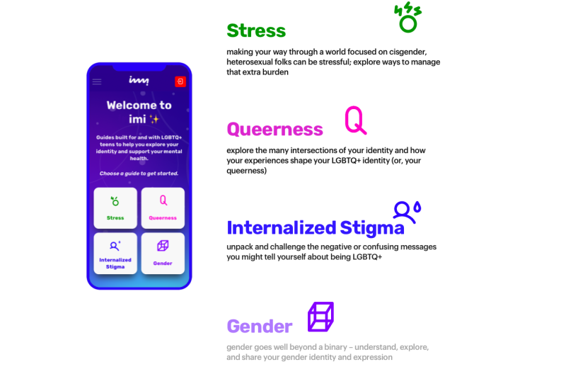
Table XI recently partnered with Hopelab, a consultancy of behavioral scientists and technologists supported by the Omidyar Group, on the design of a web app called imi, which offers guides to help LGBTQ+ youth improve their mental health and embrace their queer identities.
The app, now in beta and scheduled for release during LGBTQ+ Pride Month, bundles content in four areas: stress, queerness, internalized stigma and gender. Evidence-based research and discussions with queer youth informed the content, which, according to García, is targeted and thoughtful, but also extremely heavy at times.
“Because of the nature of this content, you couldn’t just drop a person into this curriculum, if you will, and expect that young person to process and absorb all of it,” García said. “You’re trying to support a young person in terms of their internalized stigma and sort of inner voice they’ve been conditioned to have.”
The pacing of information disseminated in the app is intended as a buffer to give users space to cope with difficult feelings about what they’ve read. Users who sign up for notifications receive “micro-content” via text only every other day. Web guides, similarly, are broken into digestible chunks, with prompts suggesting when it might be a good time for a break.
“Imi is essentially encouraging you to stop and think,” García said. “And just giving that little bit of space, I think, is really helpful for these young people to, maybe, journal about it or talk to somebody they trust, and then come back in a different frame of mind.”
Introducing Novelty Can Enhance Learning and Cognition
Friction can be useful for parsing content and suggesting the best order to proceed through complex tasks, according to Arriaga.
She cites the work of Jaime Teevan, a chief scientist and technical fellow at Microsoft, who proposed the concept of “slow search” in an article published in the journal Communications of the ACM. With extra time, “complex query processing” and crowdsourcing can improve search results by providing “a summary or synthesis of the result content, the necessary background material to understand a topic or the context necessary to resume an ongoing tasks,” Teevan and her colleagues explain.
Slow search engines might also help people respond more judiciously to complex queries, such as how to address a newly diagnosed medical condition, and determine the best search method to use for tasks with strict time and resource constraints, Arriaga said.
“People that are effective will do this by themselves,” she said. “They’ll say, ‘Okay, here’s a list of things I need to do. And here are some steps, here are these milestones. But that takes a certain kind of cognitive profile. And the idea is, how do we allow the computing system to algorithmically calculate when it’s time for us to take a break or when it’s a good time for us to reflect?”
“In casinos, they change the lighting, every once in a while ... They fade the light, so you get a little bit of new stimulation. And that, too, would be friction.”
In other cases, interrupting users with an arresting image, a change of font or style, or a recollection exercise can arouse attention, which tends to result in increased understanding and retention. Learning check-ins, for instance, are a key component of the Introduction to User Experience Design course Arriaga teaches on the online platform Coursera. Like many massive open online courses, or MOOCs, the course punctuates lengthier video lessons with assessments matched to participants’ attention spans.
“Basically, people have an attention span of about seven to nine minutes,” she said. “And so they make the lessons that length. But it’s not enough to have the lesson, there needs to be a way to check in with you. Did you get anything out of the seven minutes? And so you have these small quizzes. Is it to create friction? Sure. Is it for you to reflect on what you’ve learned? Sure.”
Think of the click of the Rolodex, magnified. The interruption is a form of feedback signaling a progression from one state — in this case, video instruction — to the next: assessment. The jolt of novelty arouses students’ attention. It’s an established principle of behavioral modification that works just as well in Las Vegas, as it does in an online course.
“In casinos, they change the lighting, every once in a while,” she said. “They fade the light, so you get a little bit of new stimulation. And that, too, would be friction.”

In-App Messaging Can Promote Behavior Change
Obviously, though, there are limits to friction. If casino lights brightened and dimmed too often, at the wrong times or too dramatically, it would get old — and people would find somewhere else to play blackjack. The same applies to digital products.
Much of Arriaga’s research focuses on mobile health, or mHealth, the use of mobile devices — smartphones, smartwatches — to support public health and medicine. In this context, one of the early approaches to encourage medication adherence, using dry, mechanical text messages as prompts, has been largely ineffective in altering behavior. “We know that reminders don’t work,” Arriaga said. “A machine telling you ‘Take your meds, take your meds, take your meds.’”
A better approach, it seems, is to raise peoples’ awareness of their symptoms and knowledge of their health conditions. In a 2013 study, Arriaga and Tae-Jung Yun, a user experience manager at HP, investigated an app designed to encourage children with asthma to take their medication on a regular schedule.
The two researchers applied the health belief model, or HBM, to study the delivery and content of messaging on the app to a group of children aged 10 to 16. The model, Arriaga told me, is grounded in research showing that people who are more conscious of the connection between their behaviors and physical and mental health tend to have better outcomes.
“So rather than asking somebody, ‘Did you take your meds today?’ or telling them, ‘Take your meds today,’ we said, ‘In the past four weeks, did you wake up at night with wheezing or difficulty breathing?’ Basically, reflecting on your symptoms.”
Results of a pulmonary function test analyzed at the start and end of the four-month study showed children who were sent text messages had greater improvements in lung function than a control group who received no messages. A subsequent study to replicate and extend the findings found that pediatric health intervention using the asthma app “led to improved psychological and physiological outcomes.”
Mindfulness, in other words, boosted children’s motivation to perform a desired action. To use the model of BJ Fogg, who founded the Behavior Lab at Stanford University, children had the ability to take their meds, and they had a trigger. What was lacking, however, was the motivation. The messages, Arriaga believes, helped them understand the connection between the medication and their health.
Onboarding Games Can Boost User Loyalty
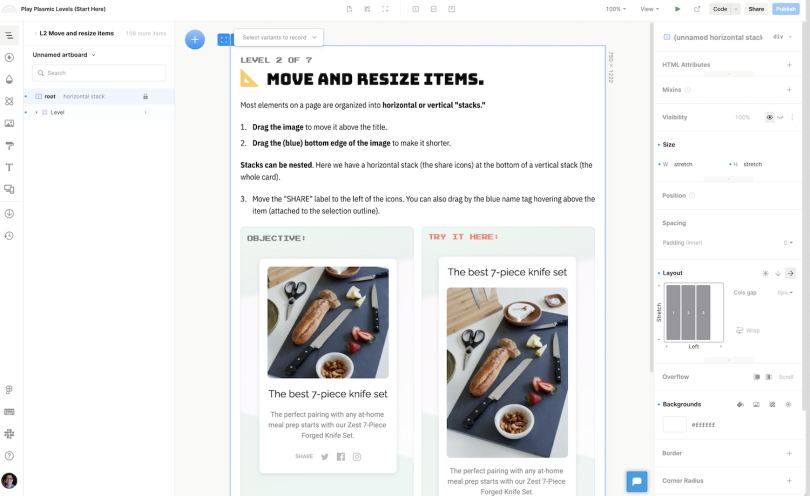
Still, realizing the benefits of friction can take time. When Yang Zhang, CEO of Plasmic, decided to redesign the company’s marquee product, a no-code webpage builder (think Squarespace or Wix, configurable to any tech stack), he did so with reservations.
The key change, he told me, was to shift from a freeform drawing canvas to a drag-and-drop environment with boxes designating the position of various elements. Though freeform drawing is, arguably, more intuitive and seamless, it led to problems later when users wanted to edit text or images, or migrate a desktop layout to a smaller screen. The building block design, while adding friction to the experience, allowed pages to adapt fluidly to different screen sizes.
A game-like tutorial helps orient users to the new system. Over the course of seven levels, they learn how to zoom in and out, edit text, drag blocks and so on, until they can create an entire webpage. Those who complete at least 100 actions in the game, about half of all users, are twice as likely to be retained.
“If it’s transactional make it super seamless, reduce the friction, help me move through the process with ease ... But if it’s experiential, or if it’s about mental health or wellness or challenging subject matter, I’m probably going to need a minute to process what’s happening. And I think technology can give that affordance.”
“We’ve actually watched a lot of sessions with the tutorial,” Yang said. “And it’s been invaluable, just seeing where users are getting stuck and kind of throwing in the towel.”’
There is such a thing as too much friction, of course. The infinite scroll, which Garcia deemed the antithesis of friction, has done pretty well as a means of boosting user engagement. But even Instagram now has an opt-in “take a break” reminder users can activate in their settings to alert them when they’ve read all new messages and it might be best to give it a rest.
As a designer, the key lesson, perhaps, is to determine whether your main goal is to nudge users through a purchase funnel (or keep them in your app at length), or motivate some sort of lasting change. When applied judiciously, Garcia told me, often to encourage users to be more mindful of their actions, friction can be extremely valuable and boost user satisfaction and loyalty.
“If it’s transactional make it super seamless, reduce the friction, help me move through the process with ease,” García said. “But if it’s experiential, or if it’s about mental health or wellness or challenging subject matter, I’m probably going to need a minute to process what’s happening. And I think technology can give that affordance.”


_0.jpg)