

When Bill Shander began leading data visualization workshops more than a quarter-century ago, it was a niche discipline. But a lot has changed, even in the last two years alone. Data viz officially punctured the mainstream in 2019, according to Elijah Meeks, former executive director of the Data Visualization Society. Last year, it arguably graduated to the level of public obsession.
Given such penetration, it’s tempting to wonder: Is data-visualization literacy simply a given now? Shander’s reply, in a word: no.
Awareness and exposure have indeed shot up, but newcomers generally still don’t feel confident in their ability to visually communicate information and companies that elicit his services are oftentimes essentially starting from scratch.
“The gap is still as wide as it ever was,” he said.
Steve Wexler, founder of data viz and dashboard consultancy Data Revelations and author of The Big Picture: How to Use Data Visualization to Make Better Decisions ― Faster, sees a similar phenomenon in his workshops. Yes, data visualization goes down more smoothly than other lessons in data literacy curricula — “It’s hard to get people to have a visceral impact about data governance,” he said. But the degree to which people are still underprepared continues to surprise him. Sometimes, there’s even a bit of willful obstinacy.
“The number of people still clinging to spreadsheets amazes me,” he said.
But the upsides are real. The Big Picture, for instance, contains a long list of companies that have seen demonstrable bottom-line impact due to more thoughtful visualization choices, in industries ranging from drug development to facilities management. Some of those success stories hinge on evangelizing the gospel of data visualization as thoroughly as possible.
“I just can’t see an organization not benefiting from people having a minimal fluency in this language — and it just isn’t that hard to achieve that fluency,” Wexler said.
With that in mind, here are a few pointers, courtesy of Shander and Wexler, for how to go about instilling a data viz-friendly culture throughout your company.
6 Steps to Organizational Data-Viz Literacy
- Expose people to “gateway” visualizations.
- Strike a balance of complexity.
- Explain (a bit) about cognitive processing.
- Stress the importance of intentional choices.
- Teach caution with colors — and in general.
- Consider a data-visualization style guide.
Expose People to ‘Gateway’ Visualizations
When Wexler laments the spreadsheet diehards, he isn’t necessarily passing judgment on the tool. (One can create lovely, informative charts in Excel, of course.) Rather, it’s the tendency to insist that “just the numbers” will always suffice.
For those folks, he recommends zeroing in on two visualization techniques that serve as effective “gateways” to a greater level of data-viz comfort: highlight tables and marginal histograms. Wexler considers them such because they introduce visual elements to the spreadsheet environment, meeting the spreadsheet enthusiast on their own terms.
Highlight tables are essentially color-coded cells where a spectrum illustrates higher and lower values at a glance.
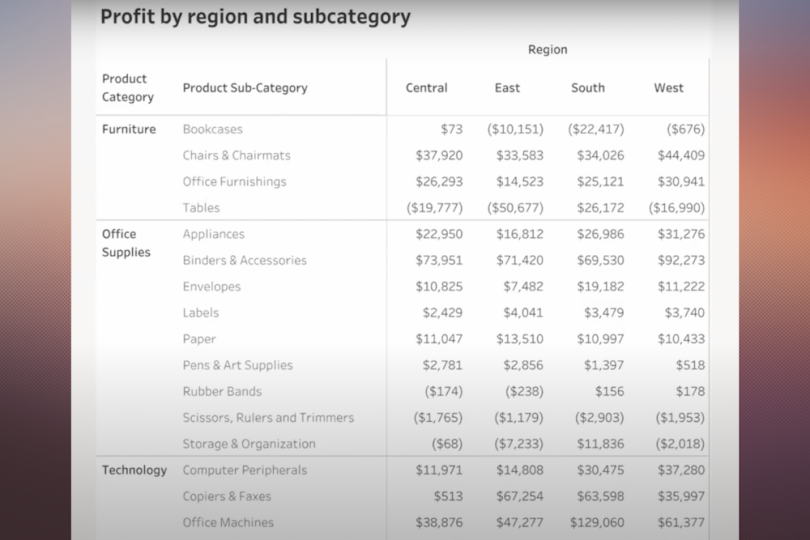
Below are two examples of the same table, from one of Wexler’s presentations. First, here’s what it looks like before.
And here’s the same chart, with highlight tables added.
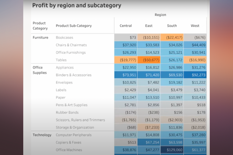
The example that uses highlight tables lets viewers not only quickly understand the highest and lowest values, but it also contextualizes all the values on a spectrum of high, moderate and low.
Wexler’s second “gateway” is the marginal histogram. Marginal histograms are precisely what they sound like: graphical summations of values, placed in the margins of a graph or chart. As Wexler wrote in 2017, they’re commonly applied to scatterplots but are equally useful when paired with highlight tables, where they offer at-a-glance totals for rows and columns. Moreover, they also sneakily illustrate the power of visualization versus traditional crosstabs and provide a comfortable on-ramp to start incorporating basic visual elements into data storytelling.
Strike a Balance of Complexity
Any data-viz literacy effort would need to include an overview of visualization types. There are a number of quality catalogs available to leverage (like the Data Visualisation Catalogue and Tableau’s Data Visualization Glossary.) Still, how deep exactly to delve can be a tricky consideration.
“I often think some of my more erudite colleagues are practicing the functional equivalent of molecular gastronomy … I’m just trying to feed people a nutritious meal,” Wexler said. But one person’s see-through ravioli might be another’s roast chicken and vegetables.
For instance, The Big Picture doesn’t introduce Sankey diagrams, which visualize proportional changes in flow, but Shander does touch on them in his workshops. Diagrams like Sankeys may be more complex, but they’re suitable for many business use cases nonetheless, like the movement of funds or a supply chain flow.
“I have no problem going a little beyond what people can necessarily execute on today in Excel … but I’m always very thoughtful about it being practical,” Shander said. “Even if it’s outside their reach, realistically, today, at least it’s aspirationally close.”
The point is: You might have to play with different approaches. Consider discussing more complex charts (like Sankey, chord and network diagrams) while gauging audience response and adjusting your teaching approach accordingly.
Explain (a Bit) About Cognitive Processing
There’s a seemingly infinite body of research that explores the intersection between data visualization and cognitive processing. It’s fascinating stuff, but how important is any of it to, say, the human-resources assistant who might need to visualize a people analytics survey from time to time but hardly lives in Tableau?
Turns out, it’s important enough to not skip altogether. For instance, Wexler and Shander both agree it’s worth taking the time to explain how we all subconsciously process visual information.
In visual perception, preattentive attributes refer to the four features that we process without conscious effort. Or, as Wexler said, “It’s a fancy term for things people notice without even noticing that they’ve noticed them.” The attributes are color, form, spatial positioning and movement. (Here’s a visual illustration.)
The average visualization consumer might not need to know the rank of effectiveness for each attribute, but a quick rundown of each, explained in a straightforward way — your eye is attracted to the long line among shorter ones or the orange dot among grey ones — will provide them an intuitive, internal framework. That can inform their own style decisions and help them highlight the most important information when telling data stories.
“If you just understand that there’s a subconscious response to visuals, then you can understand why it’s important to design visuals a certain way,” said Shander.
Stress the Importance of Intentional Choices
The biggest mistake that Shander sees with data visualization is people not being intentional about the charts they choose. Choices are often driven simply by default: We see a pie-chart icon in the toolbar, we press the pie-chart icon.
People can make better decisions about visualization selection by asking themselves a couple of simple questions: What am I trying to say? And what action do I want my audience to take with that information? When you ask, put visualizations out of your mind for the moment, Shander suggested, and focus on the verbal answers.
The words alone will “magically” help point toward a suitable visualization or at least conjure up clarifying phrases — “Am I really trying to get people to compare stuff, or is it about the trend over time?” Shander said.
When applicable, also center the audience in the visualization, Wexler stressed. (“That one dot that’s a different color or bigger, that’s you.”) It’s a lesson many of us internalized during the pandemic when interactive visualizations that allowed users to localize data based on a reader’s location inherently helped personalize and humanize the data.
Shander also recommends keeping a flowchart-style cheat sheet handy. Several are available, but he’s fond of the Financial Times’ Visual Vocabulary. It lists nine categories, such as ranking, change versus time and deviation. Each category then lists examples and chart types that would be good fits for each given category. For instance, part-to-whole examples include fiscal budgets and company structures, and effective chart types for those considerations include stacked columns, pie charts and treemaps. (Other crib-sheet decision tree options include Ferdio’s Data Viz Project, From Data to Viz and the Chart Chooser card deck.)
You’ll still need to make further design choices based on what exactly you hope to communicate, Shander said. Are percentages or absolute values more useful, for example? But simply asking about the key purpose, and guiding yourself to a good-fit visualization, will provide plenty of direction.

Teach Caution With Colors — and in General
If users are sometimes uncritically devoted to familiar options when choosing visualization styles, the opposite problem often rears its head in terms of color. Call it the Crayola 64 problem: Because users have so many color options, they feel compelled to use many. Wexler has seen it so often that it stands out more than any other common mistake.
“The number one infraction in data visualization is the misuse of color,” he said.
Wexler does another side-by-side comparison in his workshops, this one to stress the importance of not overusing categorical colors. Picture a bar chart with bars for each day of the week. Saturday and Sunday are colored blue, while the others are gray. Now picture the same bar chart, but with seven different colors for the seven days. The first chart leads everyone to notice the same, key detail, but with the second, the takeaways are random.
Luckily, most applications guide the user toward smart color choices. In Tableau, for instance, the default color scale is orange-blue, which is the safest combination for people who have color vision deficiencies. As Maureen Stone, director of research at Tableau, told Built In last year, one can use even the suboptimal combination, red-green, if they manage shading contrast to maintain accessibility. But newcomers to data viz almost certainly won’t have the know-how to approach such considerations. For a general audience, it’s better to stress the less-is-more approach to colors, especially categorical ones.
That’s probably good advice in general for anyone tasked with nurturing data-visualization literacy within a company.
“My two word design advice boils down to: do less. If you change your default position to minimize everything, then everything gets better,” said Shander.
“That doesn’t mean that every chart has to be minimalistic,” he added. “There’s a place for complexity. But I just encourage people to start from the standpoint of less … the burden is on you to convince me to add more, not the other way around.”
Consider a Data-Visualization Style Guide
Companies create data dictionaries and editorial style guides, so why not data-visualization style guides? Data-viz experts like Jonathan Schwabish and Amy Cesal are longtime proponents, and their books, talks, articles and roundups together make up valuable guidance and inspiration fuel for anyone who decides to undertake the task.
Putting together a comprehensive repository that accounts for aspects like labeling conventions, granular guidelines and color considerations (as Shopify’s internal guide does) takes time, but Shander and Wexler agree it’s a worthwhile endeavor for companies that are serious about achieving advanced organizational data-viz literacy.
“That’s a mature organization that says not only do we embrace data visualization, but we want to have a certain studied approach to the way we present data,” said Wexler.
One note of caution, however: Don’t be too beholden to your company’s brand bible, especially if that leads to accessibility concerns.
“What drives me crazy is when [design] is driven by branding and they insist on using the corporate logo colors,” said Wexler. “You end up with these really loud fuchsias on bars. It’s one thing for your logo to have those colors, but I don’t know if the charts need them as well.”